
How to graph functions in Excel
 By
SpreadCheaters
By
SpreadCheaters
You can watch a video tutorial here.

Graphs are great ways to visualize data and Excel has tools to build many types of graphs. You may need to create a graph to better represent some analysis you have done or to study trends and projections.
Step 1 – Create the function
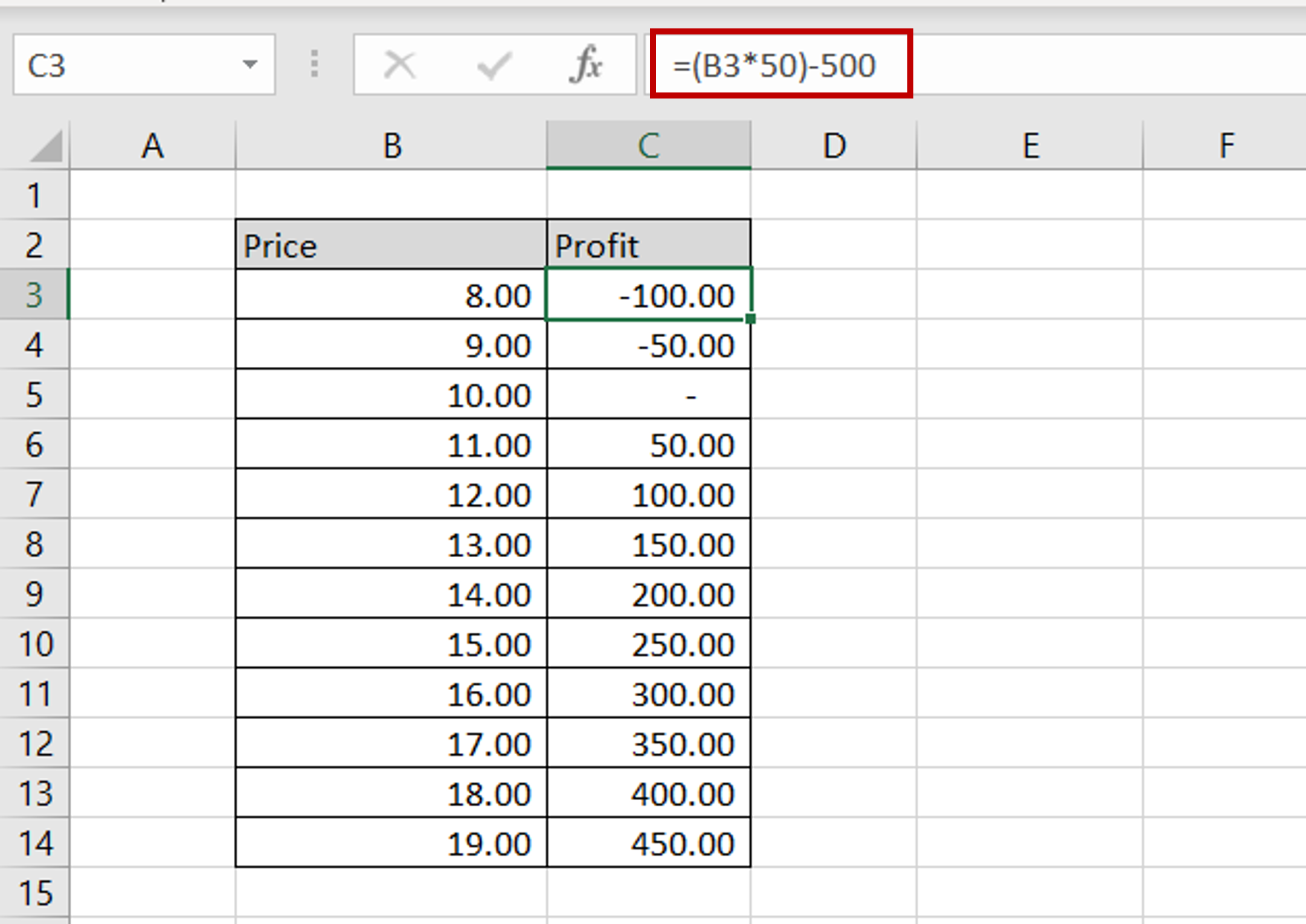
– The function is to calculate the profit at different prices with a sales quantity of 50 and a flat manufacturing cost of 500
– Enter the formula in the first cell
– Copy the formula to the rest of the column
Step 2 – Select the chart
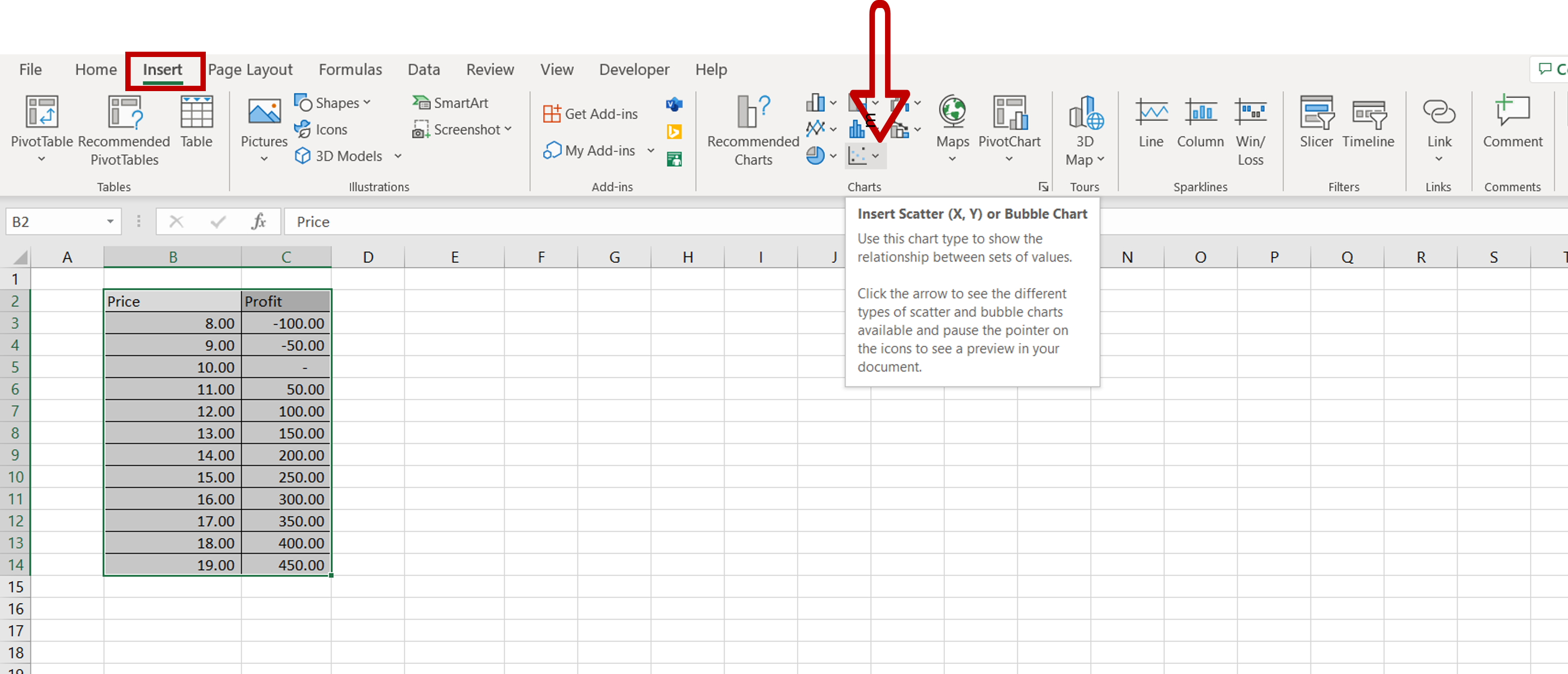
– Go to Insert > Charts
– For this data, the Scatter plot is the most relevant
Step 3 – Choose the type of Scatter plot
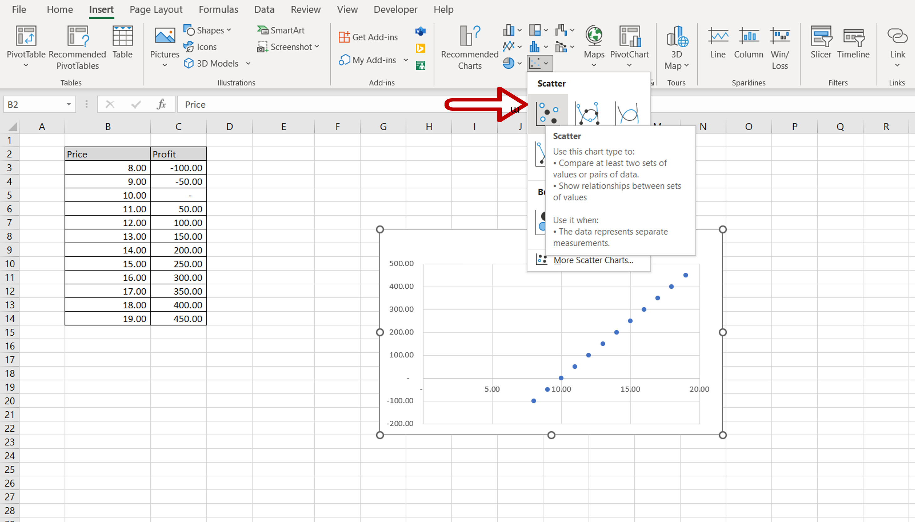
– Select any one of the Scatter or Bubble options given
Step 4 – Format the graph
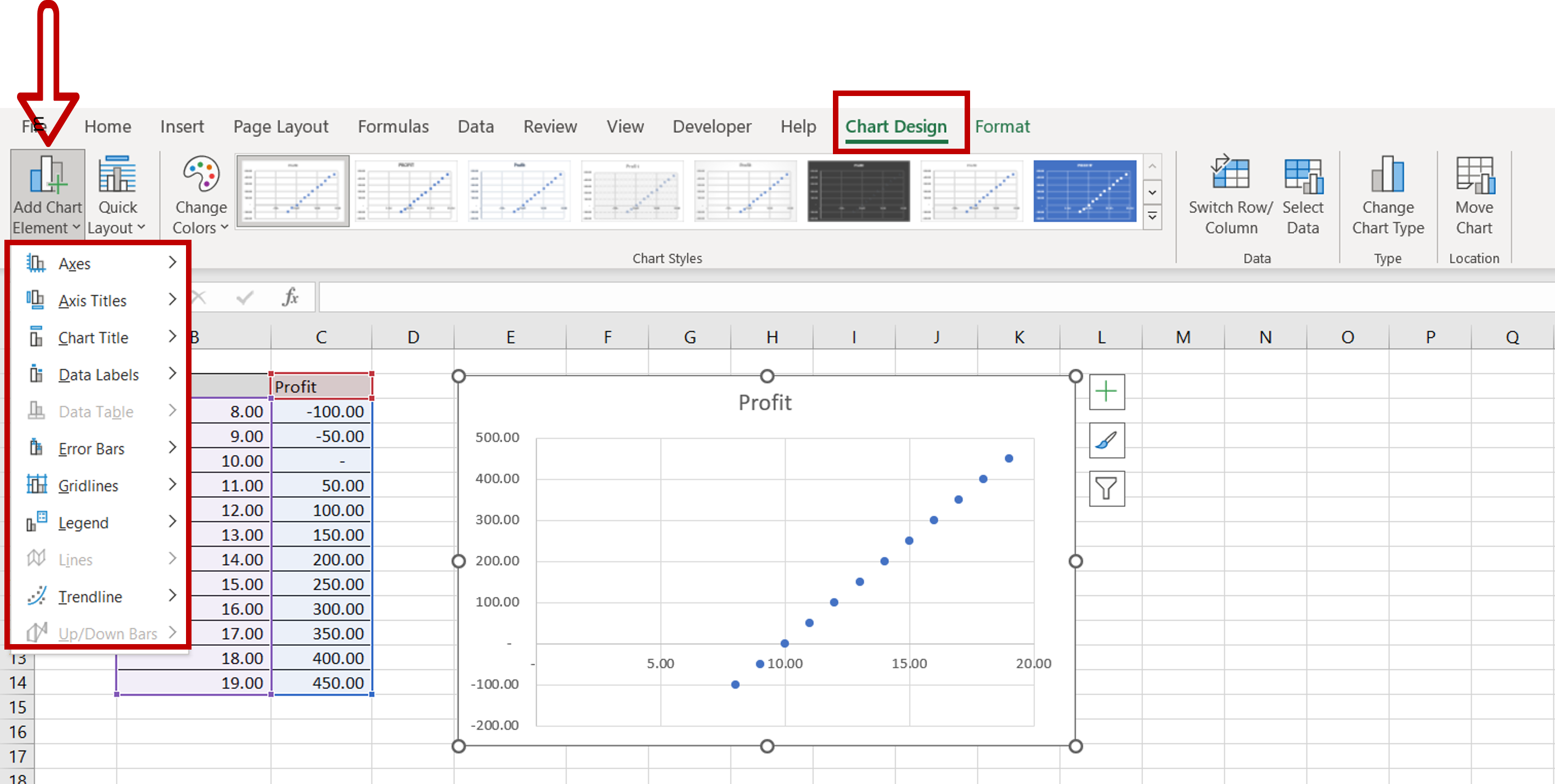
– Select the chart
– Go to Chart Design > Add Chart Element
– Choose whatever elements that need to be added to the chart to make it easy for the readers to -understand e.g. Legend, Chart Title, Axis Title
Step 5 – View the Result
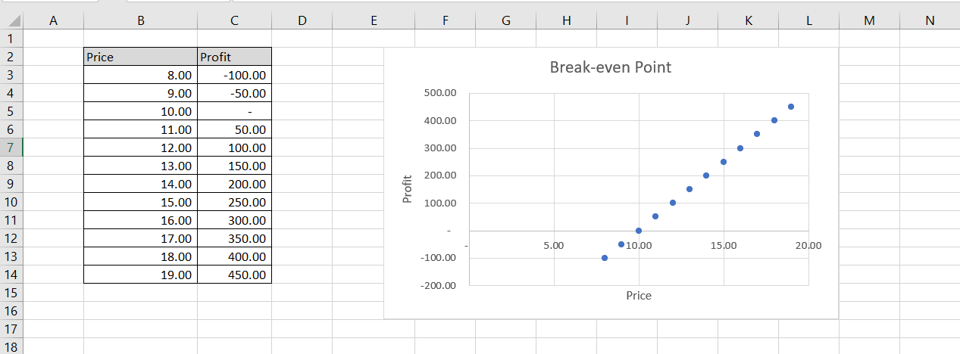
– A scatter chart has been created based on the data


