
How to graph a function in excel
 By
SpreadCheaters
By
SpreadCheaters
Microsoft Excel offers a very interesting way to graph a function. We need to have a tabular format of the values of the function in excel. We can then perform the below mentioned way to graph a function in excel:
We’ll learn about this methodology step by step.
Graph a function in excel:
Step-1: Making a tabular view of the function
To do this yourself, please follow the steps described below;
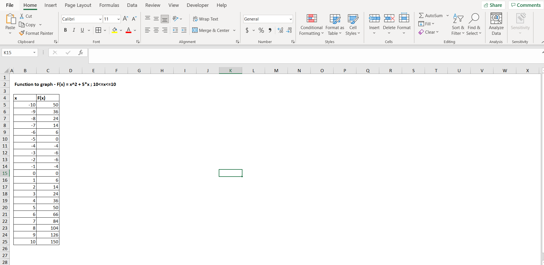
– Open the desired Excel workbook, and make a tabular view of a random function, we will use the function “F(x) = x^2 + 5x”, the domain of x here is [-10,10]. We have to make 2 columns, one for the value of x, and second for the value of F(x), as shown in the image above.
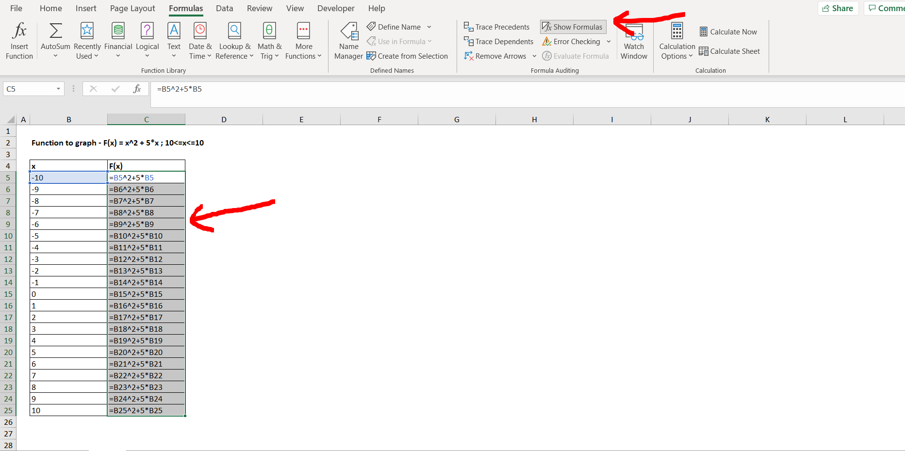
– Now to see the formula which we have typed for F(x), select the entire “F(x)” column, then go to the ”Formulas” option in the menu bar, then click on “Show Formulas”, as shown in the image below.
Step-2: Viewing the formula for F(x)
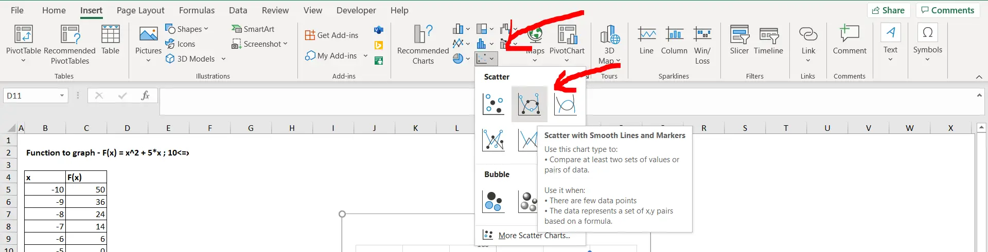
– Now click on the “Show Formula” option again, to turn the formulas back to values. To insert a graph for the above depicted tabular values of the function, we need to go to the “Insert” option in the menu bar, and then select the type of chart that we need to build. In our case it is “Scatter with smooth lines and markers” as shown in the image below.
Step-3: Insert the chart for the function
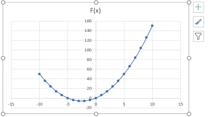
– Now we can see the parabolic curve in the graph in the below attached image, which represents the function “x^2 + 5x”.
Final Image: Graph for the function obtained
– Graph for the function obtained


