
How to do line of best fit on Excel
 By
SpreadCheaters
By
SpreadCheaters
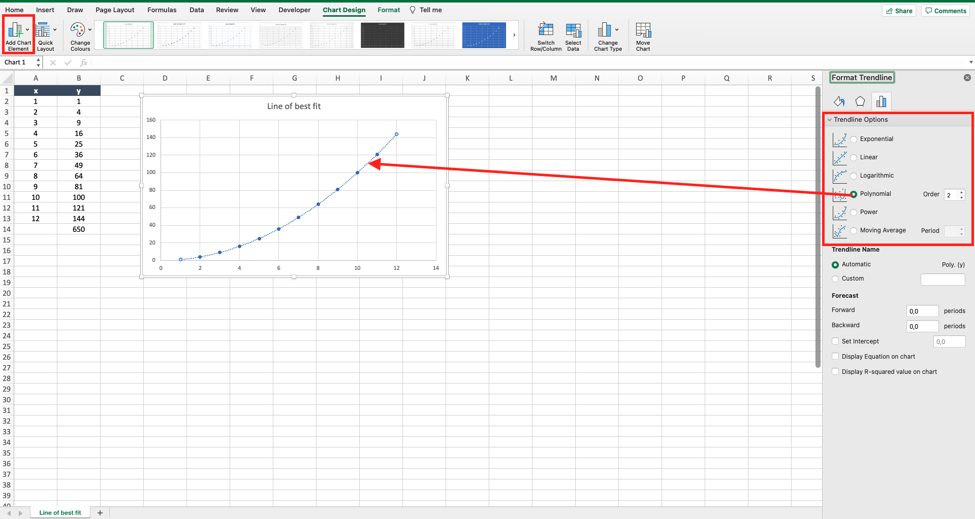
Let’s assume you have a graph with two variables, x and y, linked by an equation (e.g. y=x^2). Excel offers the possibility to add the so-called line of best fit to the graph, that is the line related to the best equation that represents the relation between your data in the chart. to add a line of best fit to a graph proceed as follows.
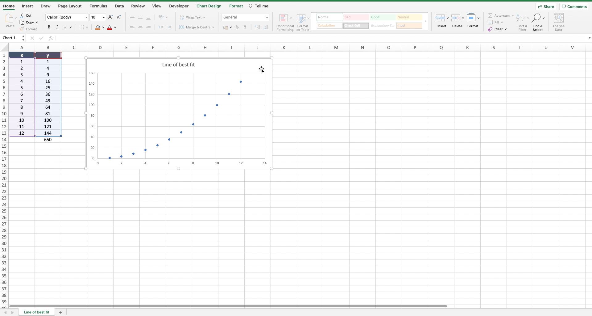
Step 1 – Select the graph
– Click on the graph where you want to add the line of best fit.
Step 2 – Add the line of best fit
– Navigate to the “chart design” tab;
– Locate the “add chart element” button on the top left of the toolbar;
– Locate the “trendline” option;
– Click on the black arrow of “trendline” to open the sub menu;
– Select “more trendline options” to open the “format trendline” menu on the right of the worksheet;
– Choose among the different trendlines the one that is more aligned to the points in your graph;
– Close the “format trendline” menu.


