
How to create a time series plot in Excel
 By
SpreadCheaters
By
SpreadCheaters
In this tutorial we will learn how to create a time series plot in excel. To plot it we will use the Line or Area Chart option in the Insert tab. By using it you can also add different colors to your plot. Following are steps to use Line or Area Chart option.
Time series plots are an important tool for visualizing trends and patterns in data over time. It is used in Spotting trends, identifying seasonal patterns, communicating insight and forecasting.It is a graphical representation of data and it is an easy way to understand and represent data.
Step 1 – Select the Data
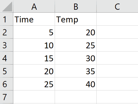
– Select the data for which slope is required.
Step 2 – Click on Insert Line or Area chart
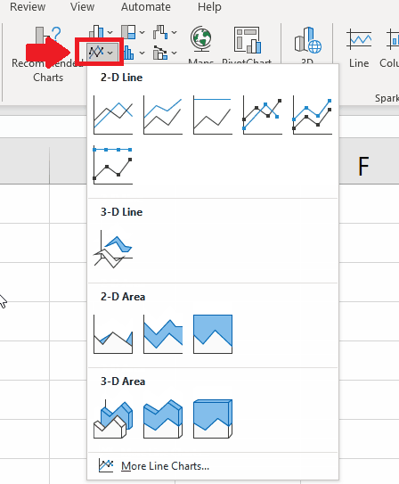
– Click on Line or Area chart option in Insert tab and a Dropdown menu will appear.
Step 3 – Click on More Line Charts
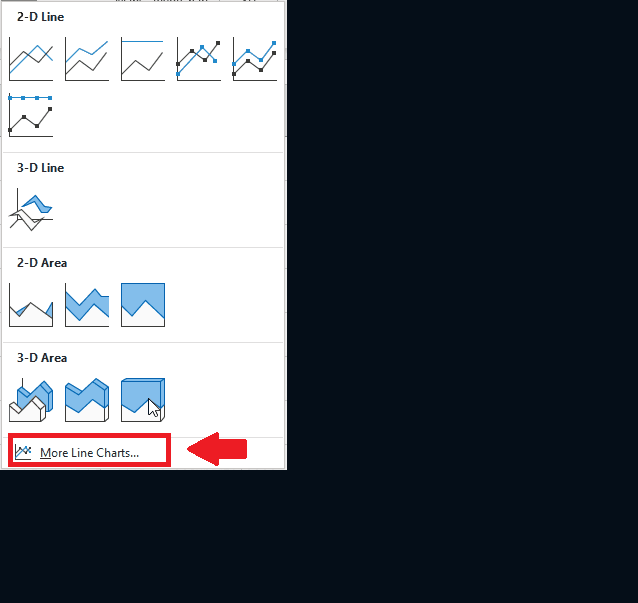
– From the dropdown menu click on more line charts option and a dialog box will appear.
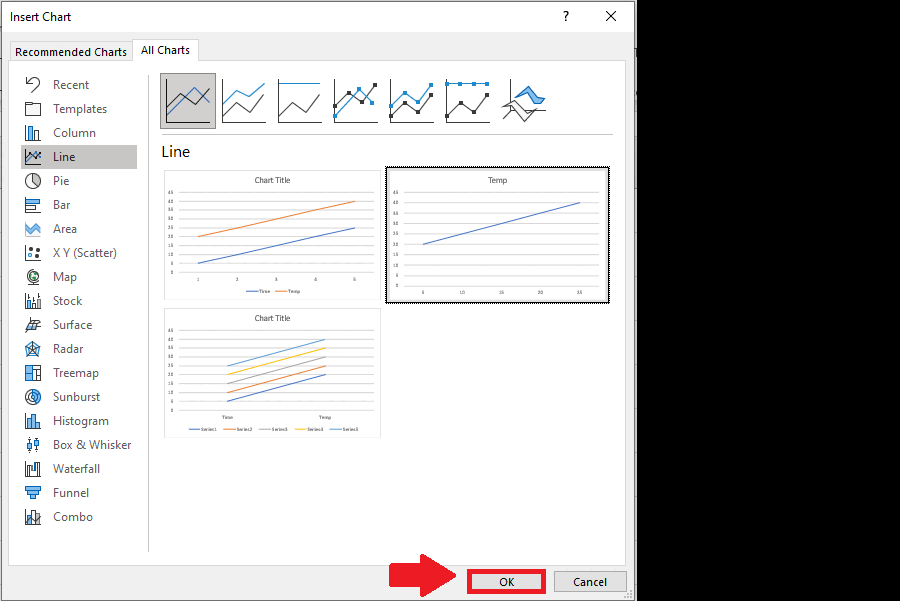
Step 4 – Select Line
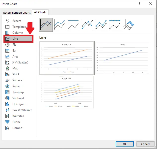
– Click on Line in the menu of dialog box.
Step 5 – Select the Graph
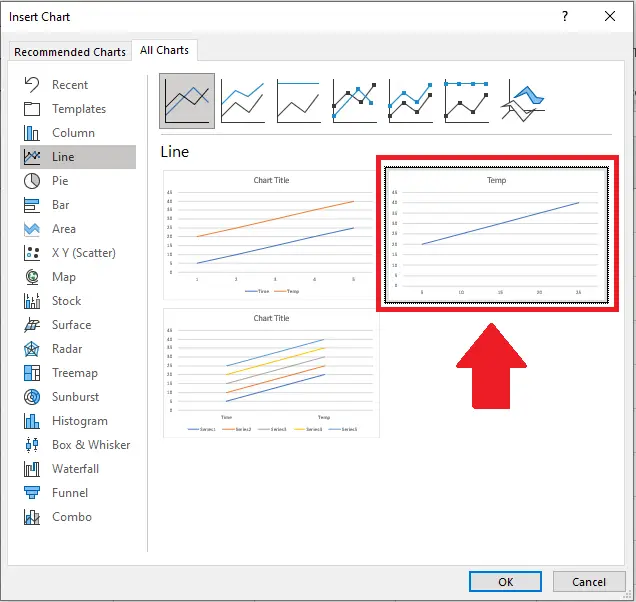
– Select the second graph from dialog box after clicking on Line.
Step 6 – Click on OK

– Click on OK to get the required result.


