
How to create a scatter plot in Excel with 3 variables
 By
SpreadCheaters
By
SpreadCheaters
You can watch a video tutorial here.
Graphs are great ways to visualize data and Excel has tools to build many types of graphs. Excel also has a variety of formatting options and features that can be used to enhance visualizations. A scatter plot shows you the relationship between a set of variables and is usually built on 2 variables as this represents 2 dimensions i.e. the horizontal x-axis and the vertical y-axis. As it is not possible to introduce another axis in 2-D, the third dimension can be added as the color or size of the dots. In this example, the third dimension we will add is the color of dots to represent the 3rd variable.
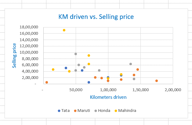
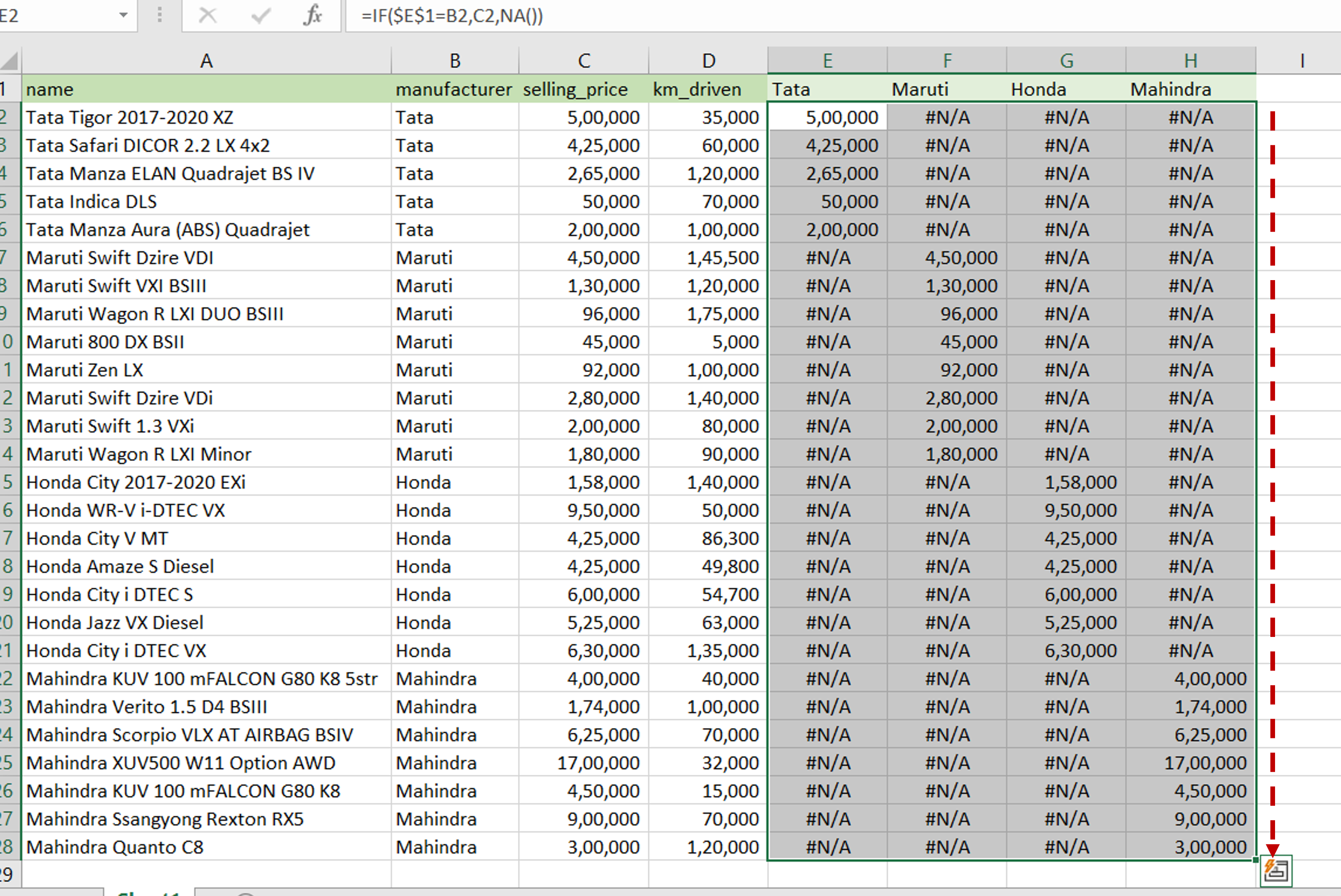
In this example, we are looking at the relationship between the kilometers driven and the selling price of previously-owned cars. The 3rd variable to be added is the manufacturer of the car. To create the scatter plot, we use the following approach:
1. Identify the unique values for the 3rd variable
2. Create a new column for each unique value
3. Populate the columns with the corresponding value of the selling price
4. Use the new columns with the kilometers driven to create the scatter plot
Step 1 – Create columns for each unique value
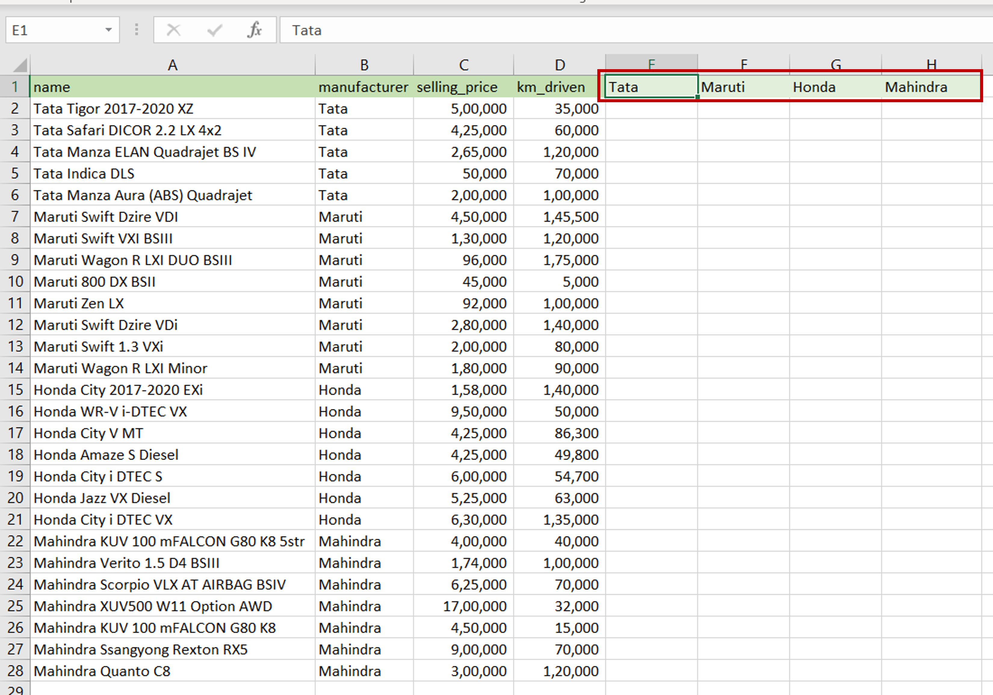
– The unique values of the manufacturer are:
>Tata
>Maruti
>Honda
>Mahindra
– Type each of these values as new column names in the table
Step 2 – Create the first formula
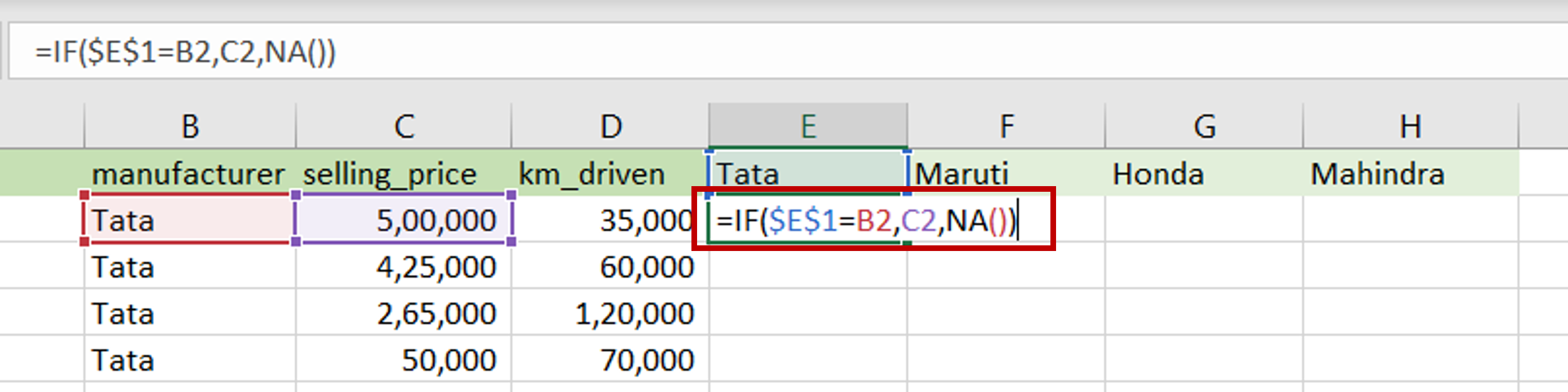
– Select the first cell of the ‘Tata’ column
– Type the formula using cell references:
=IF (Tata = manufacturer, selling_price, NA())
– This function checks if the manufacturer in the row is the same as the column name
>If it is true, then the selling_price is populated in the cell
>If it is false, then an #N/A value is to be populated
– Make the ‘manufacturer’ constant by selecting the cell reference and pressing F4
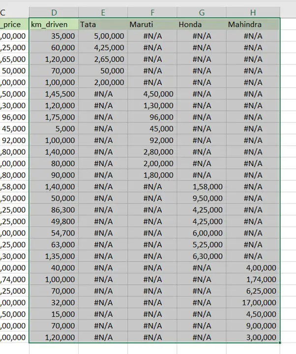
Step 3 – Create the formulas for the other columns
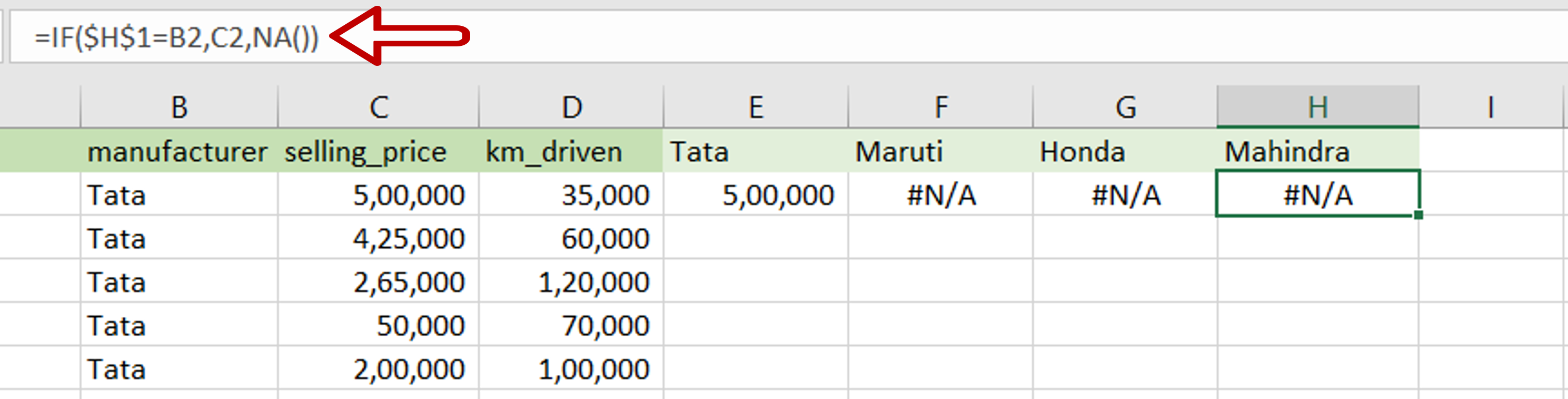
– Create the formula in the first cell of each of the other columns using the respective column name
Step 4 – Copy the formula
– Select the cells containing the formulas
– Using the fill handle from the first cell, drag the formula to the remaining cells
OR
a) Select the cell with the formula and press Ctrl+C or choose Copy from the context menu (right-click)
b) Select the rest of the cells in the column and press Ctrl+V or choose Paste from the context menu (right-click)
Step 5 – Select the data for the chart
– Select the following columns:
>km_driven
>Tata
>Maruti
>Honda
>Mahindra
Step 6 – Select the chart
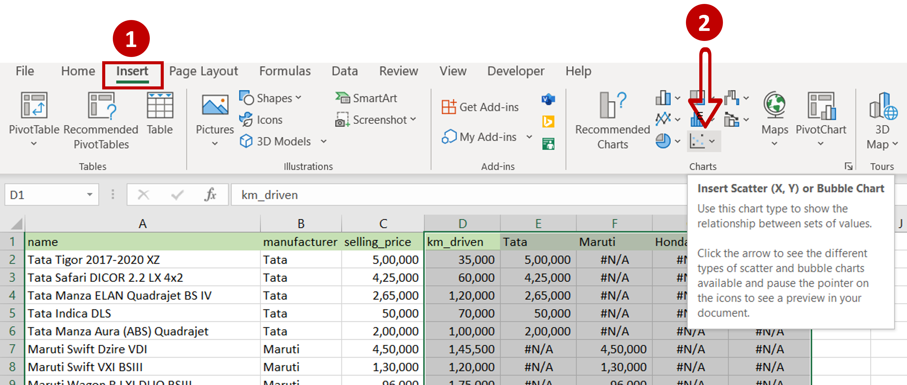
– Go to Insert > Charts
– Click on Insert Scatter (X,Y) or Bubble Chart
Step 7 – Choose the type of Scatter plot
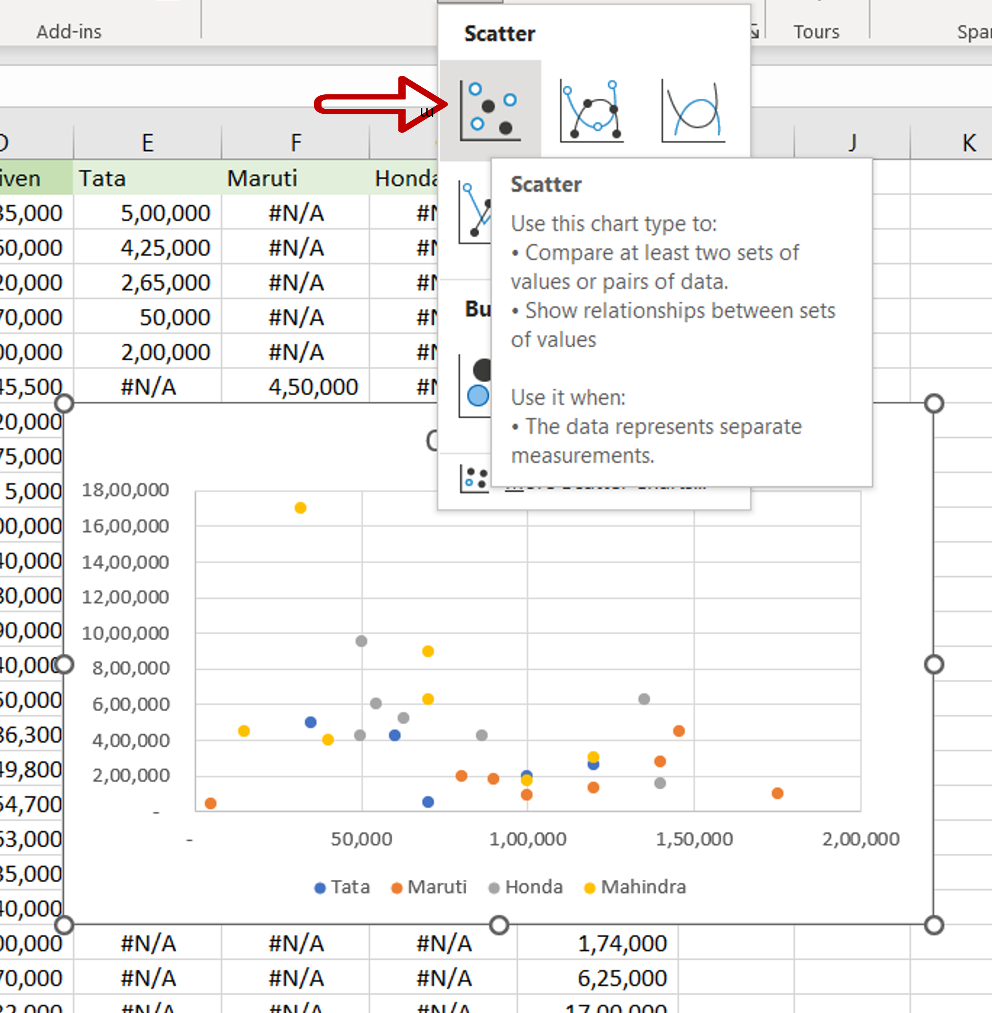
– Select the first Scatter option
Step 8 – Format the graph
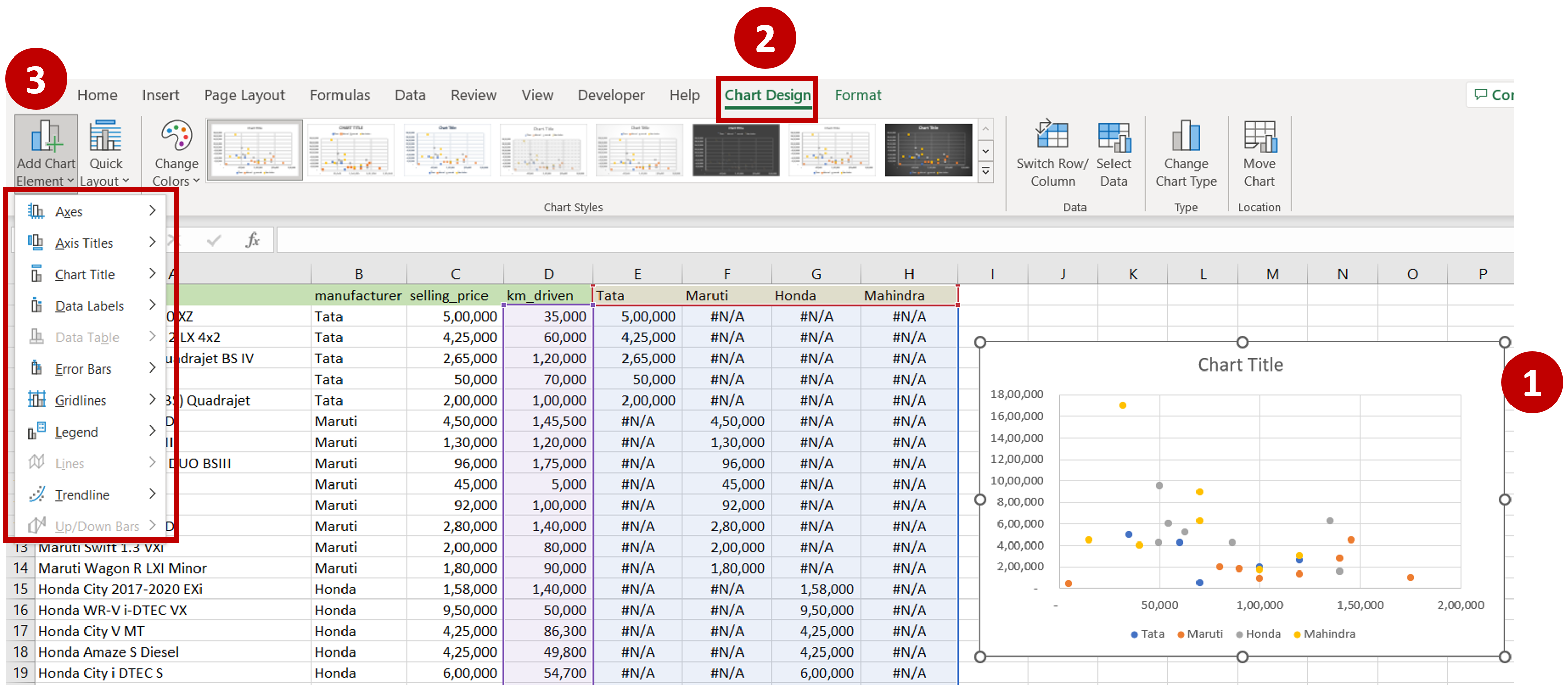
– Select the chart
– Go to Chart Design > Add Chart Element
– Choose whatever elements that need to be added to the chart to make it easy for the readers to understand e.g. Legend, Chart Title, Axis Title
Step 9 – View the Result

– The scatter plot is displayed with 3 variables


