
How to create a 3d clustered column chart in Excel
 By
SpreadCheaters
By
SpreadCheaters
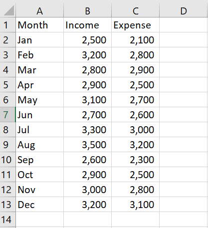
Our data set contains information on the income and expenses of a store for different months, and we aim to create a 3D clustered column chart to visually compare the income and expenses data. The chart will allow us to see how much income and expenses the store has generated each month and to identify any trends or patterns in the data.
A 3D clustered column chart is a type of chart in Microsoft Excel that displays a series of columns that are grouped by category and displayed in a three-dimensional format. The overall importance of creating a 3D clustered column chart in Excel is that it allows you to easily visualize and compare data across different categories.
Step 1 – Select the range of cells
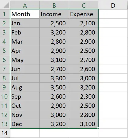
– Select the range of cells that you want to use to form the graph
Step 2 – Click on the Insert tab
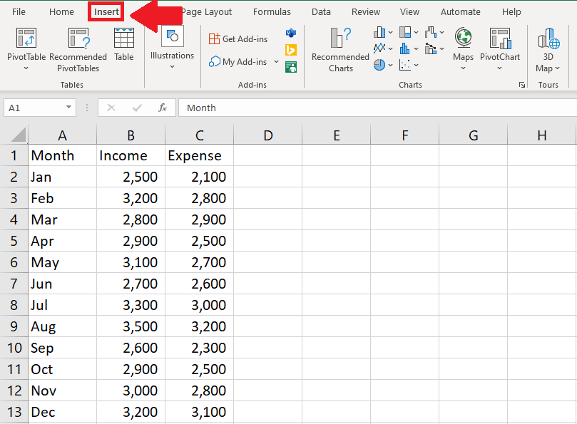
– After selecting the range of cells, click on the Insert tab
Step 3 – Click on the Insert Column or Bar chart option
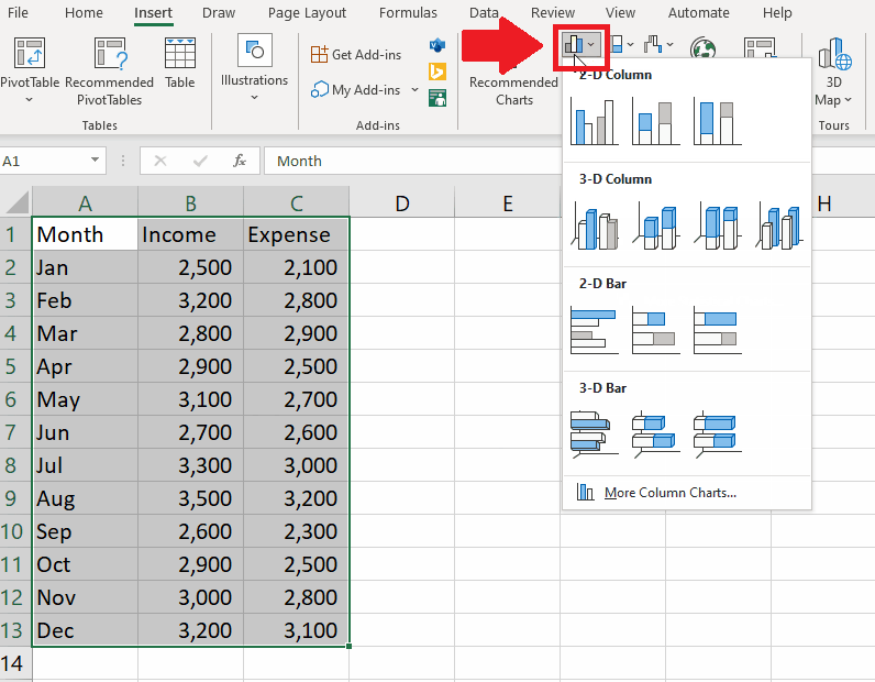
– After clicking on the Insert tab, click on the Insert Column or Bar chart option in the Charts group of the Insert tab and a drop-down menu will appear
Step 4 – Select the type of graph
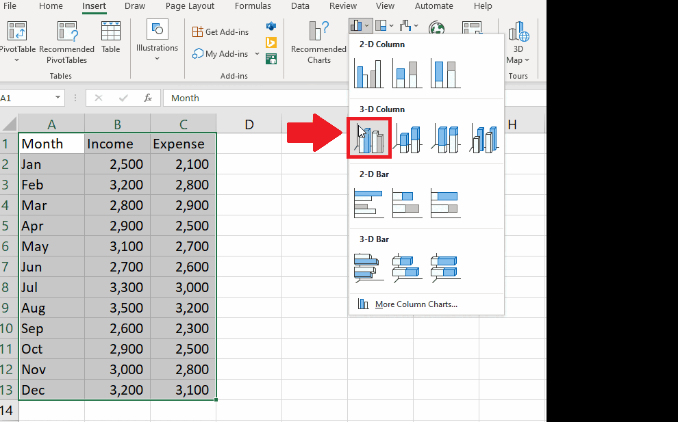
– From the drop-down menu, click on the type of chart that you want to get the required result
– You may select any type of the graph


