
How to colour code in Excel
 By
SpreadCheaters
By
SpreadCheaters
Excel is a very useful tool for analysing data and performing various calculations with the data. It has some very powerful functions and tools to visualise data as well. One of the best ways to colour code your data for visual categorization is to use the conditional formatting.
The conditional formatting is a very vast field, so to cover all the aspects of conditional formatting is beyond the scope of this tutorial. So we’ll discuss a few cases to give you an idea about how to use the conditional formatting to create useful colour codes to categorise data.
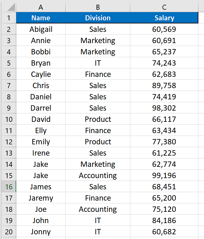
Let’s consider this dataset where we have some employee names, division and respective salaries. We’ll learn how to randomise the data with respect to the names of the employees.
Example 1 – Colour code the top 10 salaried employees
In the first example we’ll create a colour code for the top 10 employees with respect to salaries drawn by them.
Step 1 – Select the salary column and use conditional formatting’s top/bottom rules
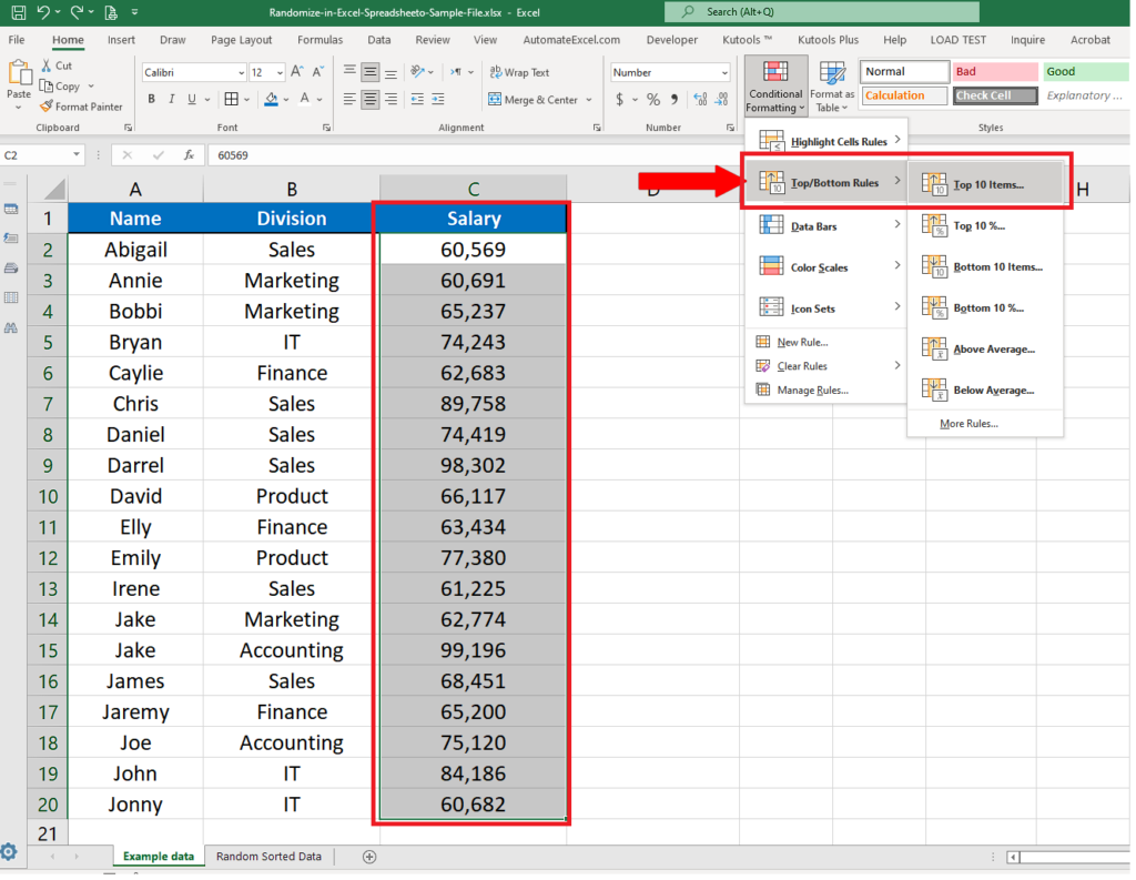
- To create a colour code for top 10 salaried employees, we will select the complete salary column and then go to the conditional formatting option in Styles group. Then select the Top/Bottom Rules —> Top 10 items…
Step 2 – Create an appropriate colour code or use the default
- Clicking on the Top 10 items… will open up a new dialog box which will give you the options to select the number of items you wish to create a colour code for and also the option to change the default colour which is light red fill with dark red text. For our example we’ll change it to Green fill with dark green text.
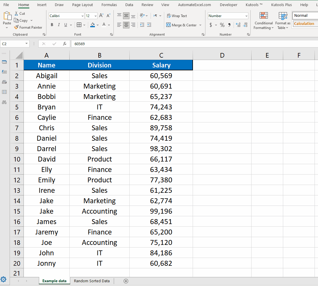
- This will create the colour code for the top 10 employees with respect to the salaries drawn.
Step 3 – Go to Sort and Filter use appropriate options for sorting by colour
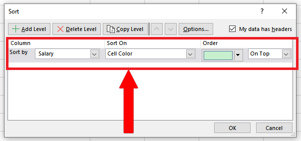
- Now we can go a step further into it just to show how useful these colour codes can become for us to visualise the data. We’ll use the colour codes to bring the colored cells to the top. So Select all data including headers and the go to Editing group on the main menu and then to Sort & Filter —> Custom Sort.
- This will open up a new dialog box and there choose the following options in appropriate categories.
Step 4 – Move the coloured cells to the top
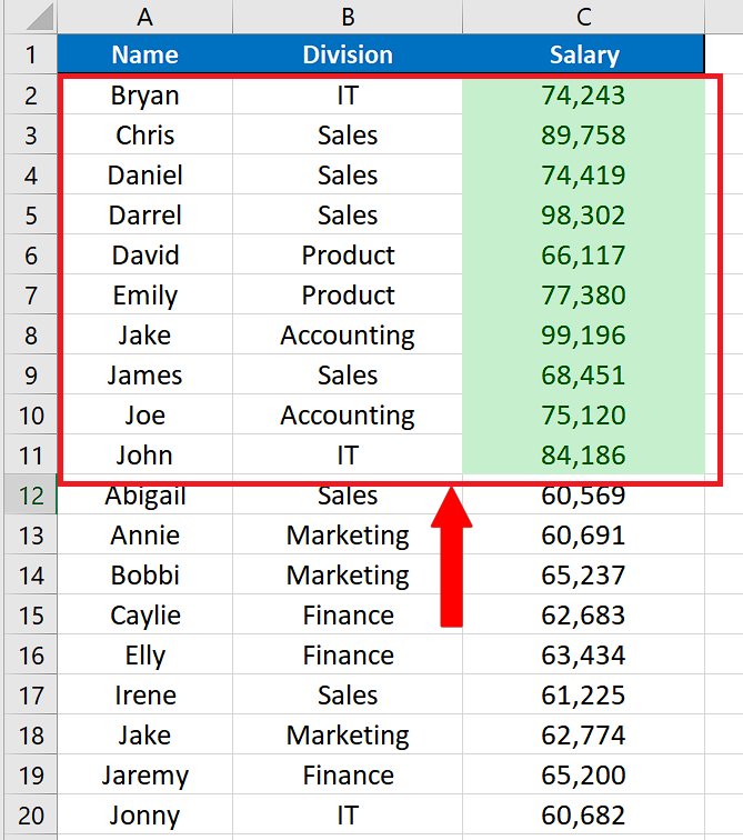
- Now Press the OK button and all green coloured cells in the data will be moved to the top position. This way we can easily identify who are the most highly paid employees.
Example 2 – Use Default colour scale to categorize data
We can use conditional formatting’s default colour scale option to categorise the data. Let’s see how this can be done. For this follow the steps explained below;
Step 1 – Select the data —> Conditional Formatting —> Colour Scales
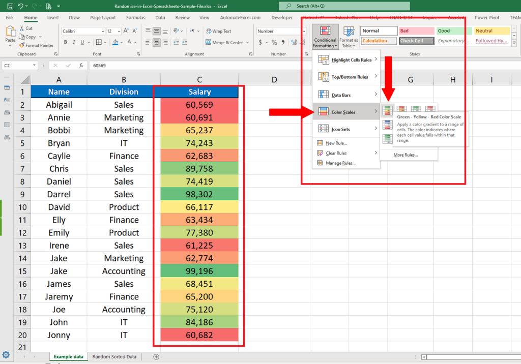
- The method to create colour scales in Excel is a pretty straight forward method. For this purpose select the data column. Then in the Styles group on the main menu go to Conditional formatting and then choose scales of your choice.
- In this tutorial we’ll select the first colour scale which uses Green, Yellow & Red colours to create a colour scale. In this scheme the lowest values are marked with red and highest with green and the middle values are marked with yellow colour.


