
How to change the x-axis scale in Excel
 By
SpreadCheaters
By
SpreadCheaters
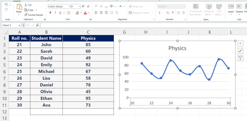
In this tutorial, we will learn how to change the x-axis scale in Excel. The following data shows the names of the students and the marks that they have obtained in the subject of Physics. The chart has already been plotted, let’s learn how to change the x-axis scale in Excel. But the x-axis scales can only be changed when the scattered chart has been plotted.
The X-axis scale is the range of values or categories that are displayed along the X-axis. The scale of the X-axis can be numeric or categorical, depending on the type of data being presented in the chart or graph. The X-axis scale makes it easy to understand the data by displaying it clearly and concisely. It allows the viewer to see the data visually and understand how it relates to each other. This makes identifying differences and similarities between data sets or categories easier.
Step 1 – Click on the axis
– Right-click on the x-axis, where you want to change the axis.
– A menu will be displayed.
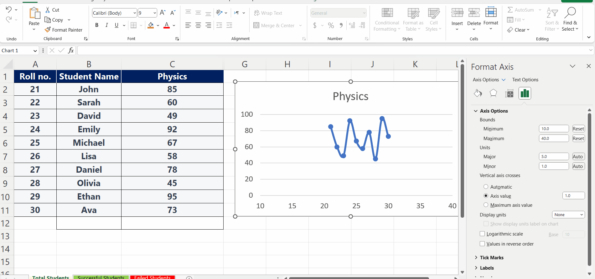
Step 2 – Click on the Format Axis
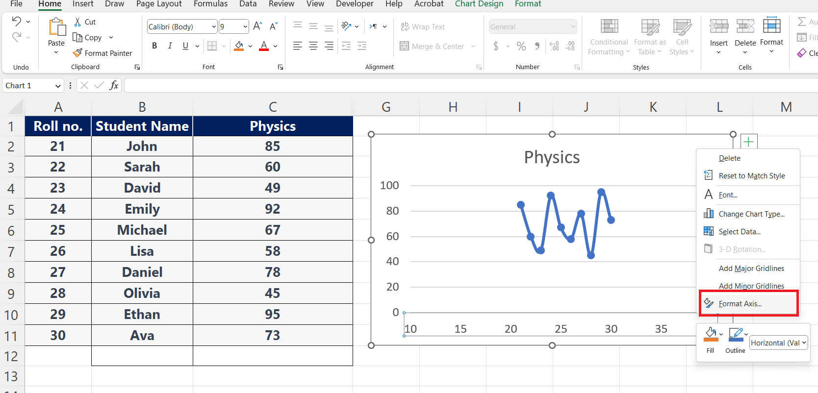
– From that menu, click on the format axis option.
Step 3 – Click on the axis option
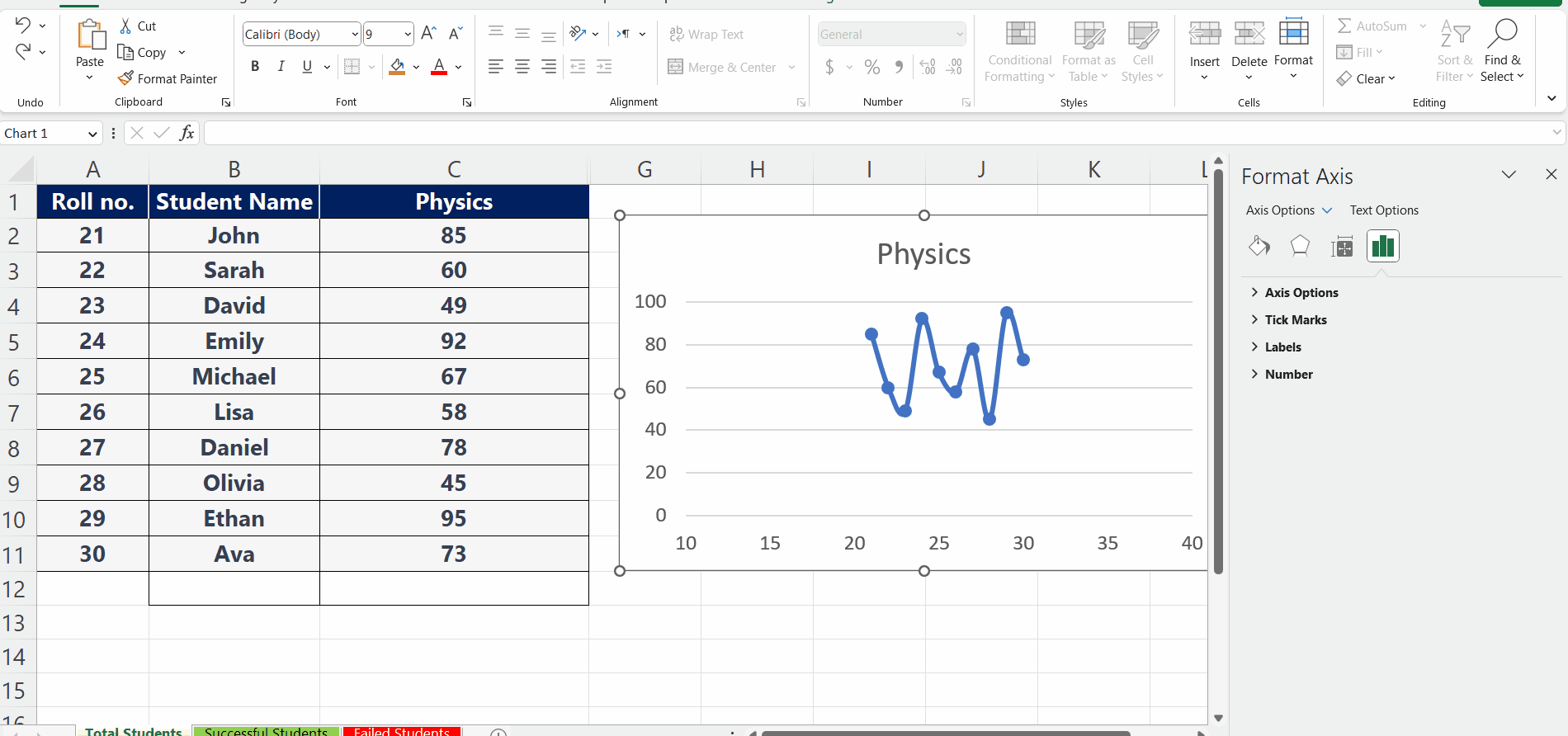
– After clicking on the format axis option, a dialogue box will appear.
– Click on the axis option, a dropdown list will appear.
Step 4 – Choose a range
– Under the bounds option, select a range from minimum to maximum.
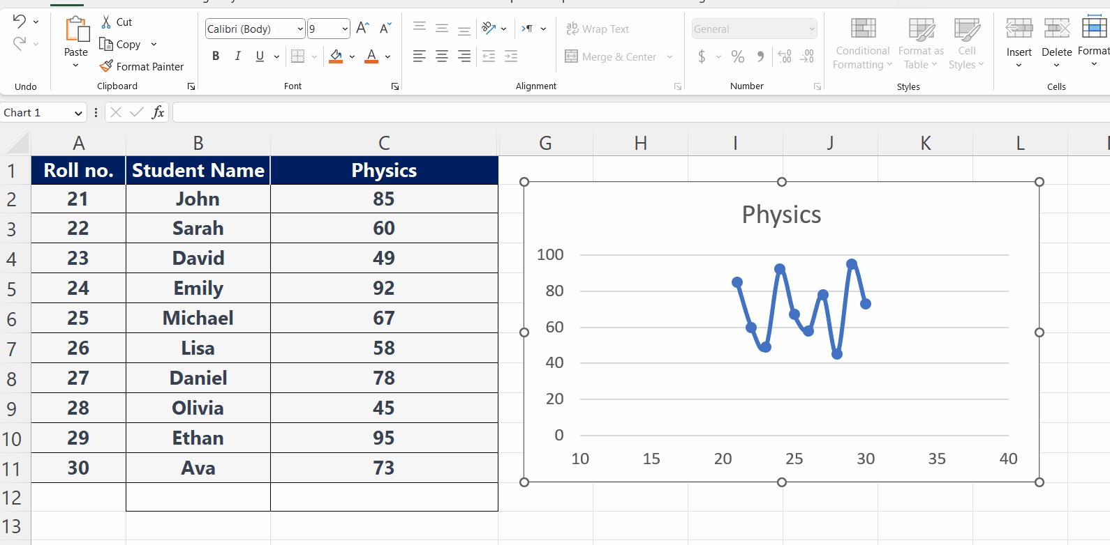
– This will change the x-axis scale on your chart.
– Press Enter and the x-axis scale will be changed.


