
How to change the numbers on the x-axis in Excel
 By
SpreadCheaters
By
SpreadCheaters
Page last updated:
05/01/2023 |
Next review date:
05/01/2025
You can watch a video tutorial here.
Charts are a great way to visualize data and Excel provides several options for creating charts and formatting them. The type of chart you create depends on the type of data that you have. When you create a chart in Excel, by default the x-axis labels are taken from the data. You may want to change the labels on the x-axis to make them easier for the reader to understand. There are two ways of doing this:
- Change the values in the underlying dataset
- Create custom labels
Option 1 – Change the underlying dataset
Step 1 – Change the values for the x-axis
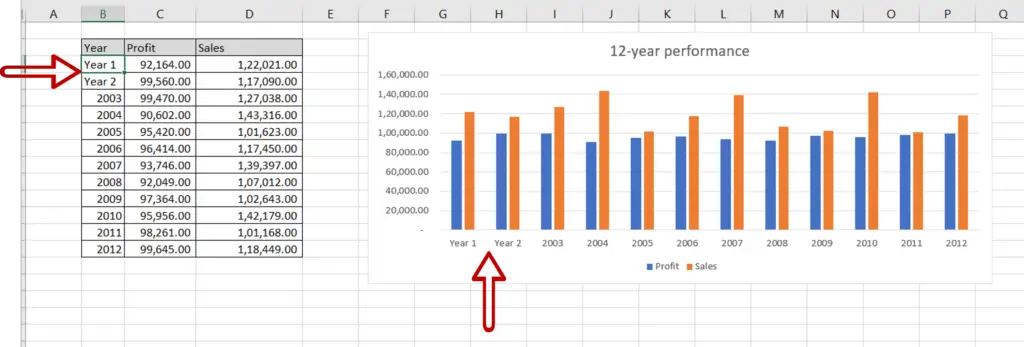
- Go to the dataset on which the chart is built
- Change the values in the ‘Year’ column
- The x-axis labels are updated as you change the values
Step 2 – Check the result
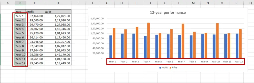
- The x-axis numbers are updated to match the updated column
Option 2 – Create custom labels
Step 1 – Open the Select Data Source box
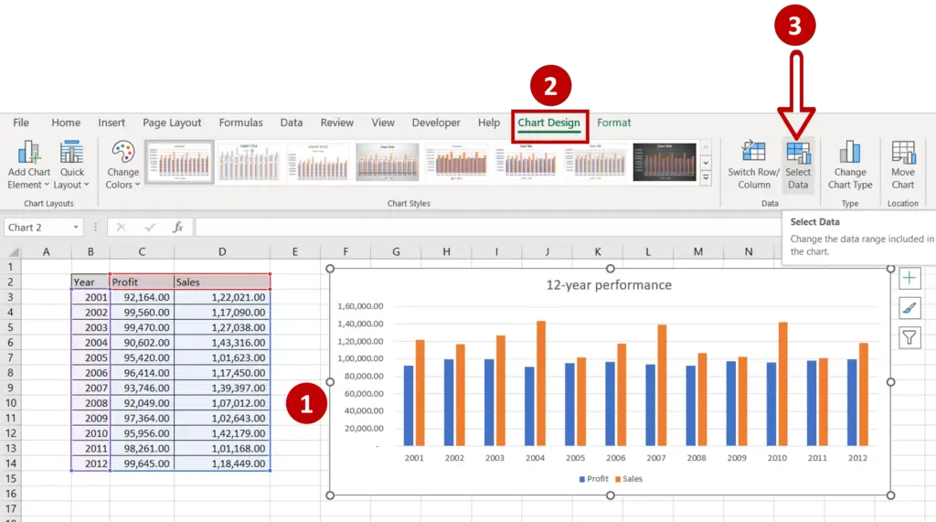
- Select the chart to summon the Chart Design menu option
- Go to Chart Design > Data
- Click on Select Data
Step 2 – Open the Axis Labels box
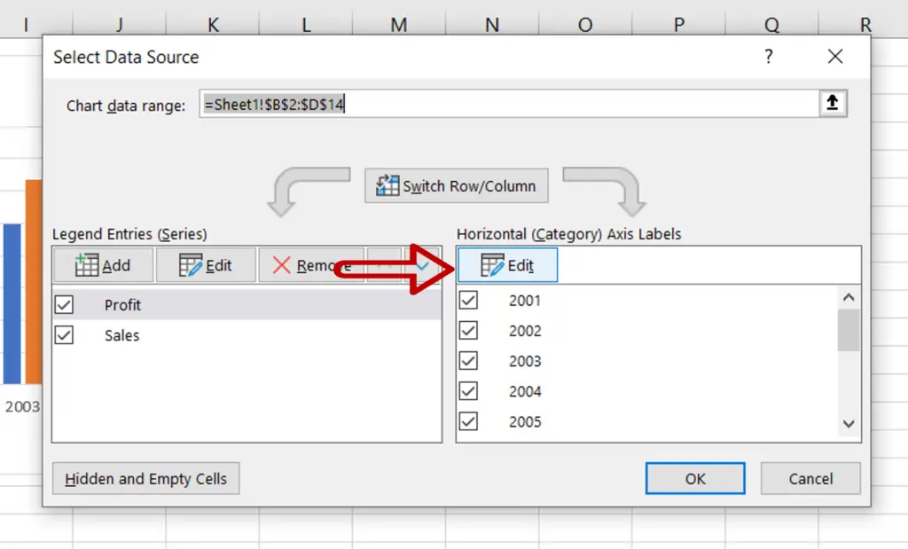
- Under Horizontal (Category) Axis labels click Edit
Step 3 – Define the labels
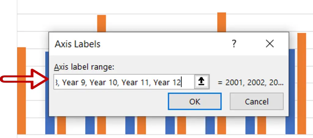
- Type the new labels, each separated by a comma
- Ensure that the number of labels matches the number of values
- Click OK
Step 4 – Check the labels
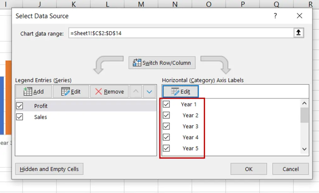
- Check that the labels have changed
- Click OK to close the Select Data Source box
Step 5 – Check the result
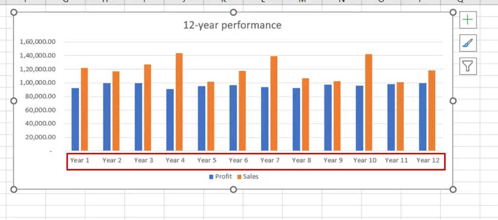
- The numbers on the x-axis are changed to the new labels


