
How to change scale on a graph in Excel
 By
SpreadCheaters
By
SpreadCheaters
Page last updated:
04/11/2022 |
Next review date:
04/11/2024
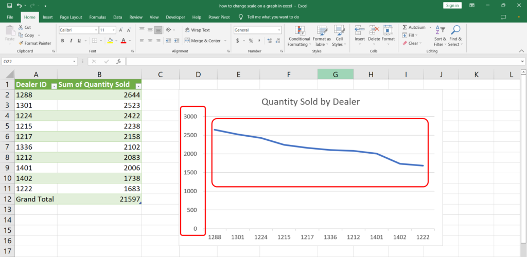

Creating charts and graphs in Excel is as easy as it gets. However, sometimes the scale on the graph might not correspond with the bounds of data. Let’s see how we can adjust the scale on a graph in Excel.
Step 1 – Chart Elements
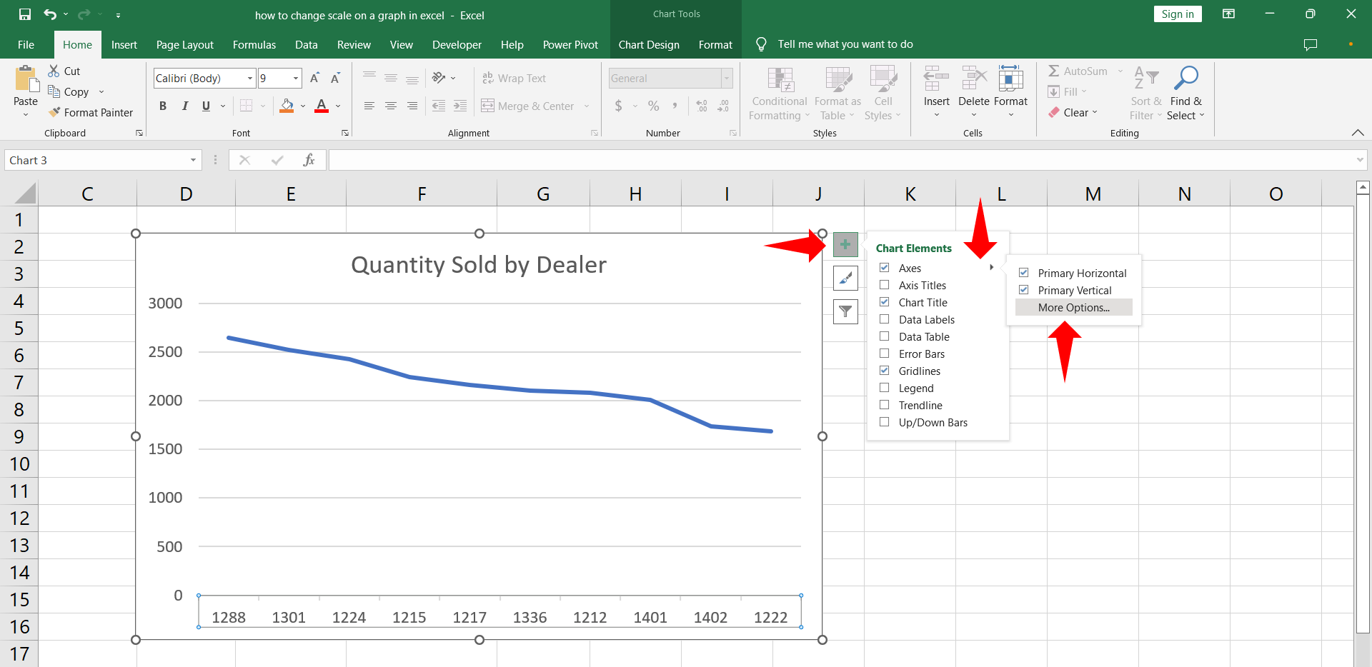
– Click the chart area. A menu with plus sign will appear on the top.
– Click the plus sign to reveal the Char Elements menu. Hover on the Axes to show the arrow.
– Click the arrow and select More Options. Format Axis menu will appear.
Step 2 – Vertical (Value) Axis
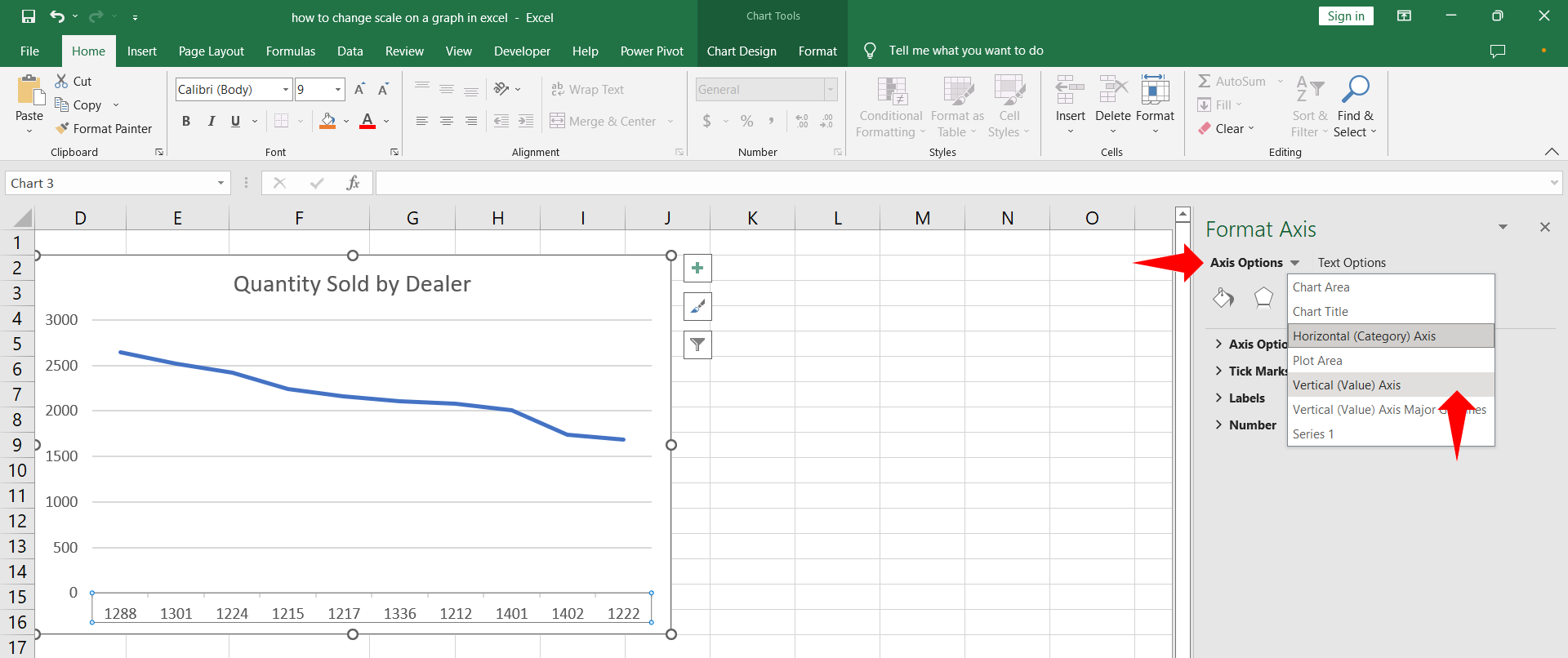
– Under Format Axis menu click Axis options and select Vertical (Value) Axis.
– The options for the vertical axis will appear.
Step 3 – Adjust scale
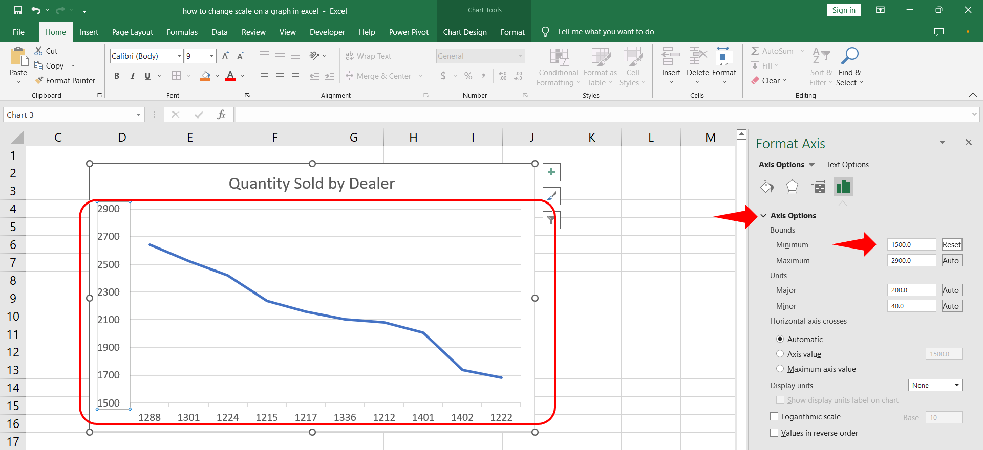
– On the current menu under the Axis Options in the Bounds section retype the minimum value as 1500.
– The chart scale will adjust to the new value for minimum bound.


