How to change horizontal axis labels in Excel 2016
 By
SpreadCheaters
By
SpreadCheaters
Page last updated:
02/12/2022 |
Next review date:
02/12/2024
Microsoft Excel offers some very interesting ways to change the axis labels in a chart. We can use the functionalities of excel and cater to this problem statement. We can perform the below mentioned 2 ways to change the axis labels:
- Change axis labels by changing the data
- Change axis labels without changing the data
We’ll learn about each of these options step by step.
Option 1 – Change axis labels by changing the data:
Option-1 (Step-1): Source table with values in excel
To do this yourself, please follow the steps described below;
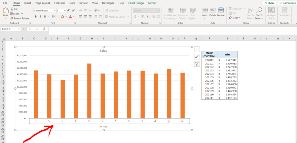
- Open the desired Excel workbook in which you want to change the axis labels of a chart and make sure you have a table with values in it, which is in turn used as the source data for the chart
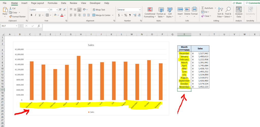
- Now we know that the x-axis is the month depicted as “YYYYMM” format. This can also be seen in the adjacent table. Our goal is to change the axis labels by changing values in the adjacent table. To cater to this, click on any cell in the data source table (in this case cell “R5”).
Option-1 (Step-2): Selecting the data source cell
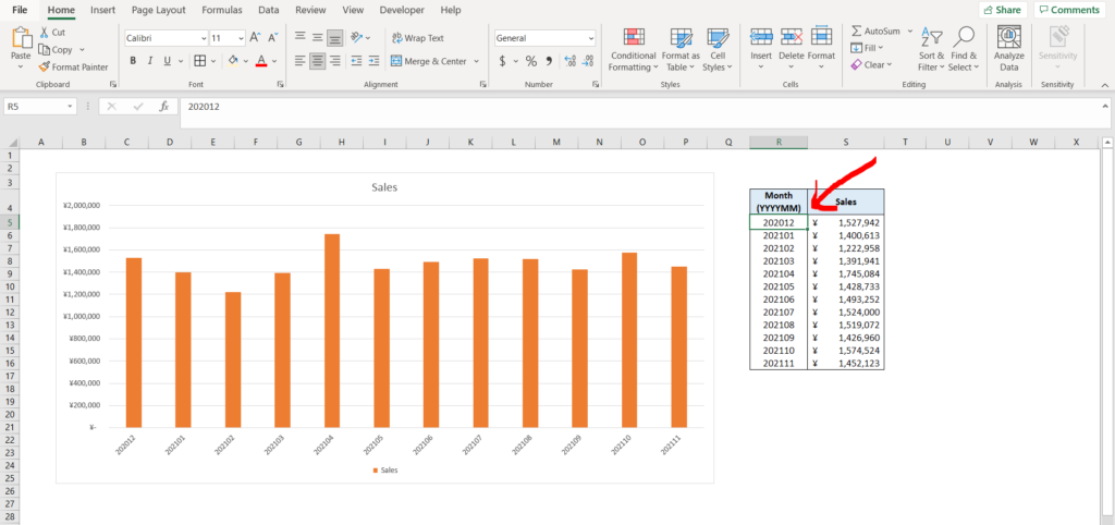
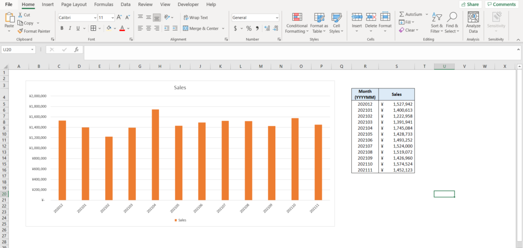
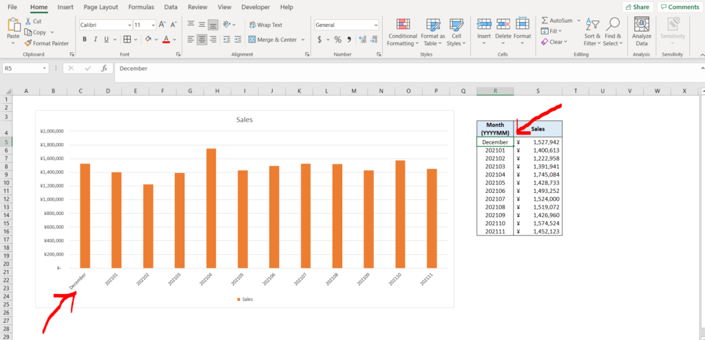
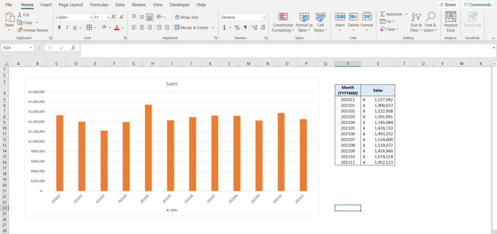
- Now change the value of the cell selected. You will see that the same has been reflected in the chart as well.
Option-1 (Step-3): Axis label changed by changing the value in the source table
- You can do this for as many label values as you want.
Option 2 – Change axis labels without changing the data:
Let’s get started with the second option. This option allows us to change the axis labels without changing the source data at all.
Option-2 (Step-1): Data source with values in excel
To do this yourself, please follow the steps described below;
- Open the desired Excel workbook in which you want to change the axis labels of a chart and make sure you have a table with values in it, which is in turn used as the source data for the chart
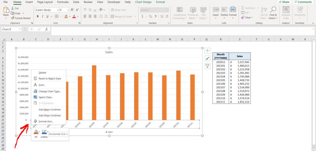
- Now right click on the axis which you want to change the labels for. In this case the X-axis labels have been right-clicked.
Option-2 (Step-2): Right click on the axis label
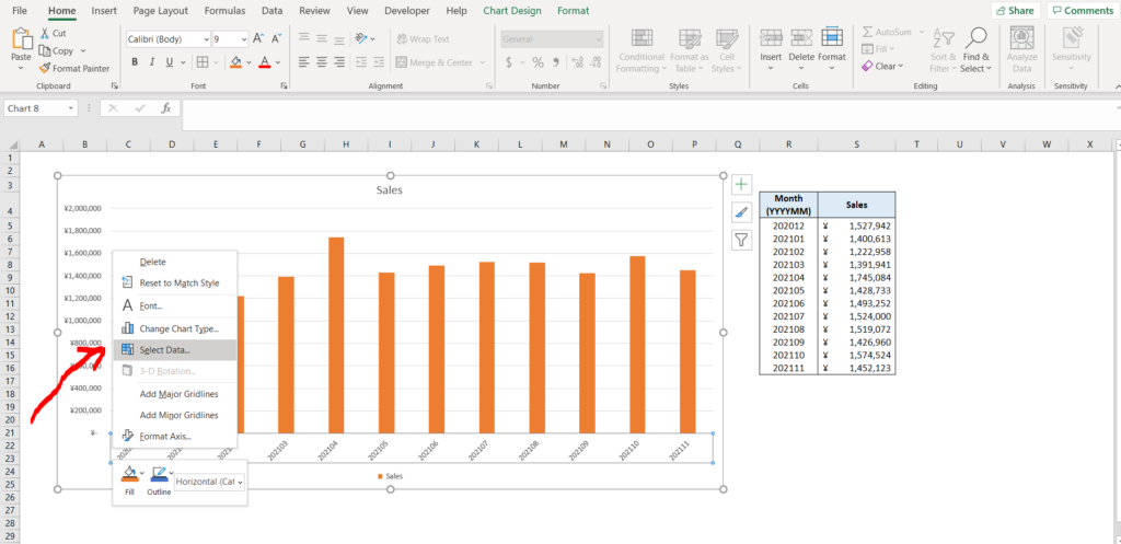
- Now select the “Select Data” option from the list of options as shown in the image below.
. Option-2 (Step-3): Selecting the “Select Data” option
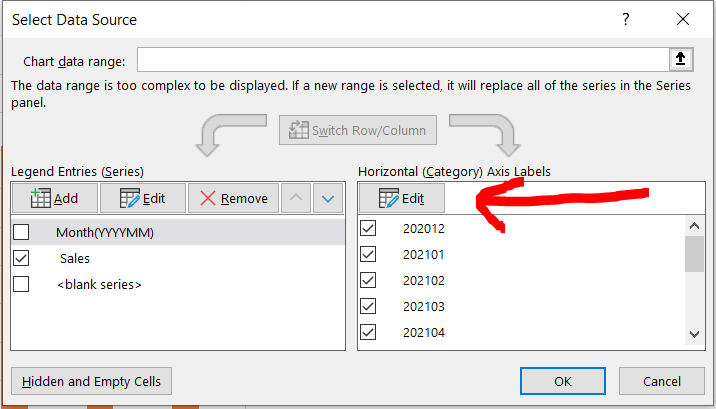
- A dialogue box will open. Click on the “Edit” option, as shown by the red arrow in the image below.
Option-2 (Step-4): Using the “Edit” option in the dialogue box
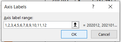
- Now a new dialogue box will appear. Type in the labels which you want to be shown instead of the original labels in a comma separated fashion (as shown in the image below),and click on “OK”. In this case, instead of the original labels, [1,2,3,4,5,6,7,8,9,10,11,12] have been used.
Option-2 (Step-5): Entering the desired labels
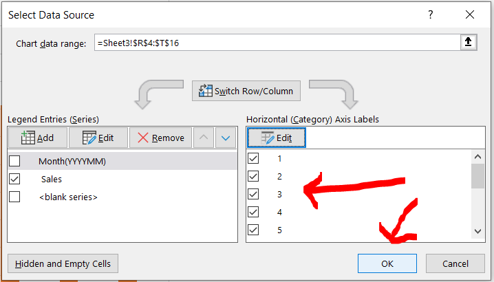
- We can now see these labels in the selection as well. Now click on “OK” as shown by the red arrow in the image below.
Option-2 (Step-6): Labels have been changed in the dialogue box
- We can see that the labels have been changed in the chart as well.