
How to add the right vertical axis in Google Sheets
 By
SpreadCheaters
By
SpreadCheaters
Here we have a dataset in which there are 3 different columns about Cameras, their Quantity, and the number of cameras Sold in the form of a Bar chart. In this tutorial, we will learn how to add the right vertical axis in Google Sheets for the Sold values column.
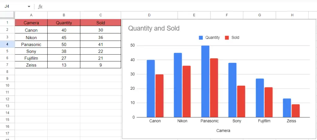
Google Sheets is a powerful spreadsheet program that allows users to create charts and graphs to visualize data. Charts can be an efficient way to display complex data sets, but sometimes a single Vertical Axis is not enough to display all the information. In such cases, it may be helpful to add a second vertical axis on the right side of the chart.
Step – 1 Edit the Chart.
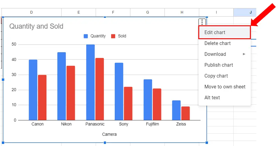
– Click on Chart.
– On the top right side of the chart three vertical dots will appear.
– Open the Edit chart menu which will appear when you will click the Three vertical dots.
Step – 2 Customize the chart.
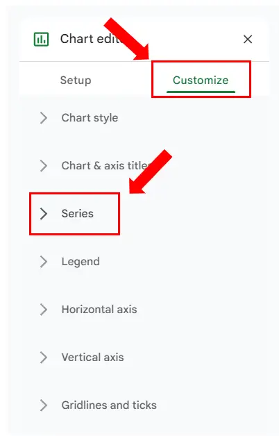
– Clicking on the Edit chart menu will open the Chart Editor dialog box.
– Go to the Customize tab and click on the Series drop-down menu.
Step – 3 Add the right axis.

– We will separately add the right vertical axis to make the values of Sold more visible in the chart.
– Then go to the Axis option and select the Right axis from the drop-down menu.
– The vertical right axis will be added.


