
How to add line of best fit (Trendline) in Excel Chart
 By
SpreadCheaters
By
SpreadCheaters
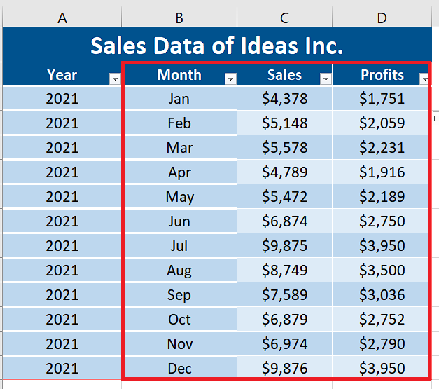
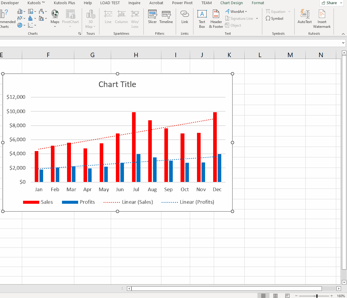
So let’s take a look at the dataset which includes the sales and profits data of a fictitious company. We’ll plot the sales and profits against months and then add a trendline to both by following the steps mentioned below.
One of the best features of Excel for data visualising is the ability to add various charts from the datasets. We can add various types of charts from the data, however, the most commonly used charts are:
>Column chart
>Line chart
>Pie and doughnut charts
>Doughnut charts
>Bar chart
>Area chart
>XY (scatter) and bubble chart
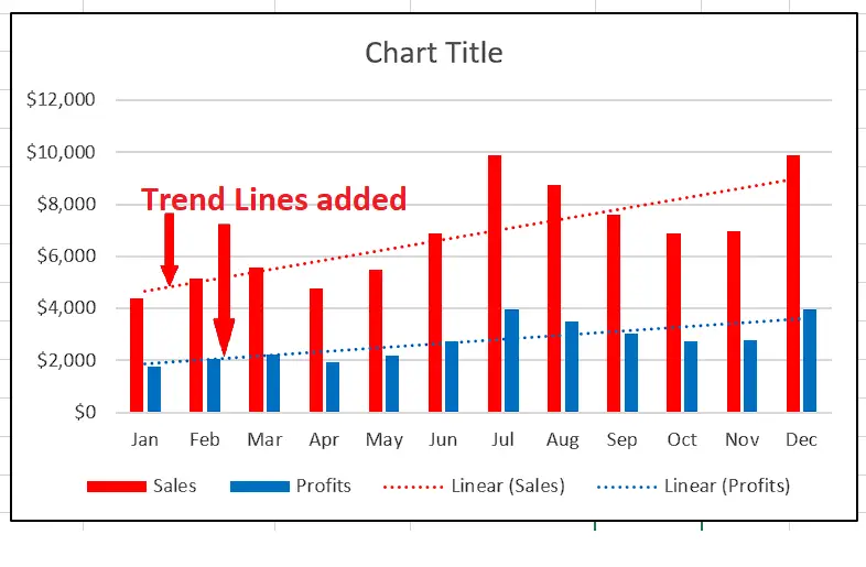
While charts can give us a good visual effect at the same time, a line of best fit, mostly referred to as Trendline can give us more insight to the plotted data’s pattern over time.
In today’s tutorial we’ll learn how to add a trendline to a column chart in Excel. However, we should know that there are only a few types of graphs that support the addition of trendlines. These types are XY scatter, bubble, stock, as well as unstacked 2-D bar, column, area and line graphs. We can’t add the trendlines to 3-D or stacked charts, pie, radar and similar other charts.
Step 1 – Select data and insert the column chart
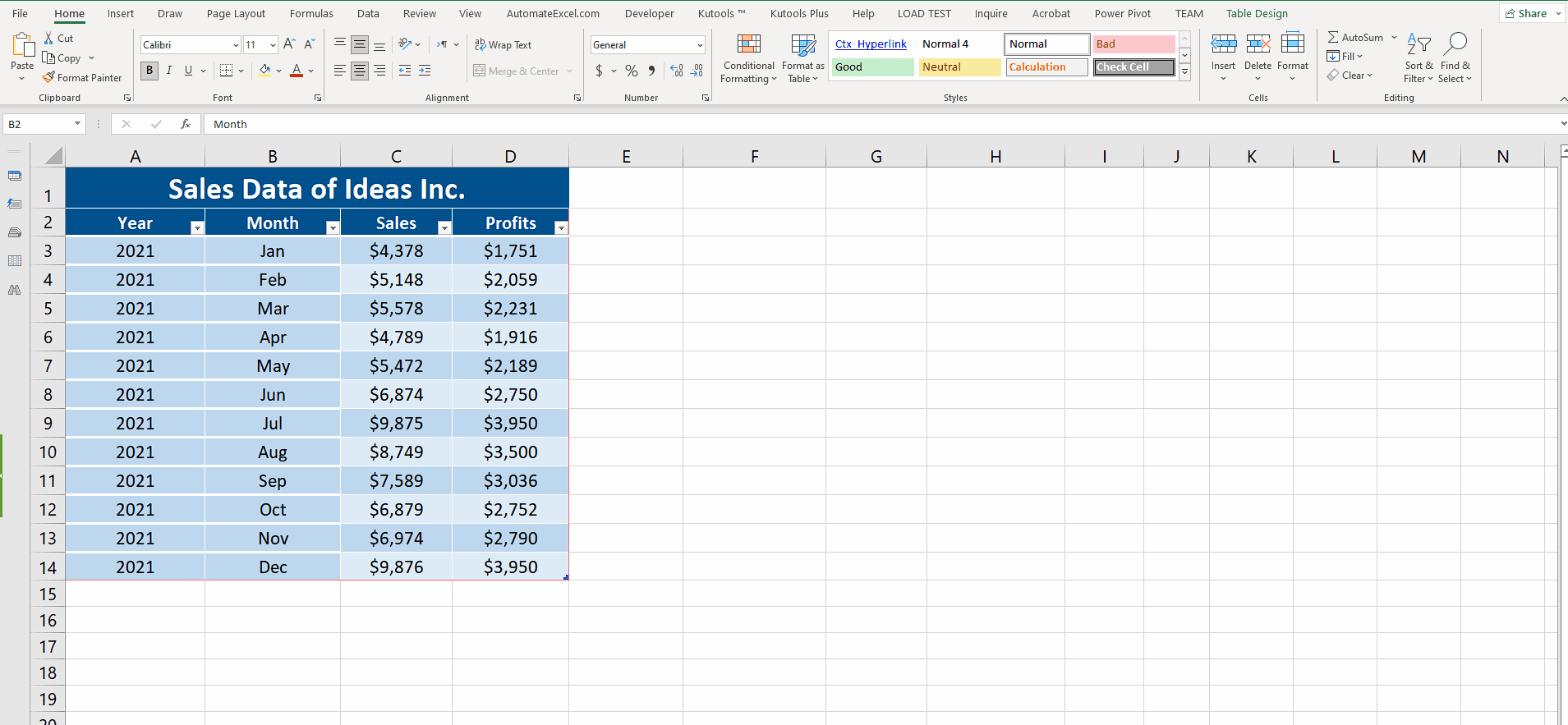
– Let’s select the columns B, C and D including the headers i.e. Months, Sales and Profits.
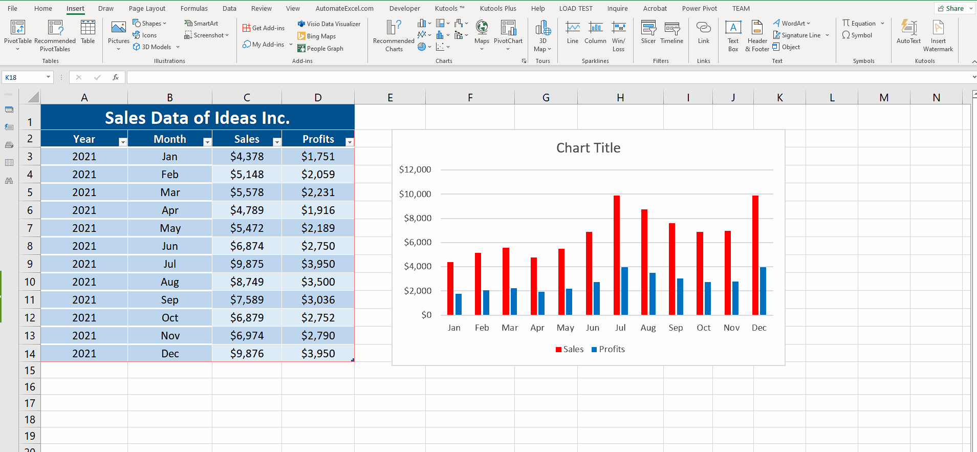
– Now in the Insert tab, go to the Charts group and click on Insert Column or Bar Charts.
– This will add a column chart in the sheet. You may adjust the height and width of the chart as per your requirement.
Step 2 – Select a series and insert the trendline
– In Excel 2013 and above the process of adding a trendline is very simple.
– Just select any one of the series in the chart. It will automatically make some options appear at the top right side of the chart.
– Click on the button. It will show you some more options. At the bottom most you will see the Trendline option. Just click on it and a trendline will be added to the chart. We can repeat the same procedure for the second series as well. We can add as many trend lines as the number of series in the chart.
– So this is how we can add a trendline or line of best fit to an Excel chart.
Step 3 – Changing the default Trendline
– By default, Excels adds a linear trendline. However, we can select various types of trend lines from the following options depending upon the requirement.
->Exponential, Linear, Logarithmic, Polynomial, Power, Moving Average, Automatic, Custom.


