
How to add another line to a graph in Excel
 By
SpreadCheaters
By
SpreadCheaters
You can watch a video tutorial here.
Graphs are great ways to visualize data and Excel has several tools for creating and formatting charts. The type of chart that you create depends on the dataset that you have. Using the charting tools in Excel, you can explore various types of charts and decide on the one that best suits the data that you are visualizing. A line graph is a popular way to depict time series data. Having plotted one line, you may need to add another line to the graph to represent another set of related data.
Step 1 – Open the Select Data Source box
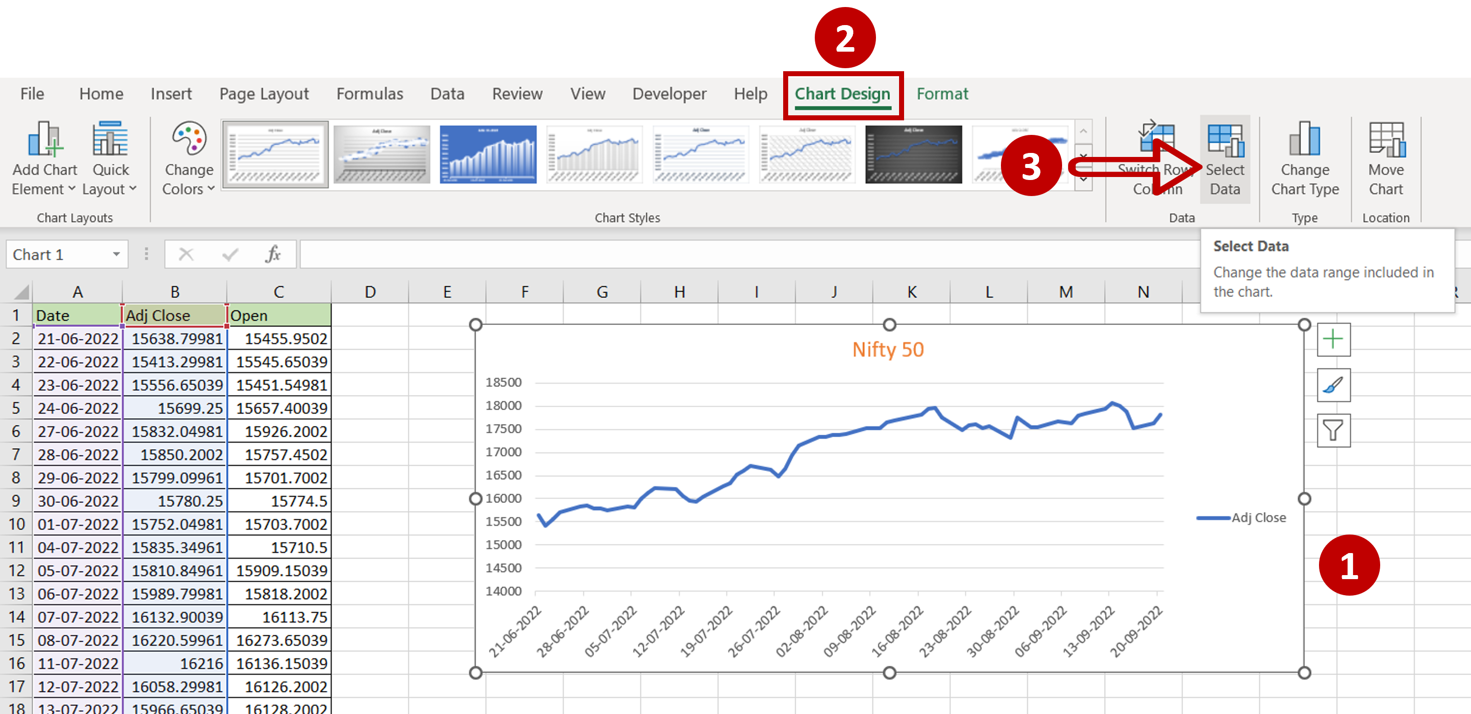
– Select the chart to which the line is to be added
– Go to Chart Design > Data
– Click on the Select Data button
Step 2 – Open the Edit Series box
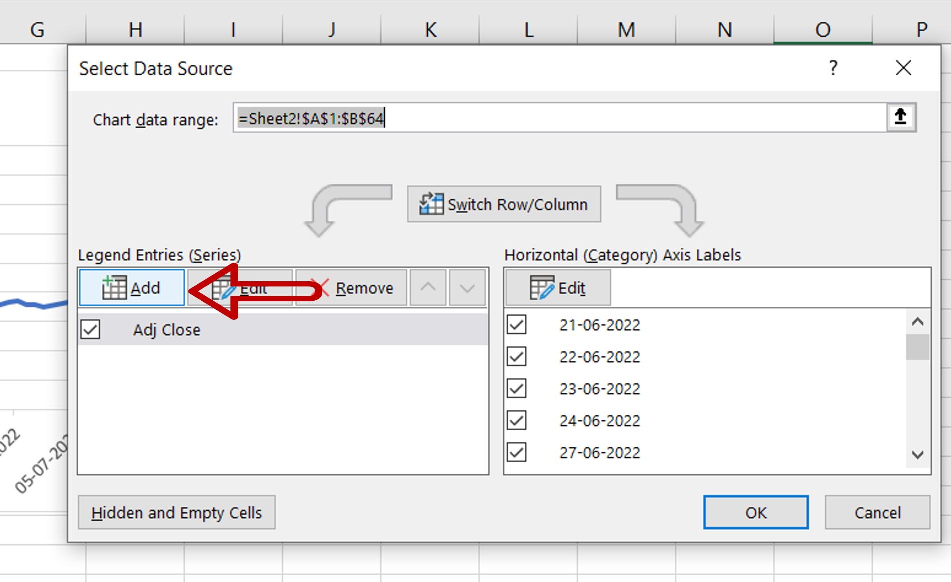
– Under Legend Entries (Series) click Add
Step 3 – Define the series
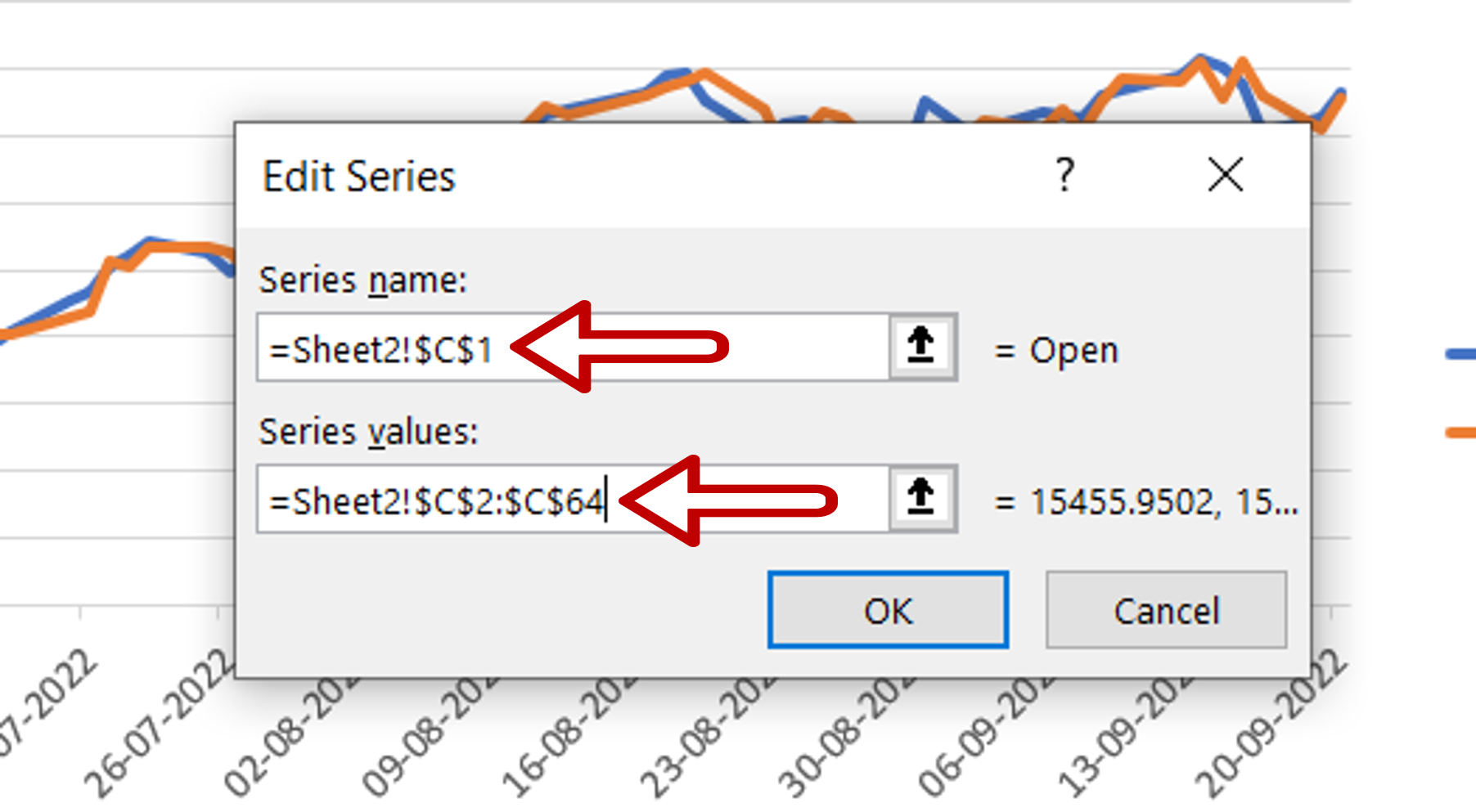
– Define the parameters using cell references:
>Series name: Open
>Series values: Range of the ‘Open’ column
– Click OK to close the Edit Series box
– Click OK to close the Select Data Source box
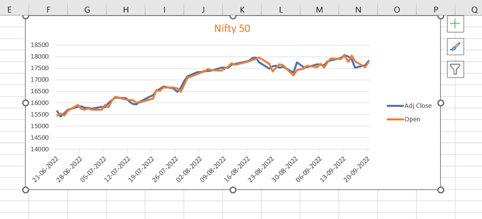
Step 4 – Check the result
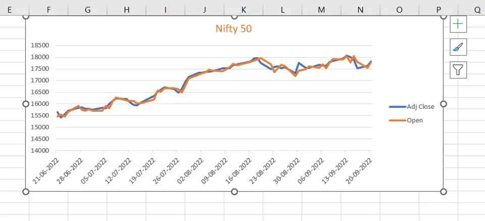
– Another line is added to the graph


