
How to add a line to a scatter plot in excel
 By
SpreadCheaters
By
SpreadCheaters
Page last updated:
19/11/2022 |
Next review date:
19/11/2024
You can watch a video tutorial here.
You need to highlight an important data point in a scatter chart and clearly define its position on the x-axis (or both x and y axes).
There are three types of lines:
- Vertical line;
- Horizontal line;
- Slope line
Option 1 – Adding a Vertical Line:
Step 1 – Opening the Data Source settings
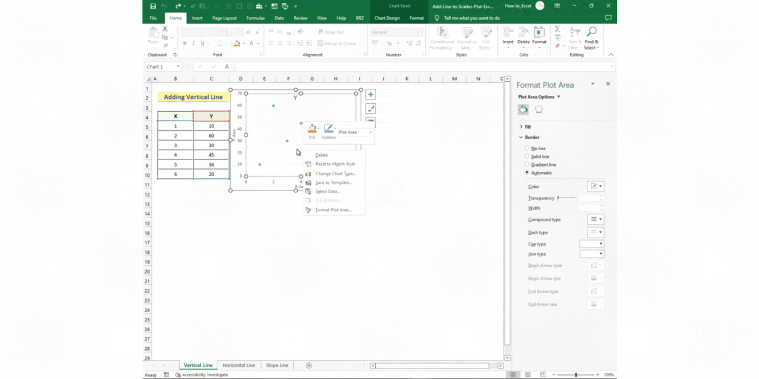
- Right-click the scatter chart and select Select Data.
- Click on Add in the Select Data Source window.
- The Edit Series window will open.
Step 2 – Setting the parameters
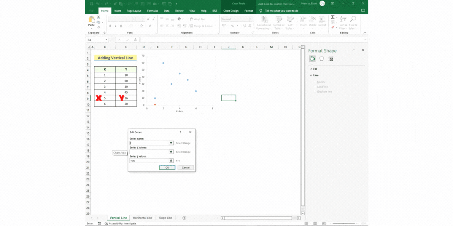
- Set the Series name as “Vertical Line”.
- Set the Series X values by selecting cell B9.
- Set the Series Y values by selecting cell C9.
- Press OK.
- A new data is generated, called “Vertical Line”.
- Press OK again.
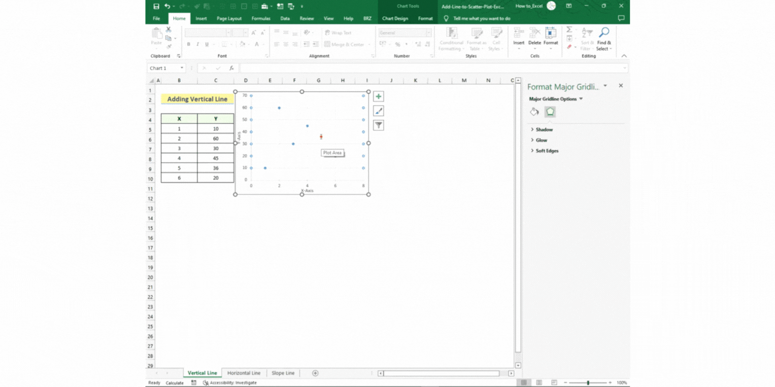
Step 3 – Setting up your line
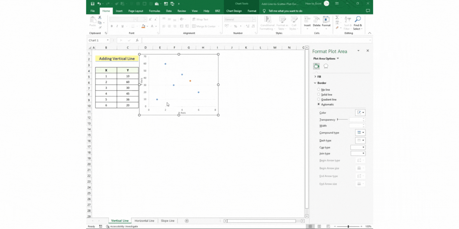
- Select the orange data point.
- Go to Chart Design > Add Chart Element > Error Bars > Percentage.
- Here, you will get a horizontal and a vertical line around the selected data point.
Step 4 – Removing the horizontal line
- Right-click on the horizontal line.
- Select Format Error Bars.
- Set the Percentage value to 0 under the Error Amount section in the new window on the right.
Step 5 – Formatting your vertical line
- Right-click on the vertical line.
- Select Format Error Bars.
- Set the Direction to Minus.
- Set the Percentage value to 100 under the Error Amount section.
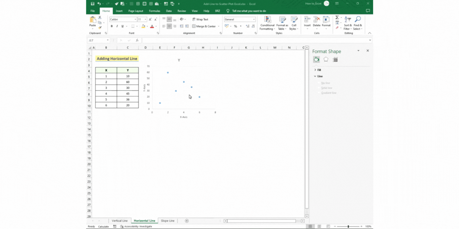
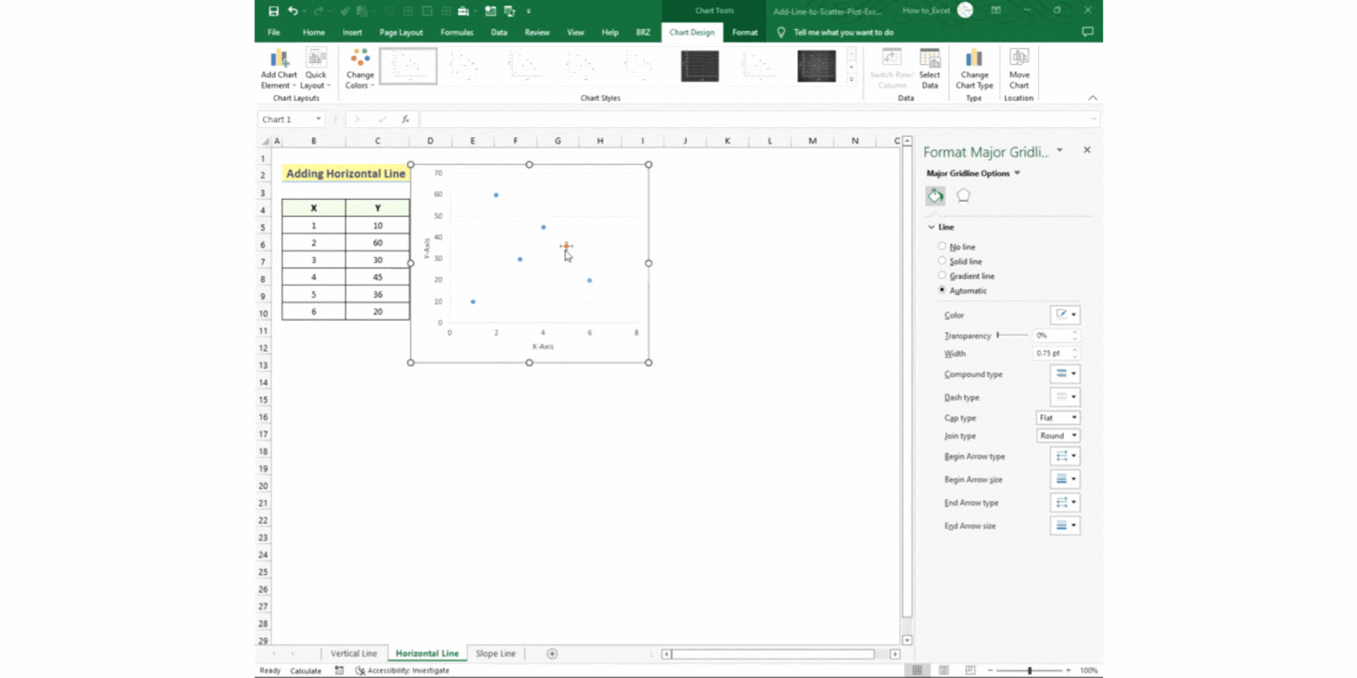
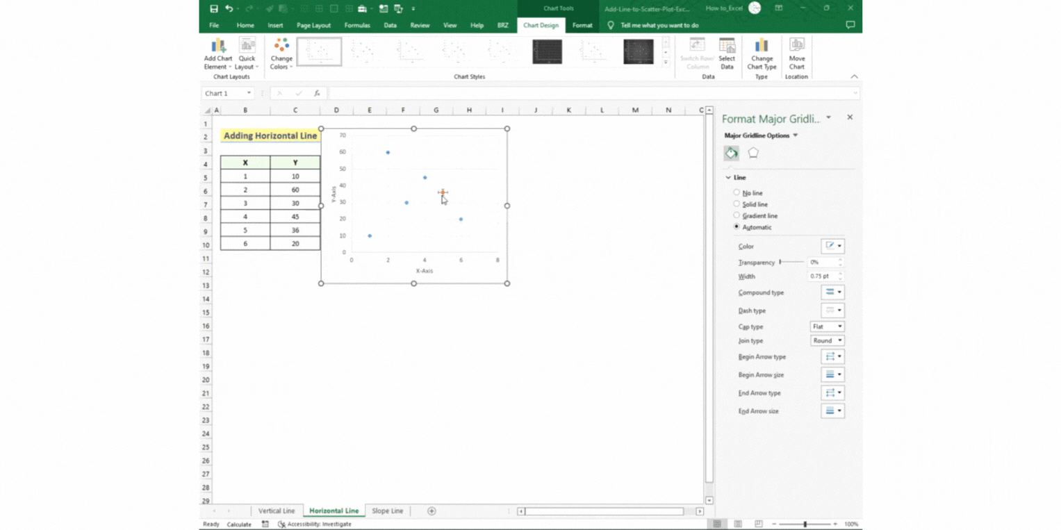
Option 2 – Adding a Horizontal Line:
Step 1 – Opening the Data Source settings
- Right-click the scatter chart and select Select Data.
- Click on Add in the Select Data Source window.
- The Edit Series window will open.
Step 2 – Setting the parameters
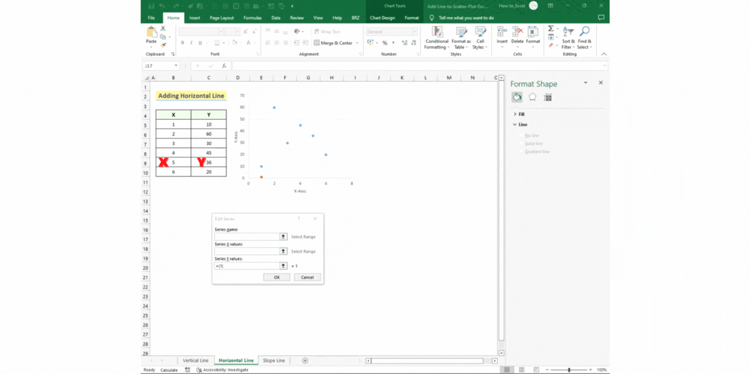
- Set the Series name as “Horizontal Line”.
- Set the Series X values by selecting cell B9.
- Set the Series Y values by selecting cell C9.
- Press OK.
- A new data is generated, called “Horizontal Line”.
- Press OK again.
Step 3 – Setting up your line
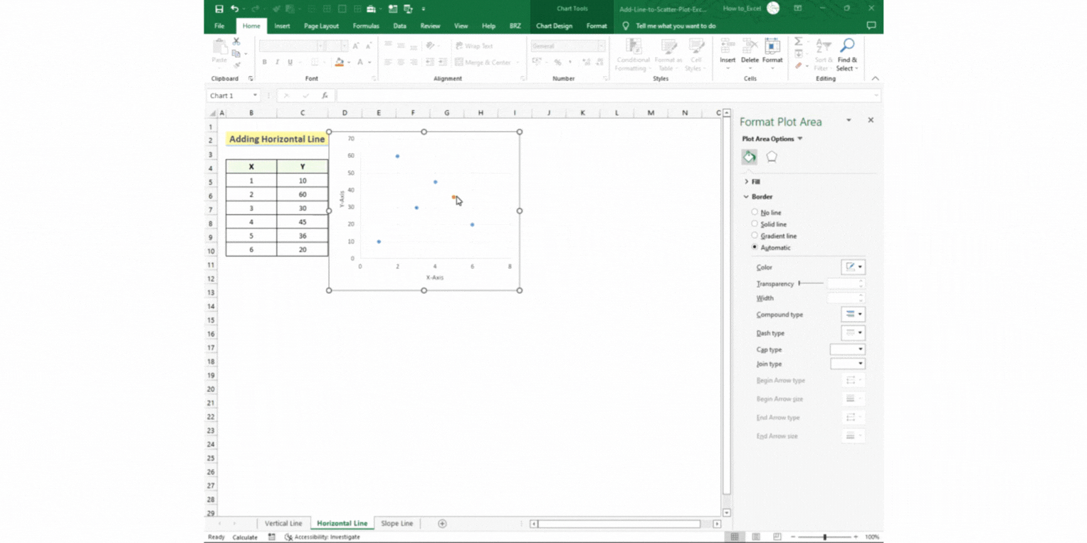
- Select the orange data point.
- Go to Chart Design > Add Chart Element > Error Bars > Percentage.
- Here, you will get a horizontal and a vertical line around the selected data point.
Step 4 – Removing the vertical line
- Right-click on the vertical line.
- Select Format Error Bars.
- Set the Percentage value to 0 under the Error Amount section in the new window on the right.
Step 5 – Formatting your horizontal line
- Right-click on the horizontal line.
- Select Format Error Bars.
- Set the Direction to Minus.
- Set the Percentage value to 100 under the Error Amount section.
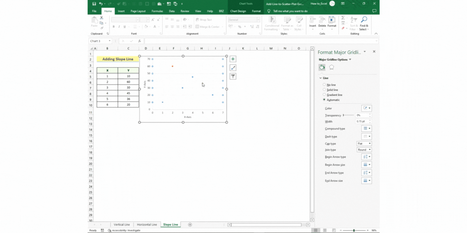
Option 3 – Adding a Slope Line:
Step 1 – Opening the Data Source settings
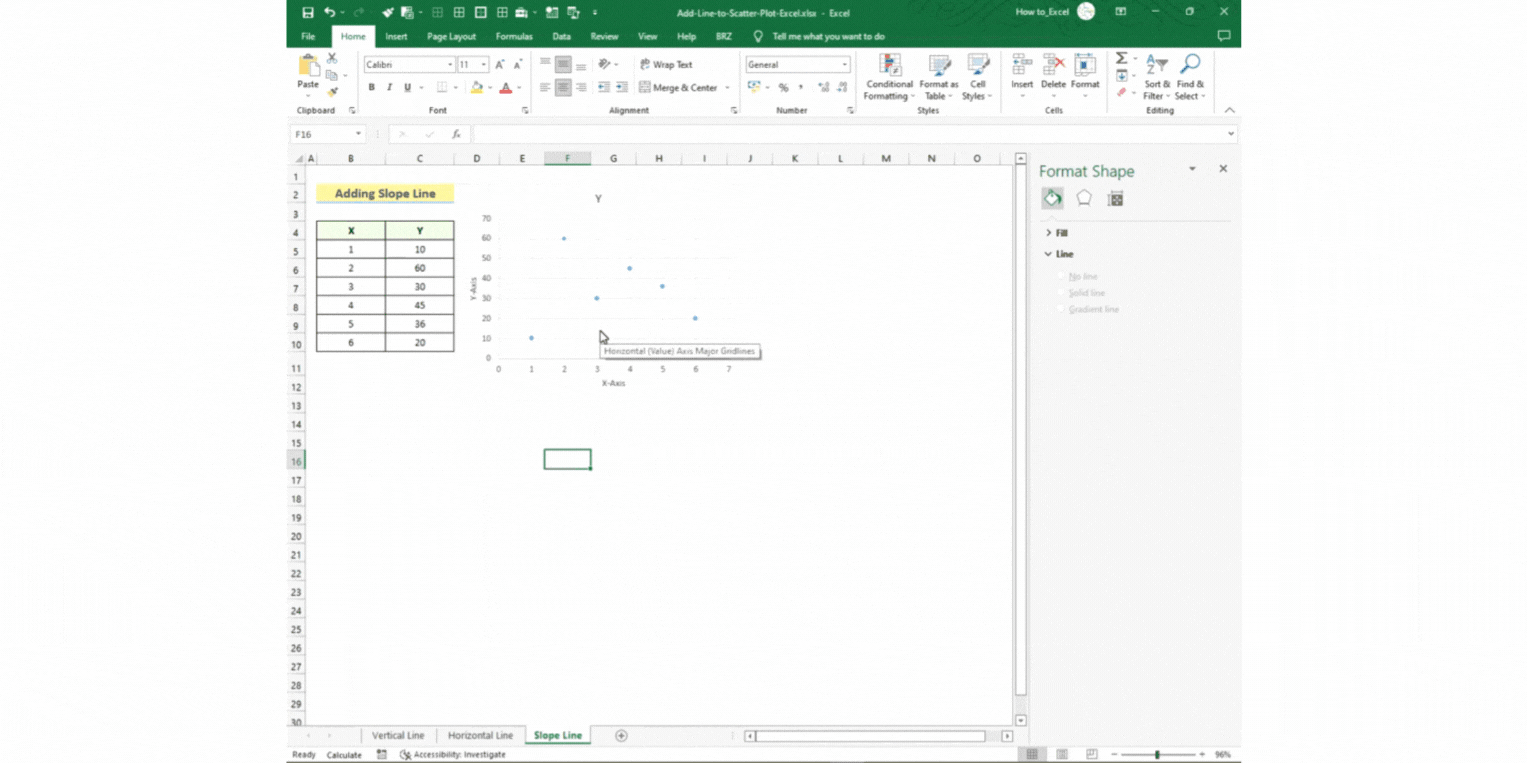
- Right-click the scatter chart and select Select Data.
- Click on Add in the Select Data Source window.
- The Edit Series window will open.
Step 2 – Setting the parameters
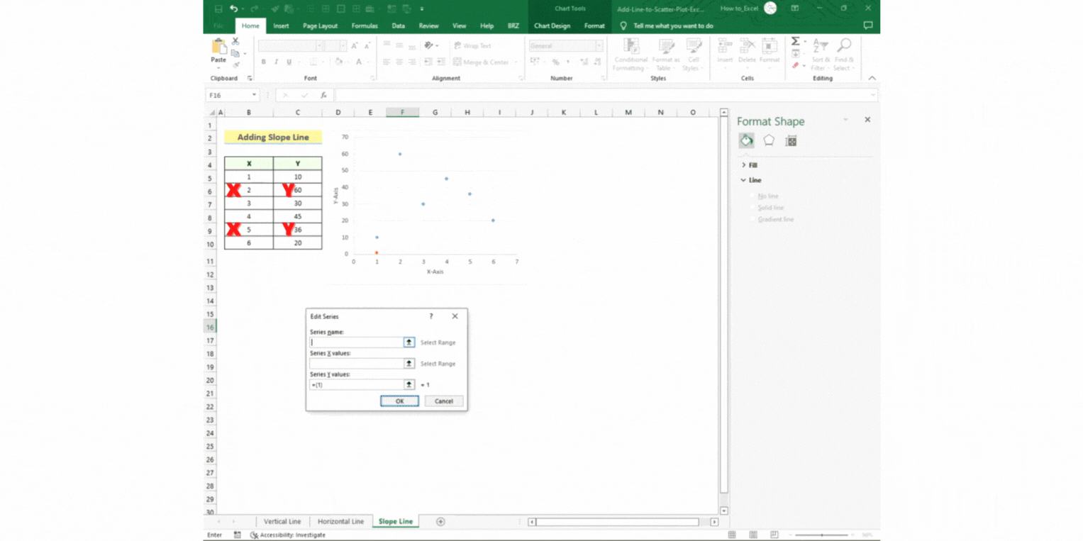
- Set the Series name as “Slope Line”.
- Set the Series X values by holding Ctrl and selecting cells B6 and B9.
- Set the Series Y values by holding Ctrl and selecting cells C6 and C9.
- Press OK.
- A new data is generated, called “Slope Line”.
- Press OK again.
Step 3 – Setting up your line
- Select the two data points.
- Right-click and select Change Series Chart Type.
- Click on Combo.
- Click the dropdown arrow beside the Slope Line option.
- Select the icon with the name Scatter with Straight Lines from the dropdown options.
- Press OK.
These are easy ways to add a line to a scatter plot.


