
How to add a line of best fit in Excel
 By
SpreadCheaters
By
SpreadCheaters
You can watch a video tutorial here.
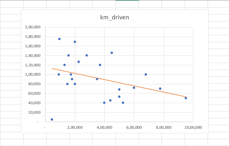
Charts are a great way to visualize data and perform data analysis. Excel has several options when it comes to creating and formatting charts. In a scatter plot, the line of best fit is used to approximate the relationship between the data points.
Suppose you have 2 sets of data for used cars. One is the number of kilometers driven and the second is the selling price. To see the relationship between these variables, you create a scatter plot. To better visualize the relationship between the kilometers driven and the selling price, you want to add the line of best fit.
Step 1 – Open the Chart Elements quick menu
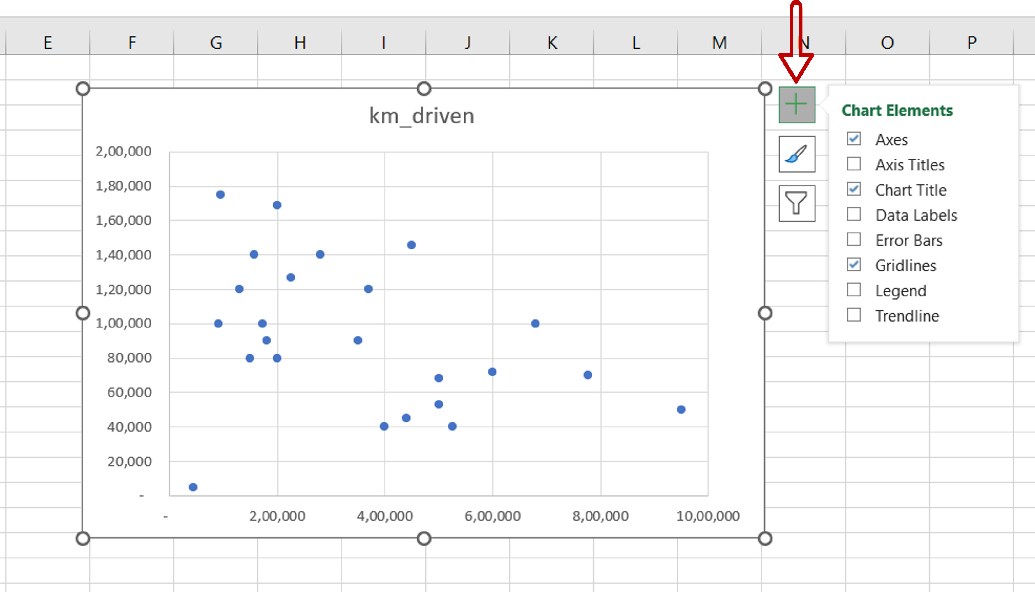
– Select the chart
– Click on the plus sign (+) that appears at the top right corner of the chart
Step 2 – Select the Linear option
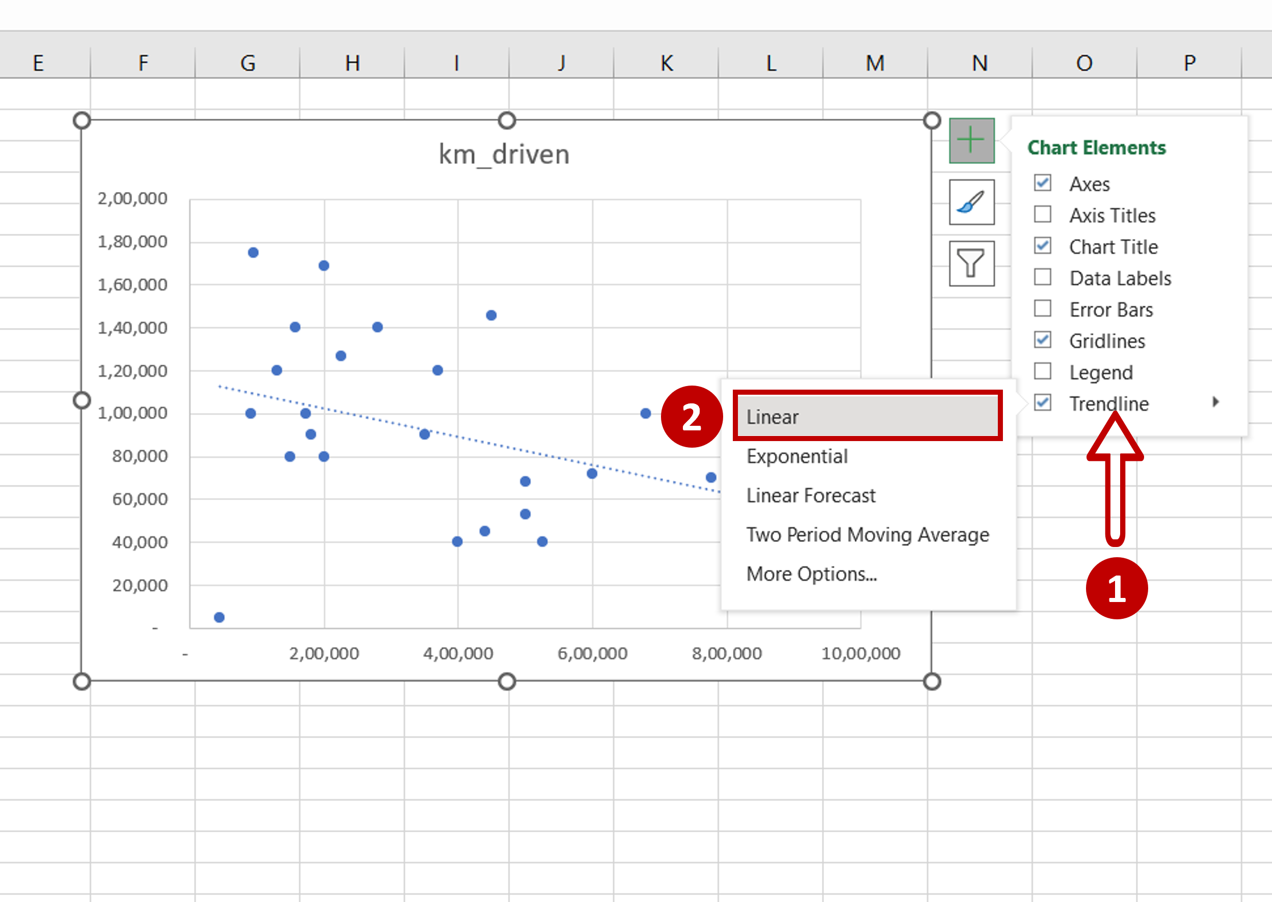
– From the Trendline menu, click Linear
OR
Go to Chart Design > Add Chart Element > Trendline > Linear
– The linear trendline is the line of best fit
Step 3 – Format the trendline
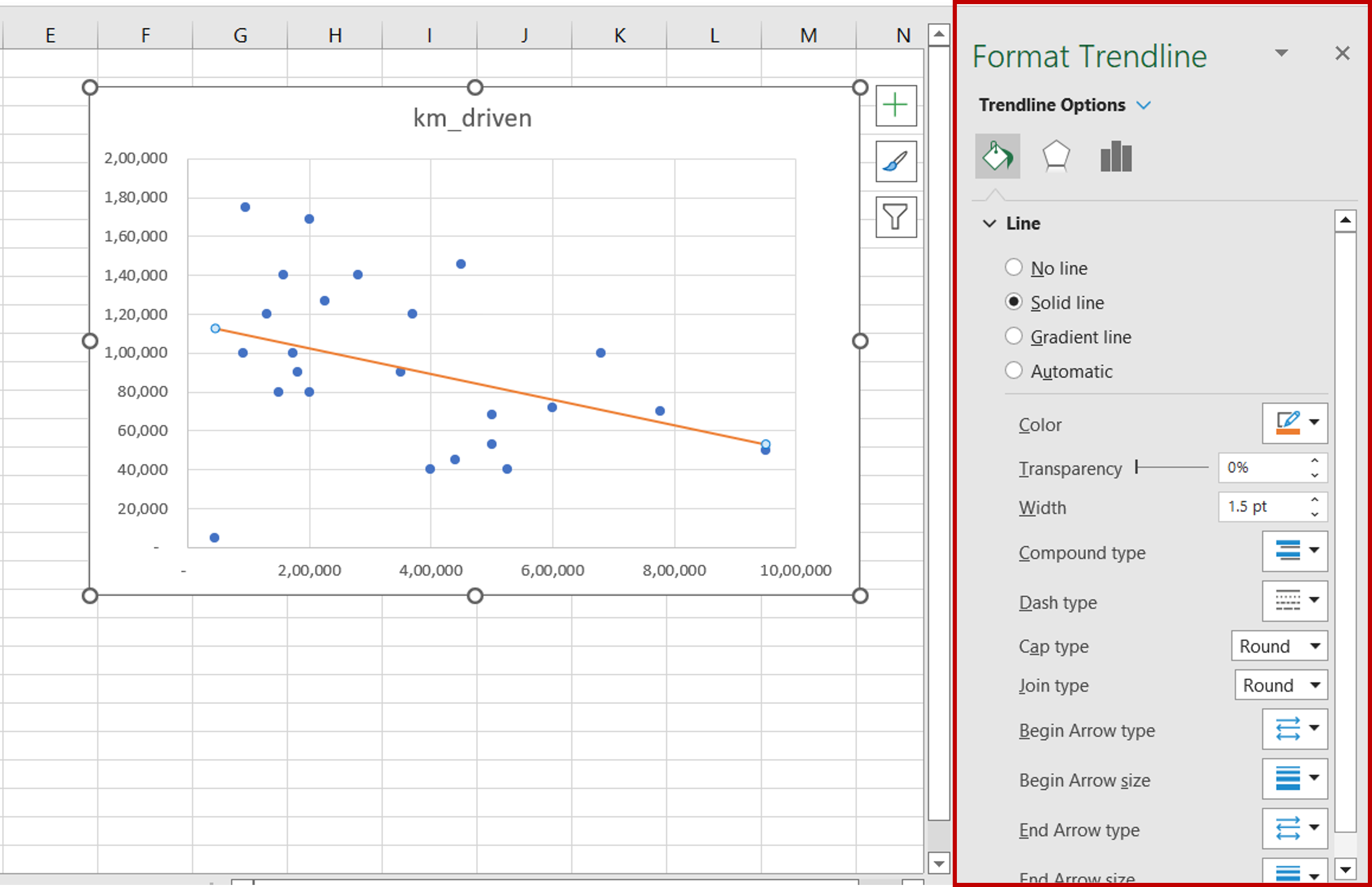
– Select the trendline and right-click to open the context menu
– Use the Format Trendline pane to format the line as desired


