How to switch the x and y axis in Google Sheets
 By
SpreadCheaters
By
SpreadCheaters
Page last updated:
19/04/2023 |
Next review date:
19/04/2025
You can watch a video tutorial here.

Graphs are great ways to visualize data and Google Sheets has tools to build many types of graphs. You may need to create a graph to better represent some analysis you have done or to study trends and projections. Having created a chart, you may want to switch the axes to make the data more presentable.
Step 1 – Open the Chart editor
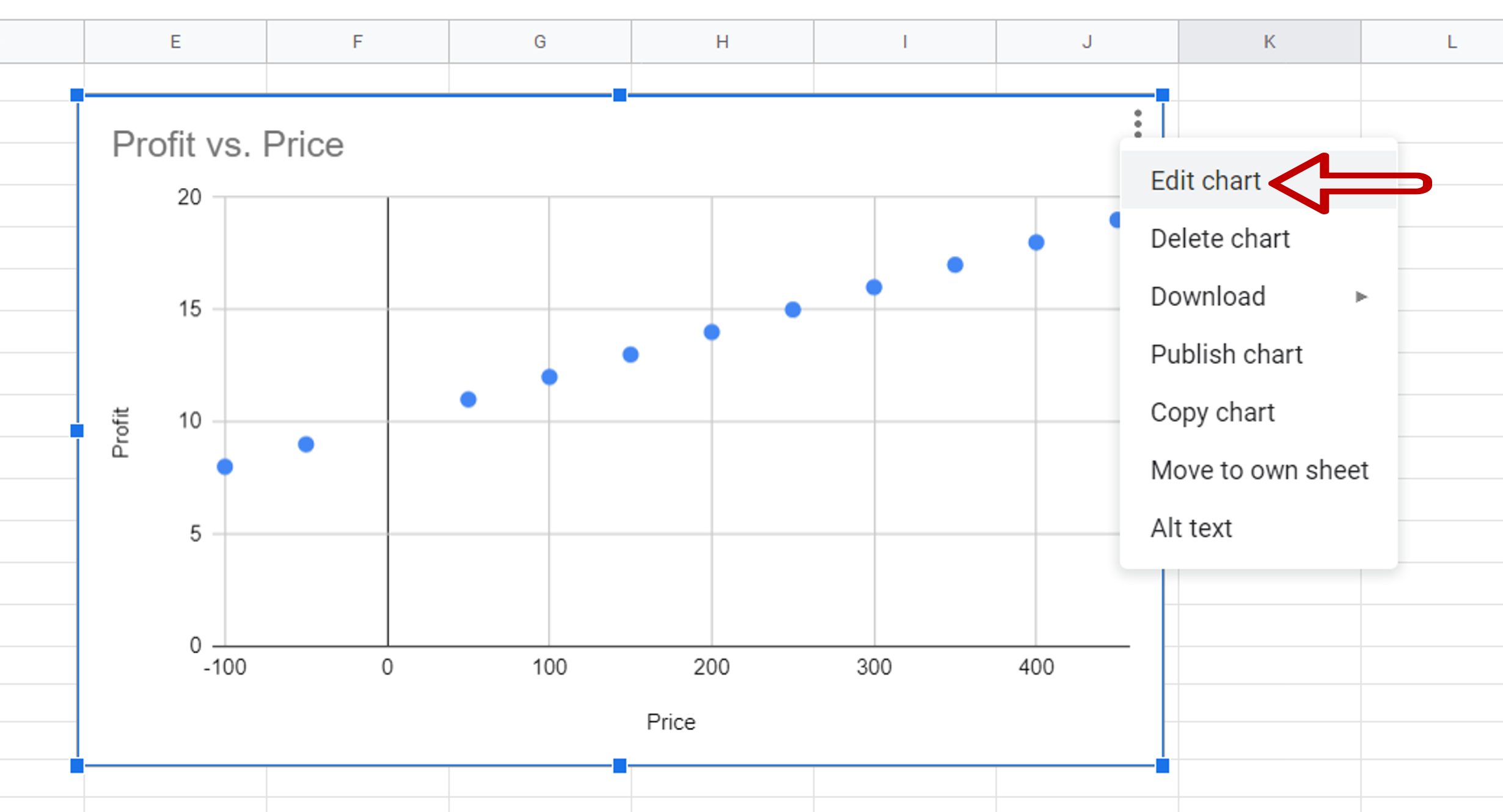
– Select the chart
– Click on the 3 dots at the top right corner of the chart
– Select Edit chart
Step 2 – Change the X axis
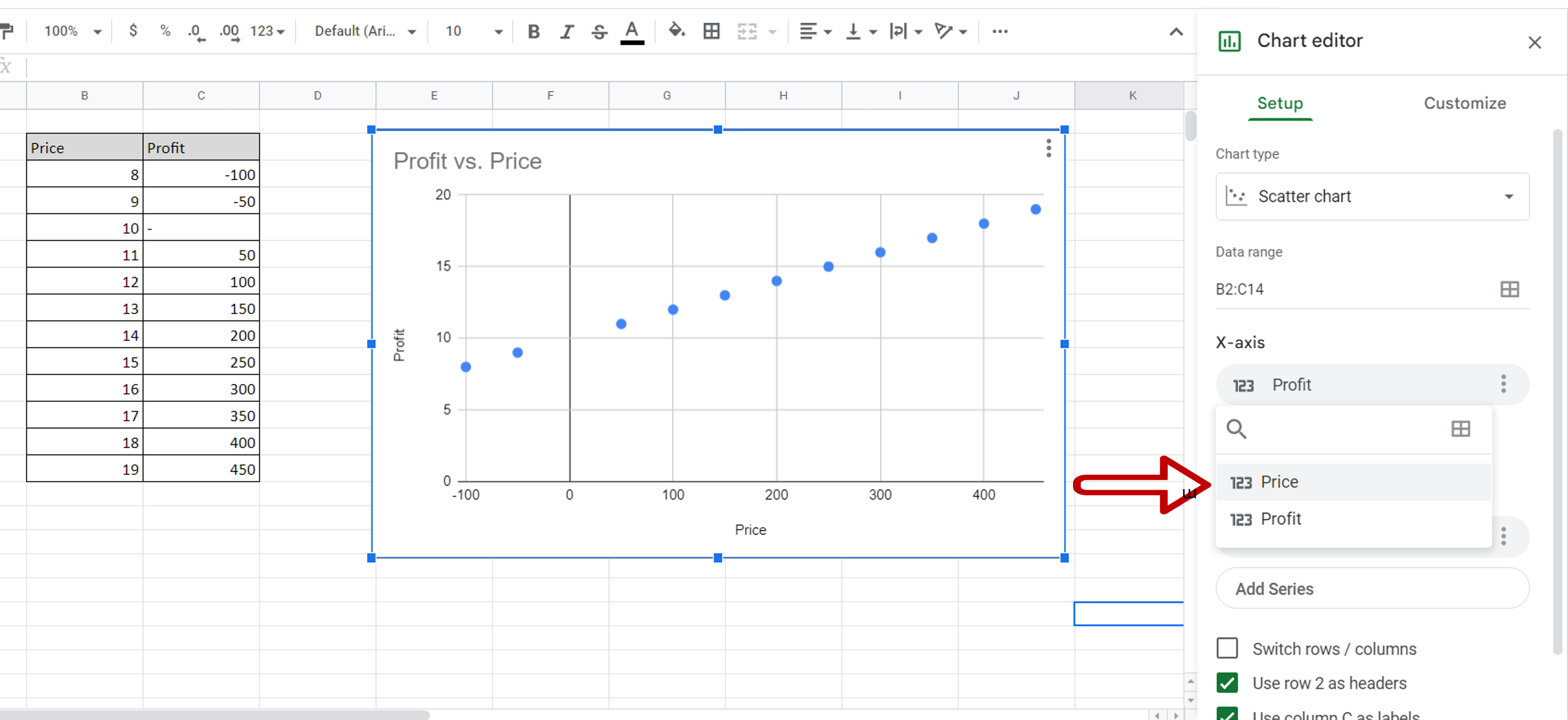
– Click the box under X-axis
– Select Profit
Step 3 – Change the Y-axis
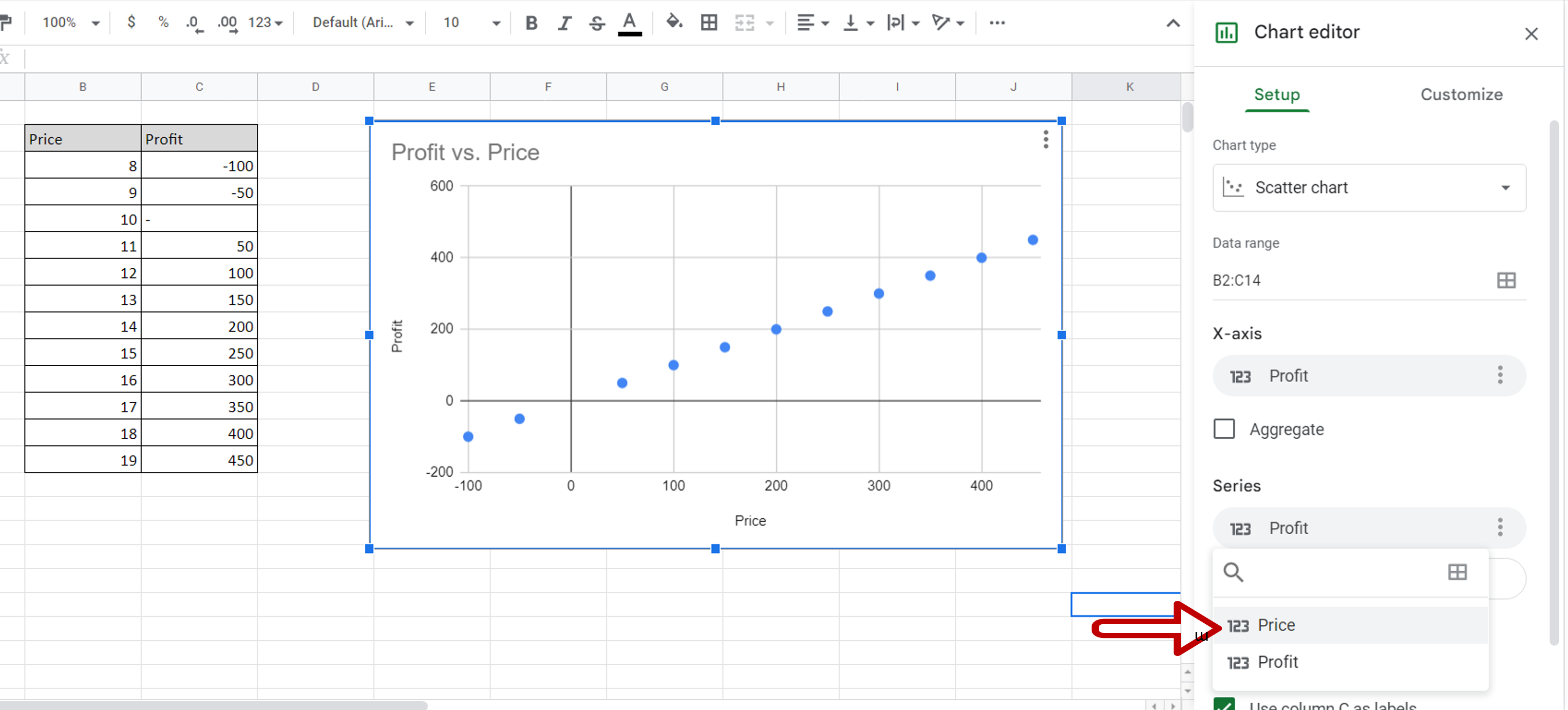
– Click the box under Series
– Select Price
Step 4 – Change the X-axis title

– Double-click the x-axis title
– In the Chart editor, under Horizontal axis title enter ‘Profit’
Step 5 – Change the Y-axis title
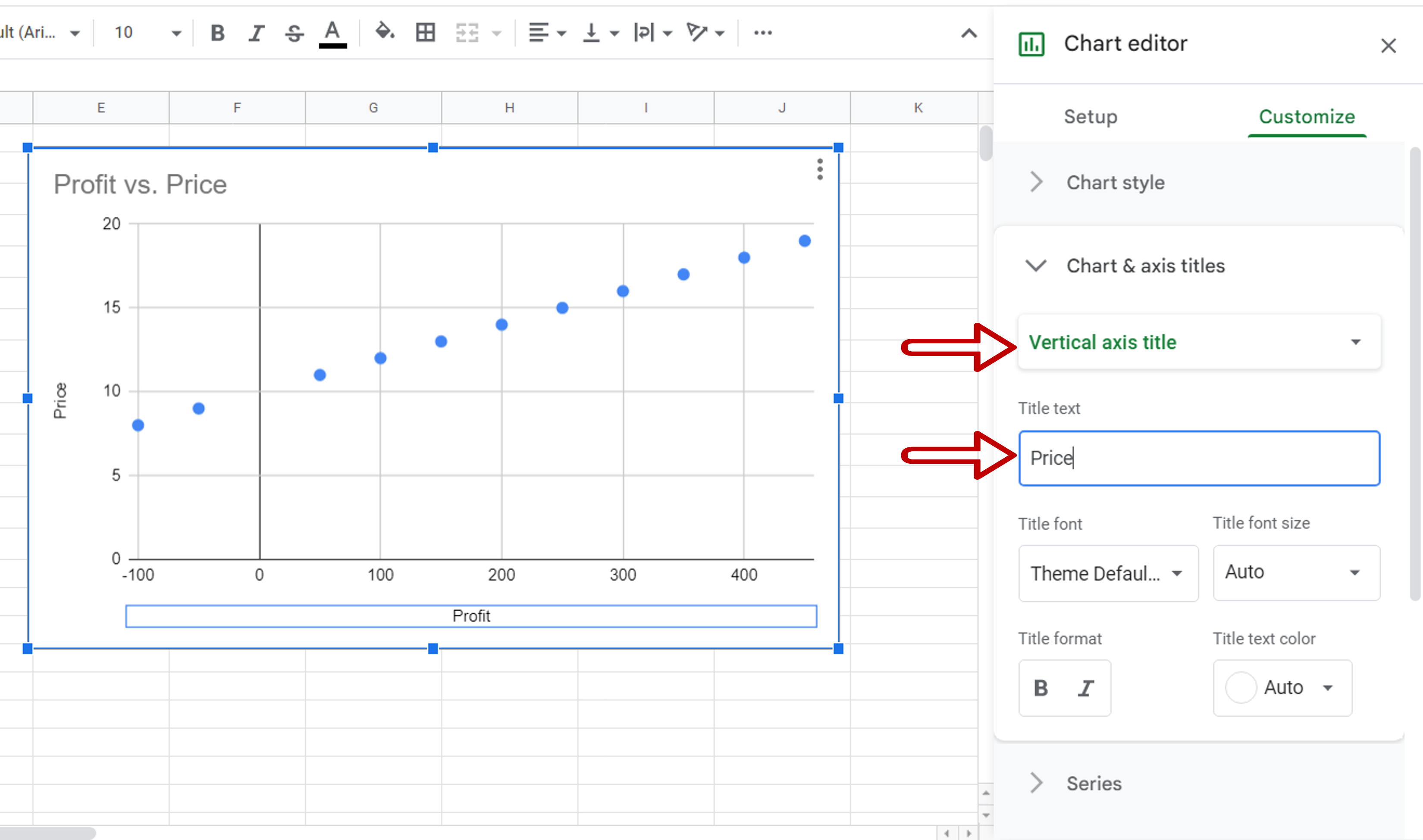
– In the Chart editor select Vertical axis title
– Enter ‘Price’ as the Title text
Step 6 – Check the result
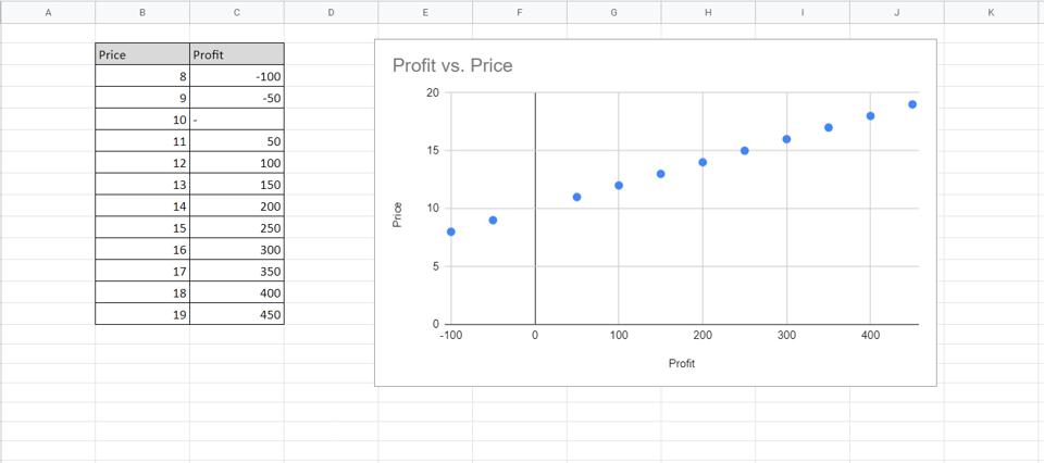
– The X and Y axes are switched