How to make Pivot Chart in Google Sheets
 By
SpreadCheaters
By
SpreadCheaters
In this tutorial we will learn how to make A Pivot Chart. A pivot chart is a graphical representation of data that is organized in a pivot table. A pivot table is a special type of table that aggregates data from another table. By using a pivot chart, you can quickly understand patterns and trends in your data, and make informed decisions.
Google Sheets is a powerful spreadsheet tool that can help you organize, analyze, and visualize data. One of the features of Google Sheets is the ability to create pivot charts, which allow you to quickly summarize and display data in a visual format.
Step 1 – Create a Data Set For Pivot Table
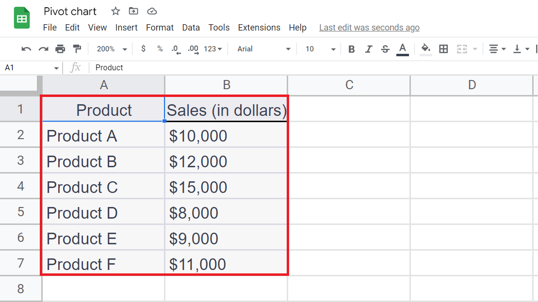
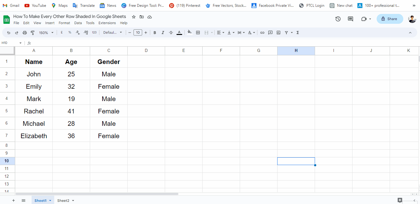
– Create a data set for a pivot table. Make sure the data must be organized in rows and columns.
Step 2 – Select the Data
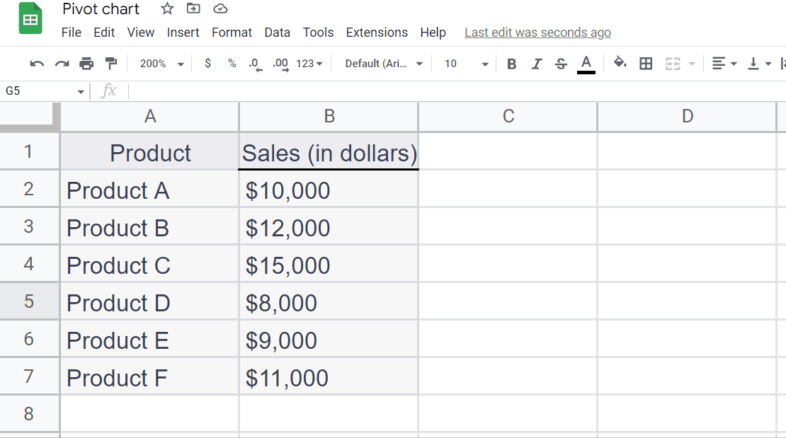
– Select the Data using the “Handle Select” and “Drag and Drop” method.
Step 3 – Go to Insert tab
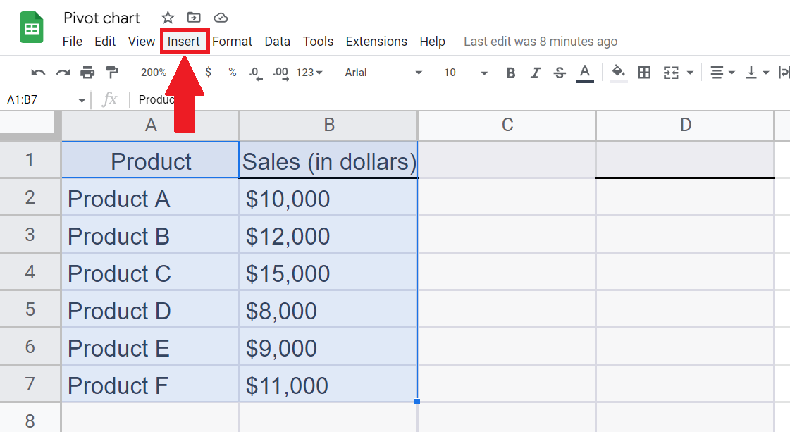
– Go to the Insert tab in the menu bar.
Step 4 – Click on Pivot Table
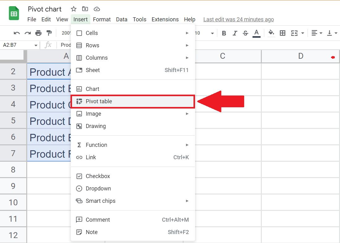
– A Drop down menu will appear.
– Click on the Pivot Table option to create a pivot table.
Step 5 – Enter the Targeted Location and Click on Create
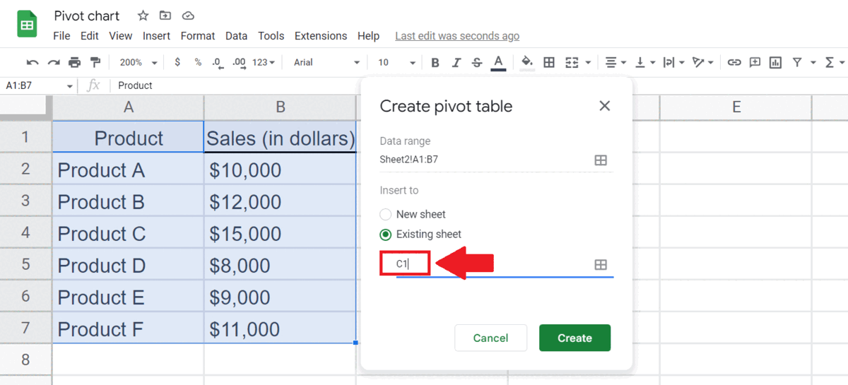
– You may select New sheet or enter the Location of Existing sheet .
– Then click on Create to create a Pivot table.
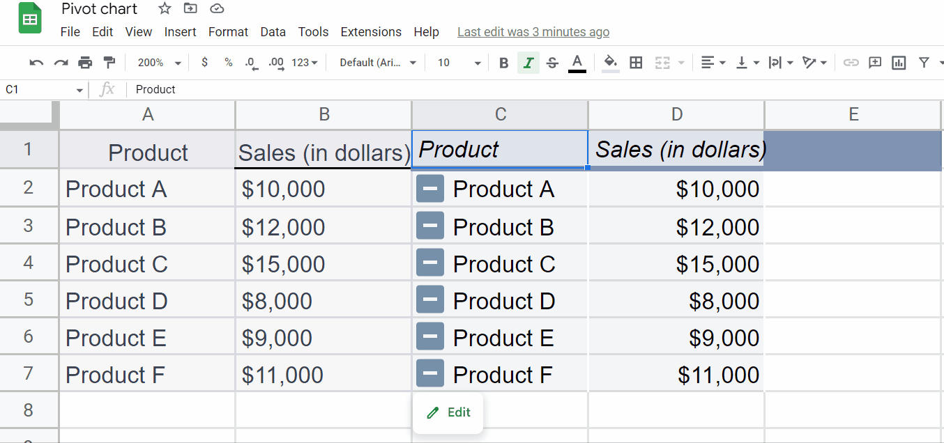
Step 6 – Manipulate the Pivot table
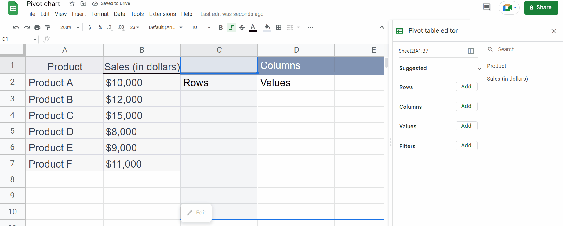
– Manipulate the Pivot table using Pivot Table Editor .
Step 7 – Select the Pivot table
– Select the Pivot table using the “Handle Select” and “Drag and Drop” method.
Step 8 – Go to Insert tab
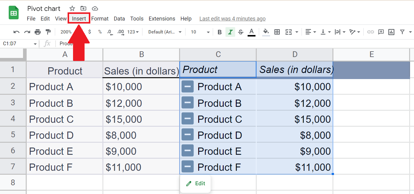
– Go to the Insert tab in the menu bar.
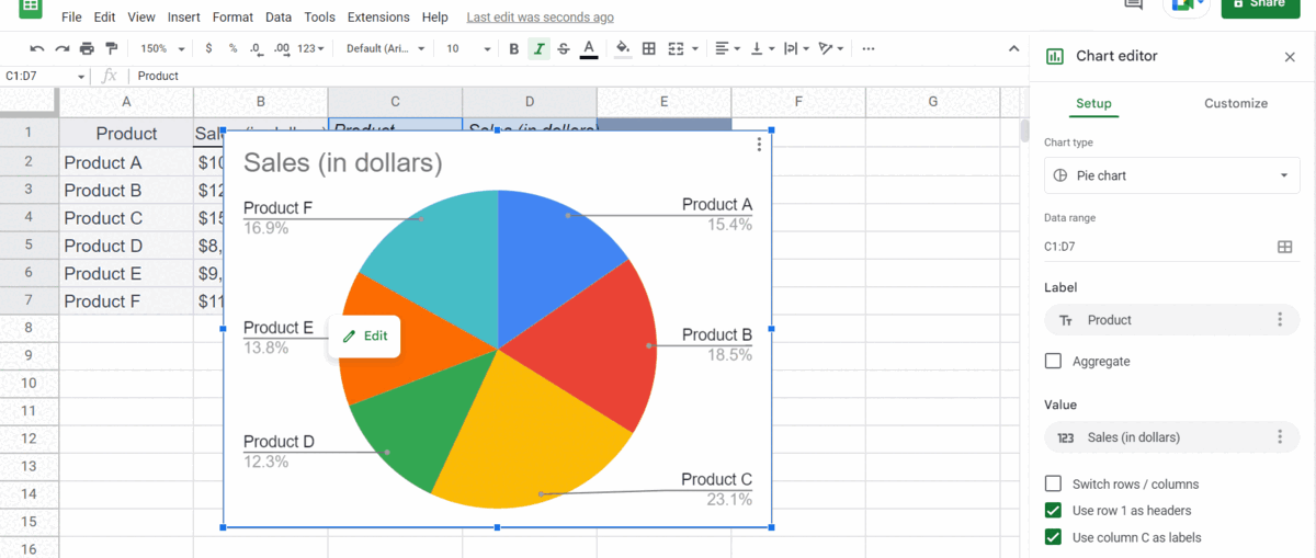
Step 9 – Click on Chart
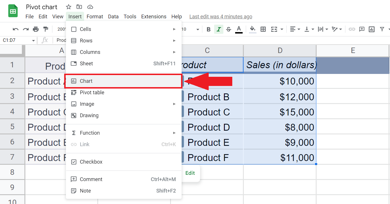
– Click on the Chart option above Pivot Table to create the Pivot chart.
Step 10 – Manipulate the Pivot chart

– You may manipulate the chart according to the requirement using Chart Editor.