How to make a box plot in Google Sheets
 By
SpreadCheaters
By
SpreadCheaters
You can watch a video tutorial here.
The box plot is an interesting chart. It shows you the distribution and range of a set of numerical data and is useful for comparing different sets of data. It is often used in explanatory data analysis (EDA) to visualize the quartiles of a dataset. Google Sheets does not have the option to create a box plot, but you can create an approximation using the candlestick chart type. Candlestick charts visualize the Open, High, Low, and Close prices of a stock over a period and we will adapt this to display the minimum, maximum, first, and third quartiles of a dataset.
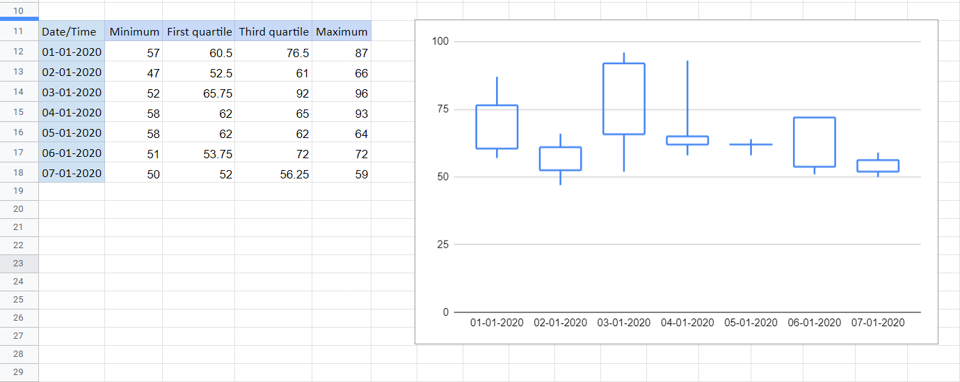
In this example, we look at air quality over 7 days. There are hourly readings for each day and we would like to compare how the air quality has changed over this period. We will derive the values from the data set and then map them as follows:
Minimum -> Low
First quartile -> Close
Third quartile -> Open
Maximum -> High
We will use the following functions in Google Sheets to derive the values:
MIN(): this returns the minimum value in a range of numbers
Syntax: MIN(range of values)
QUARTILE(): this returns the quartile, indicated by the number, of a range of numbers
Syntax: QUARTILE(range of values, quartile number)
MAX(): this returns the maximum value in a range of numbers
Syntax: MAX(range of values)
Note: the only drawback to this method is that the median is not displayed. Box plots usually use 5 values i.e. the values given here and the median or second quartile as well.
Step 1 – Get the minimum value
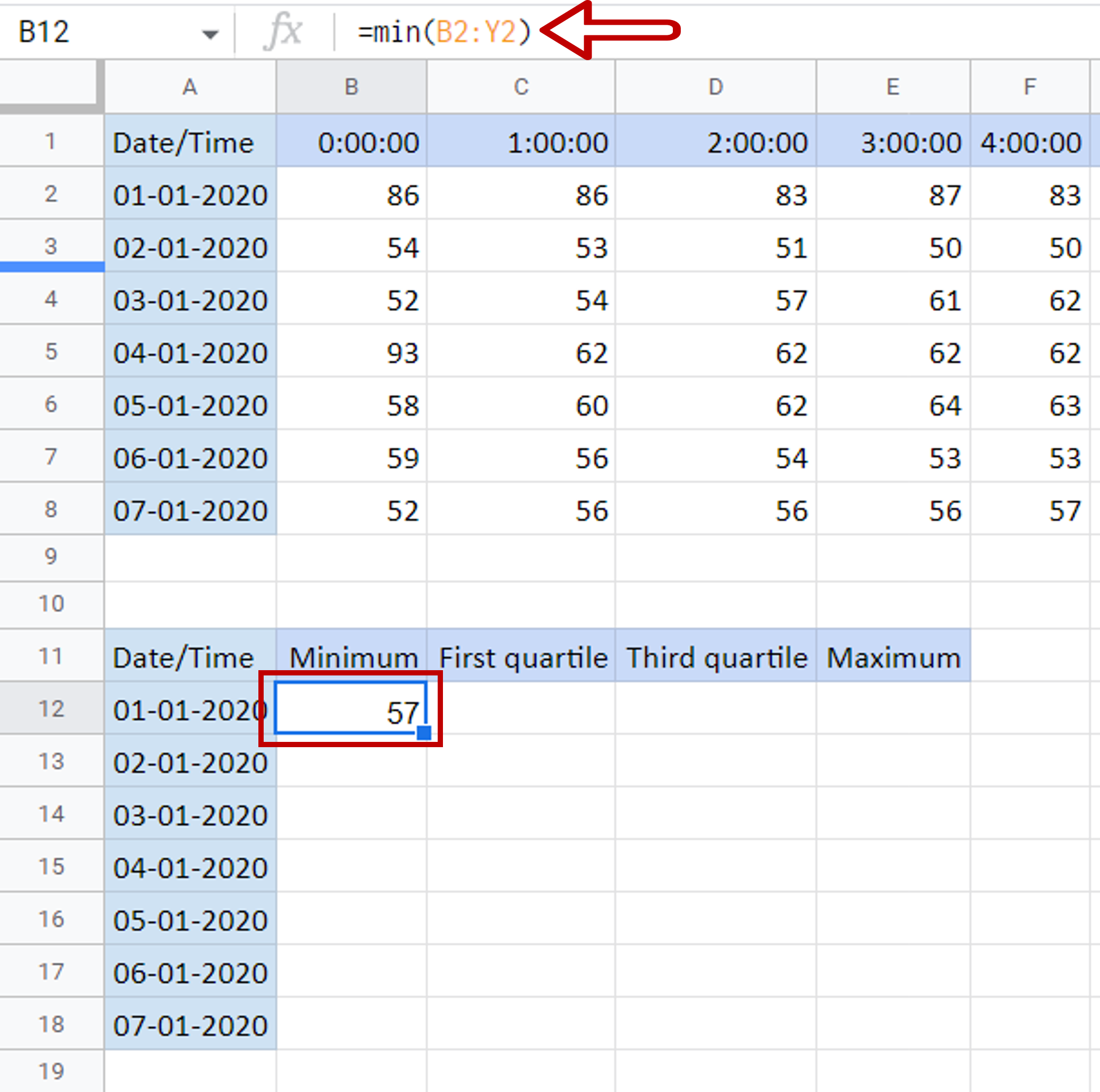
– Select the cell in which the minimum value is to be displayed
– Type the formula using cell references:
= MIN(range of values for the first day)
– Press Enter
Step 2 – Get the first and third quartiles
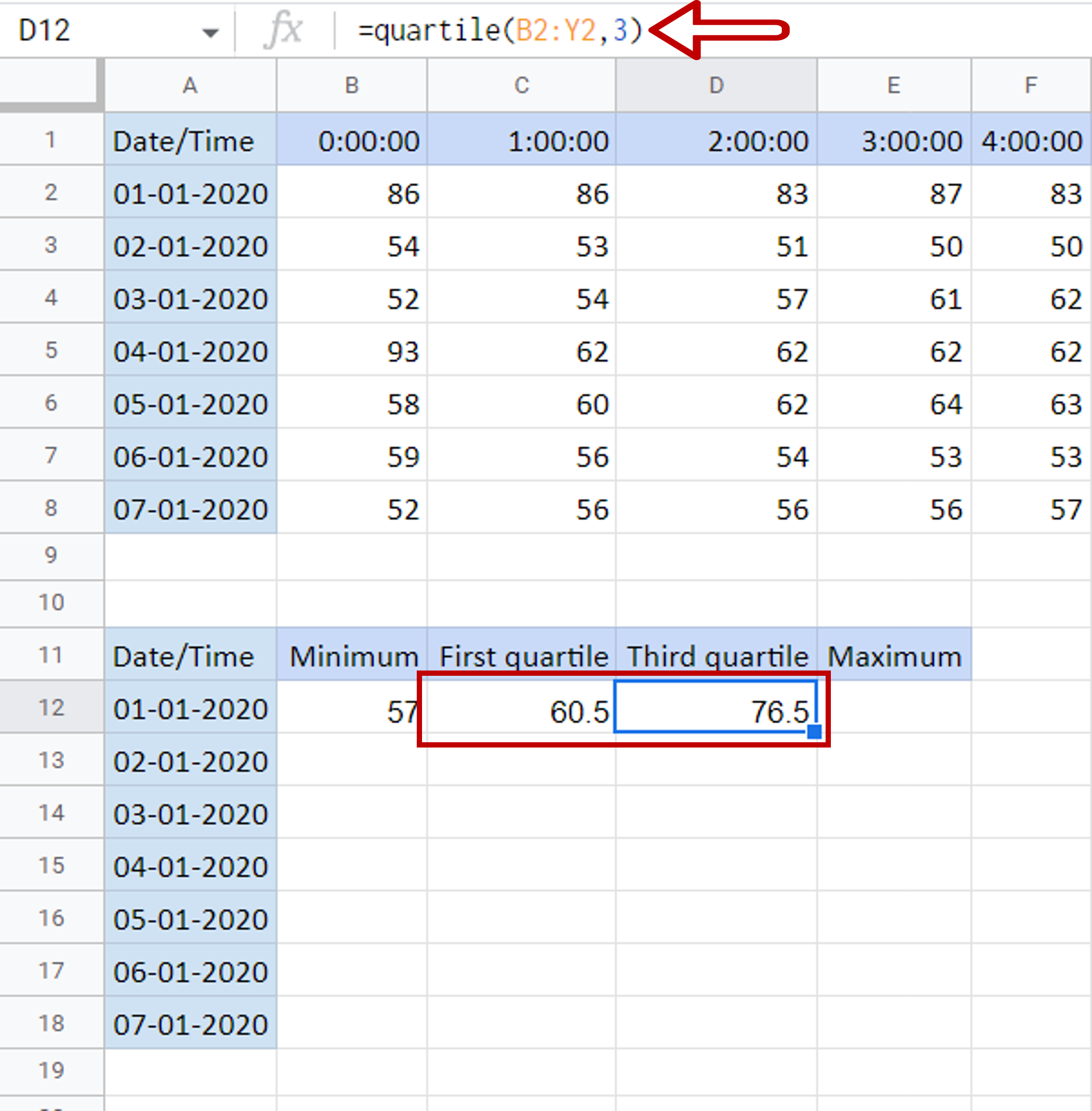
– Select the cell in which the first quartile is to be displayed
– Type the formula using cell references:
= QUARTILE (range of values for the first day, 1)
– Press Enter
– Select the cell in which the third quartile is to be displayed
– Type the formula using cell references:
= QUARTILE (range of values for the first day, 3)
– Press Enter
Step 3 – Get the maximum value
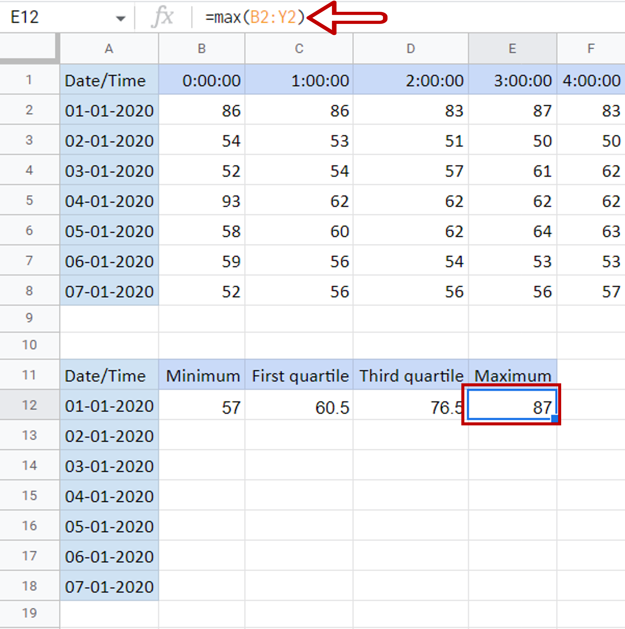
– Select the cell in which the maximum value is to be displayed
– Type the formula using cell references:
= MAX(range of values for the first day)
– Press Enter
Step 4 – Copy the formulas
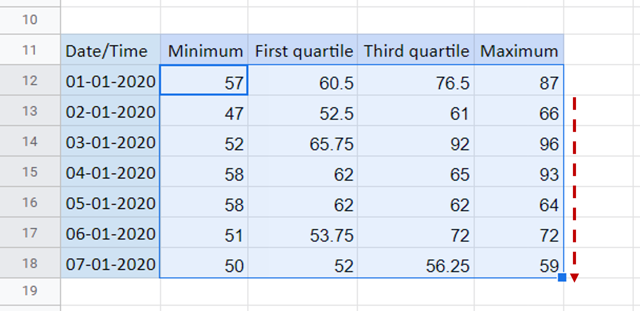
– Select the cells containing the formulas for the first day
– Using the fill handle from the first cell, drag the formula to the remaining days
OR
a) Select the cell with the formula and press Ctrl+C or choose Copy from the context menu (right-click)
b) Select the rest of the cells in the column and press Ctrl+V or choose Paste from the context menu (right-click)
Step 5 – Insert a chart object
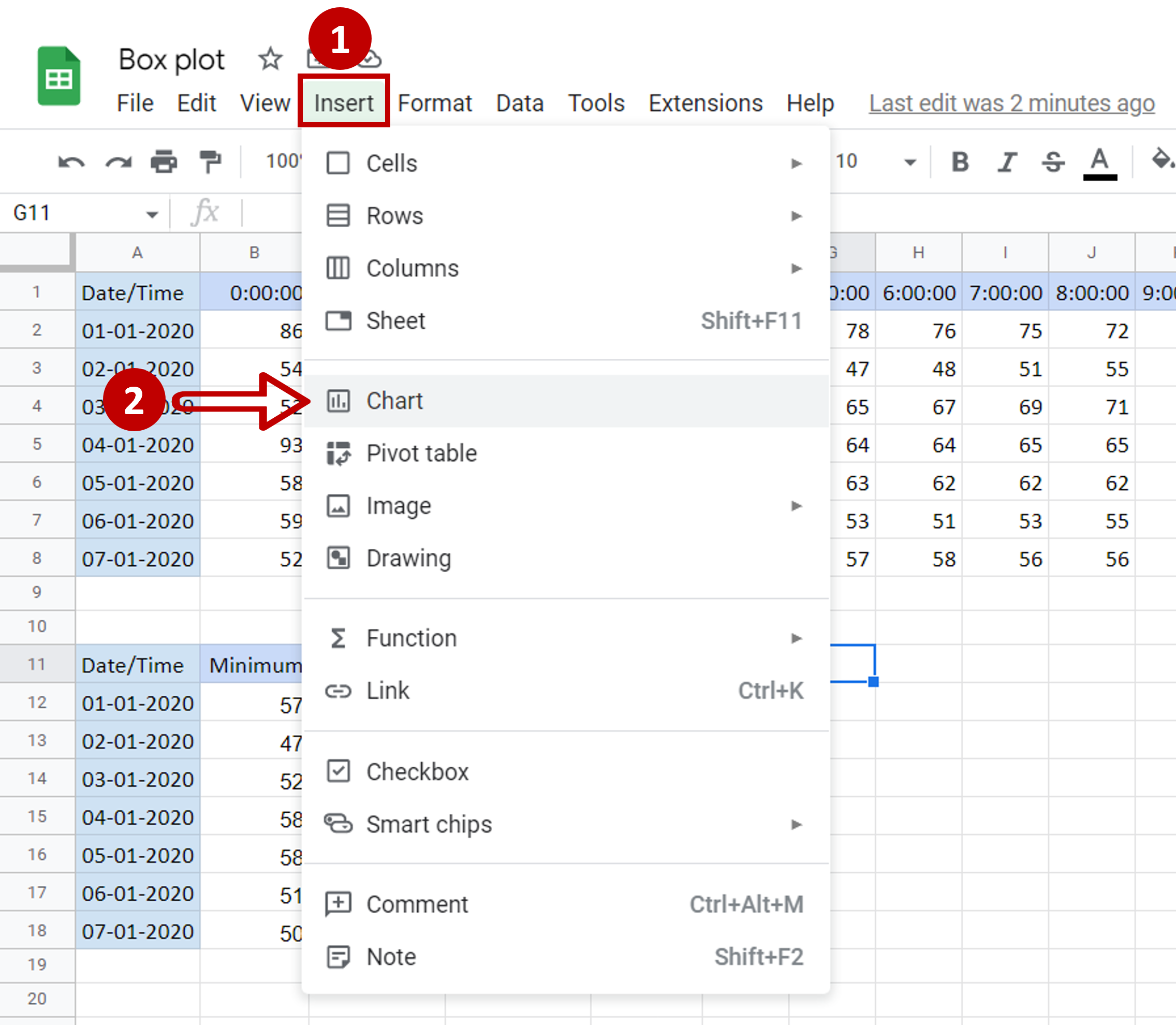
– Go to Insert
– Select Chart
Step 6 – Choose the candlestick chart
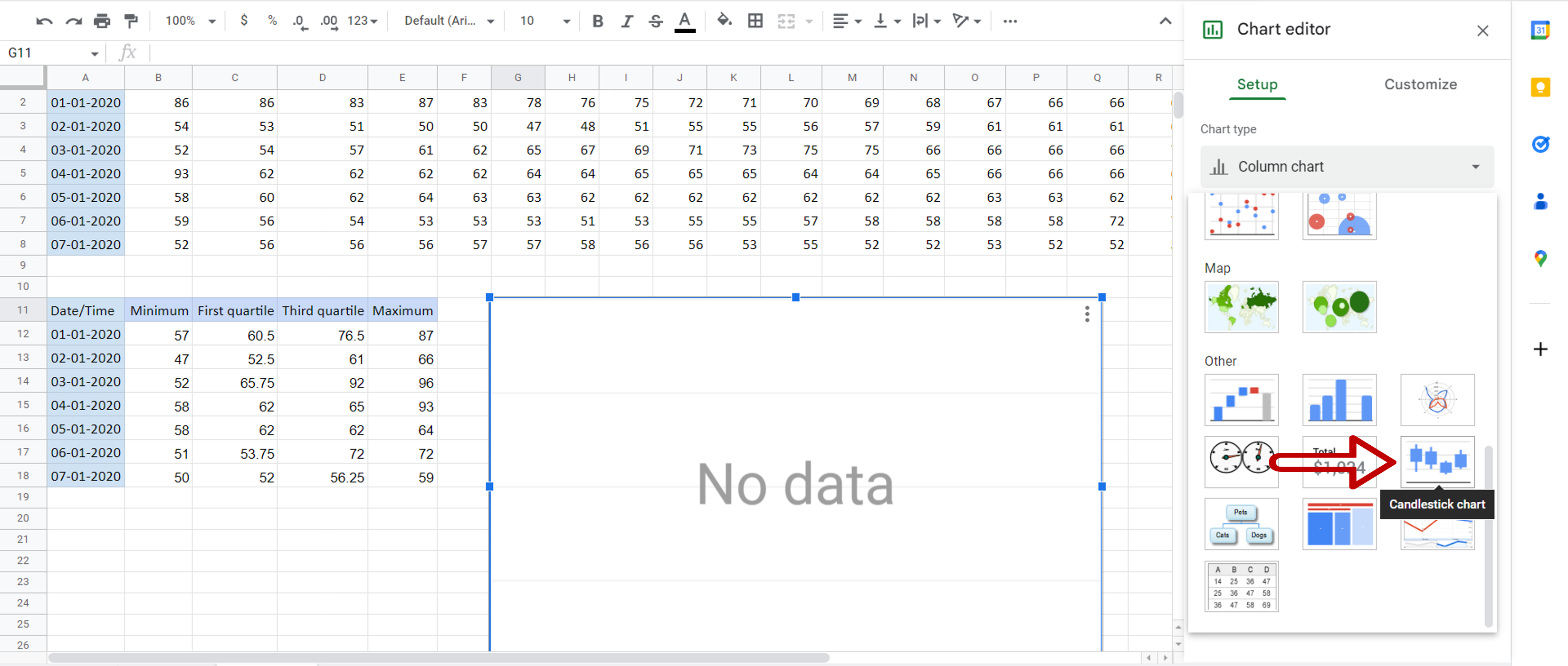
– In the Chart Editor expand the Chart Type menu
– Scroll down and click on the Candlestick chart
Step 7 – Add the X-axis
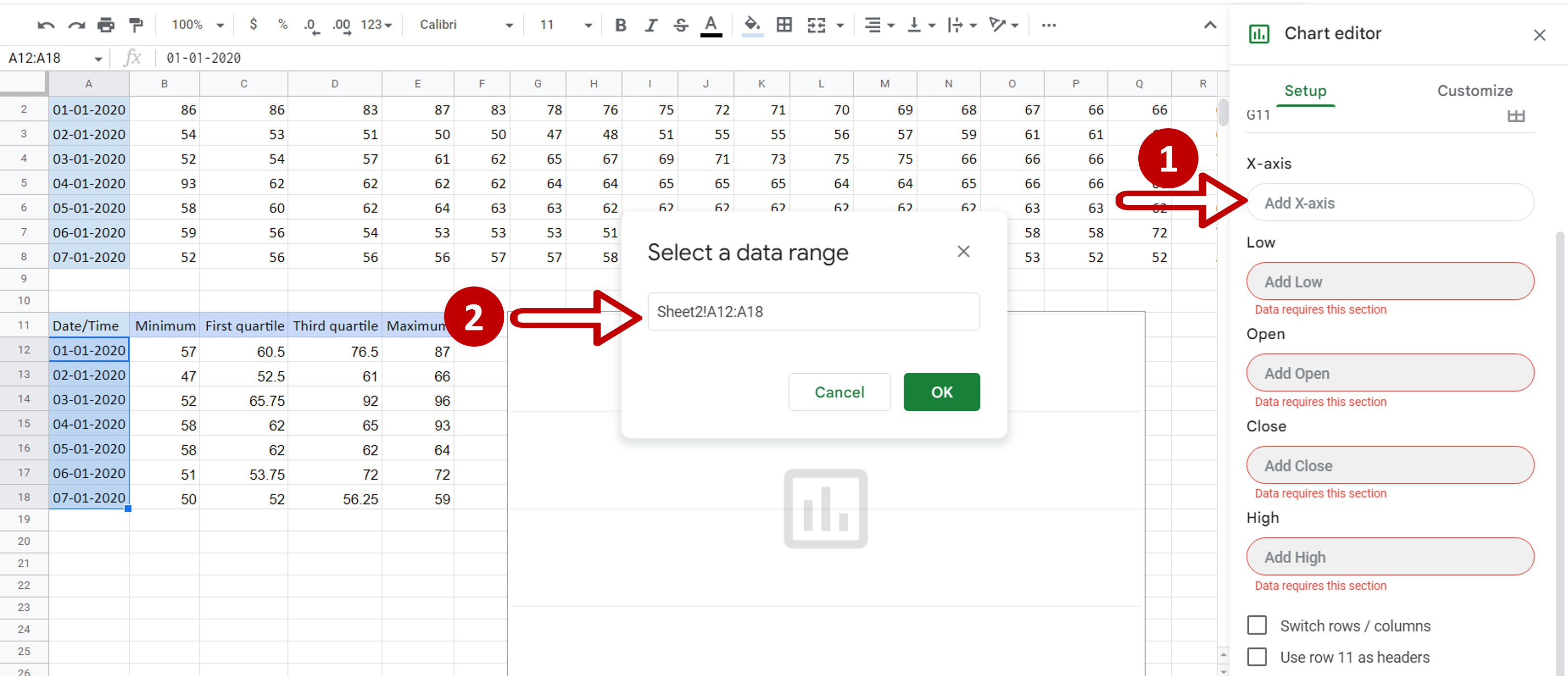
– Click on X-axis
– In Select a data range, choose the range of the dates
– Click OK
Step 8 – Define the other values
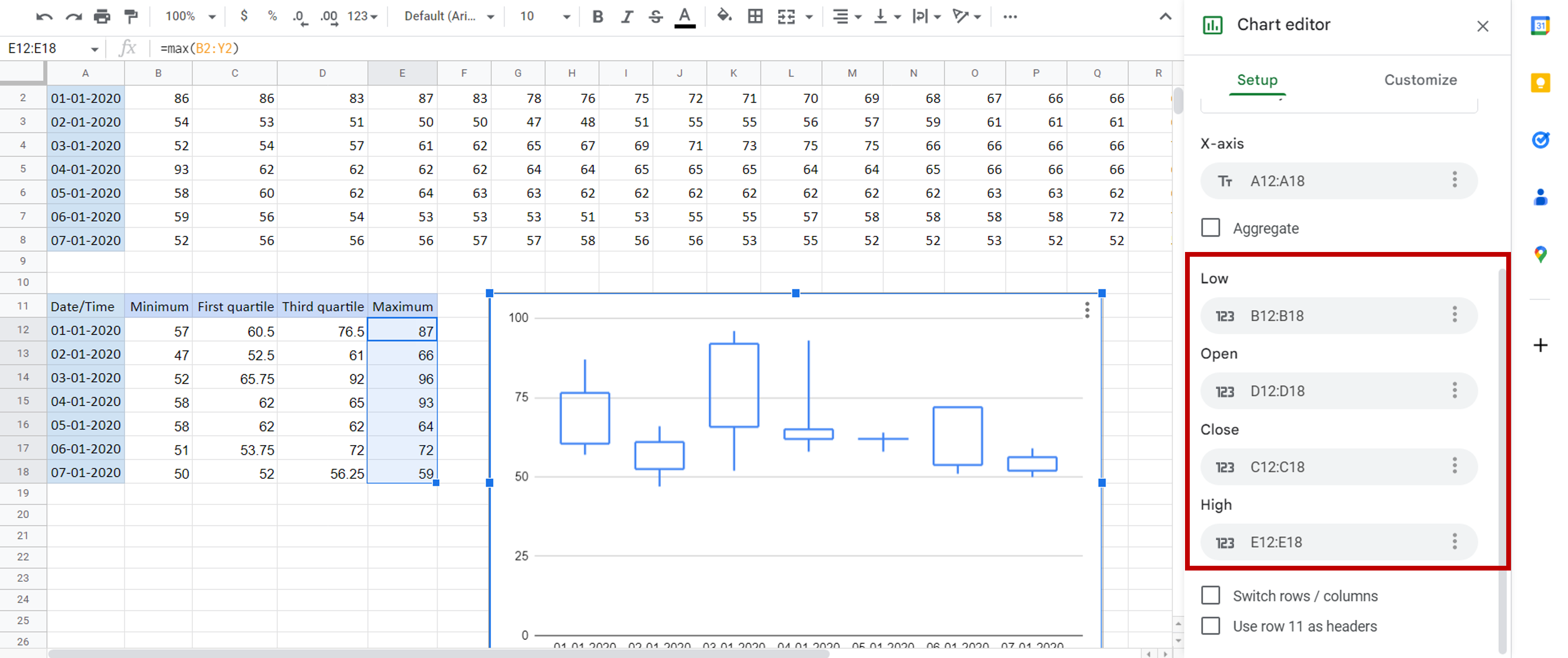
– Set the ranges for the rest of the values:
>Low = range of ‘Minimum’
>Open = range of ‘Third quartile’
>Close = range of ‘First quartile’
>High = range of ‘Maximum’
Step 9 – Check the result
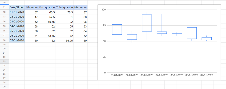
– The box plot is displayed