How to create pie chart in Google Sheets
 By
SpreadCheaters
By
SpreadCheaters
Google sheet is an online way of numeric data calculation which can be accessed remotely. People around the globe can access and perform their tasks by sharing the same sheet. It significantly removed the distance and improved coordination among people. Pie charts are a key factor in data presentation. Google sheet is capable of presenting data in pie charts.
In this tutorial, we will learn how to create pie charts in Google sheets.
Below are the steps to follow;
Step 1 – Select the Charts

Above is an animation as an example.
– Open Google sheet click on insert in the menu bar.
– Dropdown menu will appear.
– Click on charts.
– Side menu will appear and select the type of charts.
– A column chart will appear by default, and all the credentials will be automatically set.
Step 2 – Set types and credentials
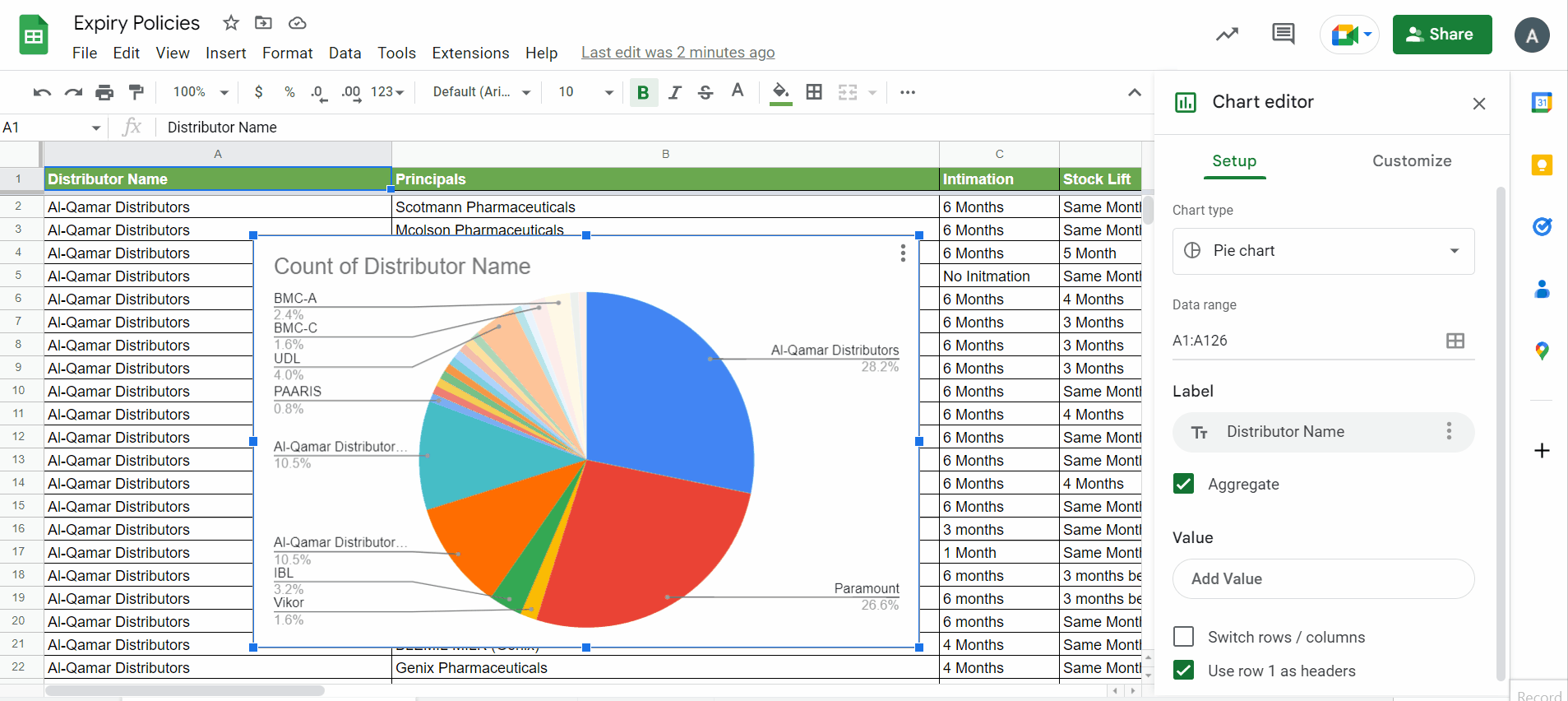
Above is an animation as an example.
– Select the type of pie chart.
– Select the data range.
– Label the name of the chart.
– Set colors , values , and other settings.
– Adjust its height and width as per requirements.
– In the customize tab , set values as per requirements.
– It will change in the pie chart.
By this great feature we can easily present our LARGE data with the help of pie chart by the above-mentioned steps.