How to add a secondary axis in Google Sheets
 By
SpreadCheaters
By
SpreadCheaters
You can watch a video tutorial here.

Graphs are great ways to visualize data and Google Sheets has several tools for creating and formatting charts. The type of chart that you create depends on the dataset that you have. Using the charting tools in Google Sheets, you can explore various types of charts and decide on the one that best suits the data that you are visualizing. When you have 2 sets of data that have different scales, you can create a secondary axis to display the units of the second set of data.
Step 1 – Open the Chart editor
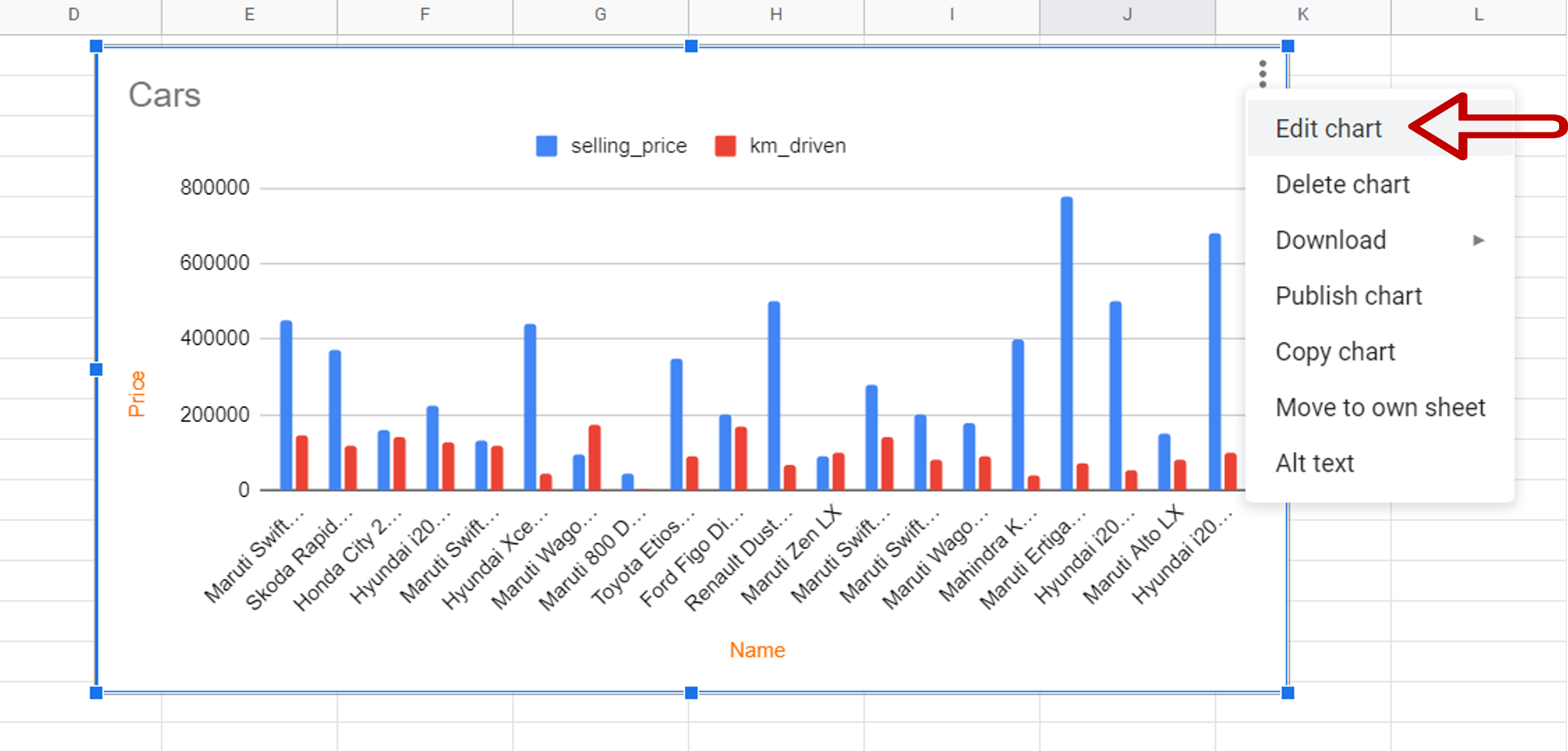
– Select the chart
– Click on the 3 dots in the top left corner of the chart to display the menu options
– Select Edit chart
Step 2 – Open the Series for editing
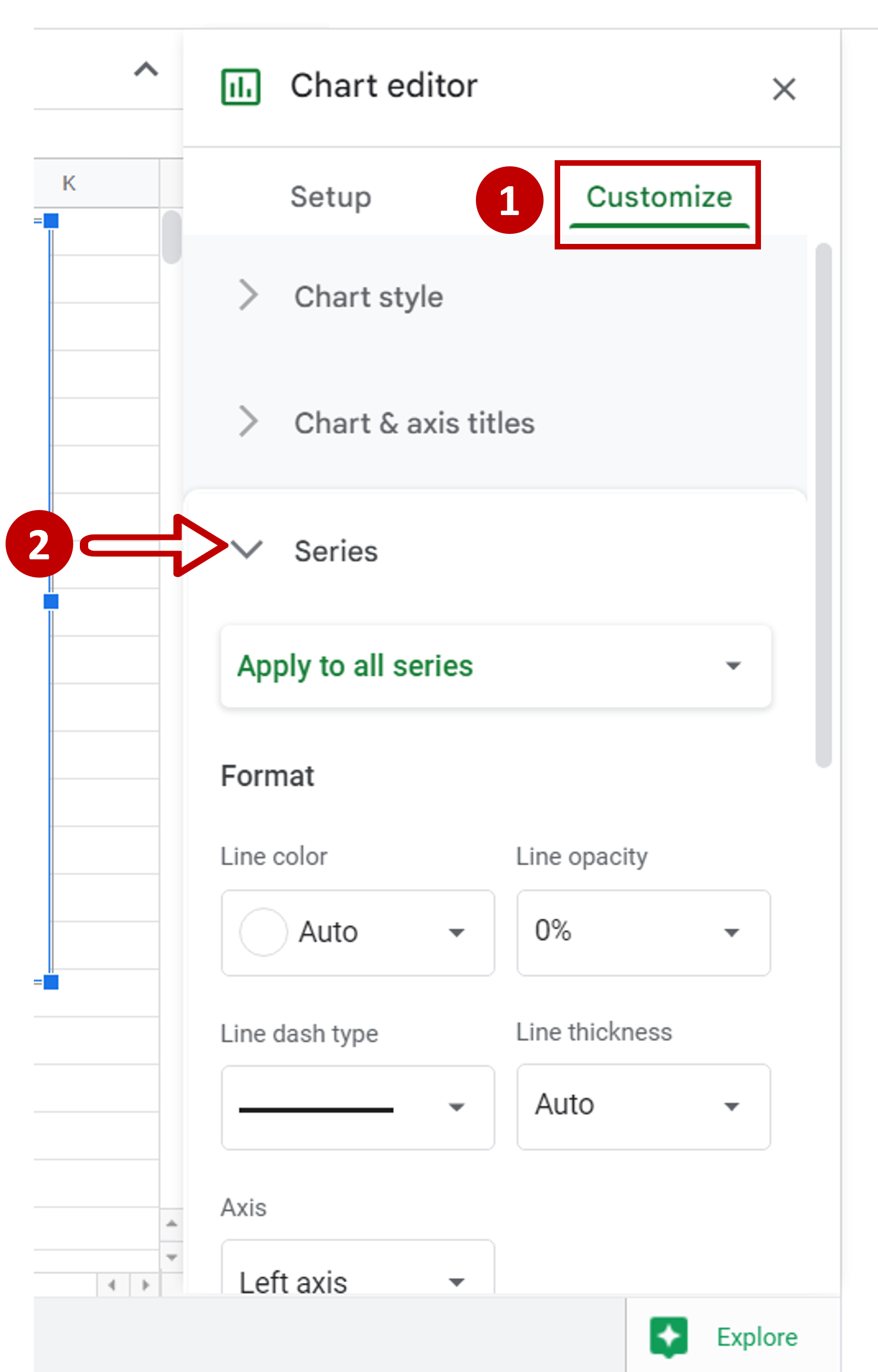
– Choose the Customize tab
– Expand the Series dropdown
Step 3 – Choose the series
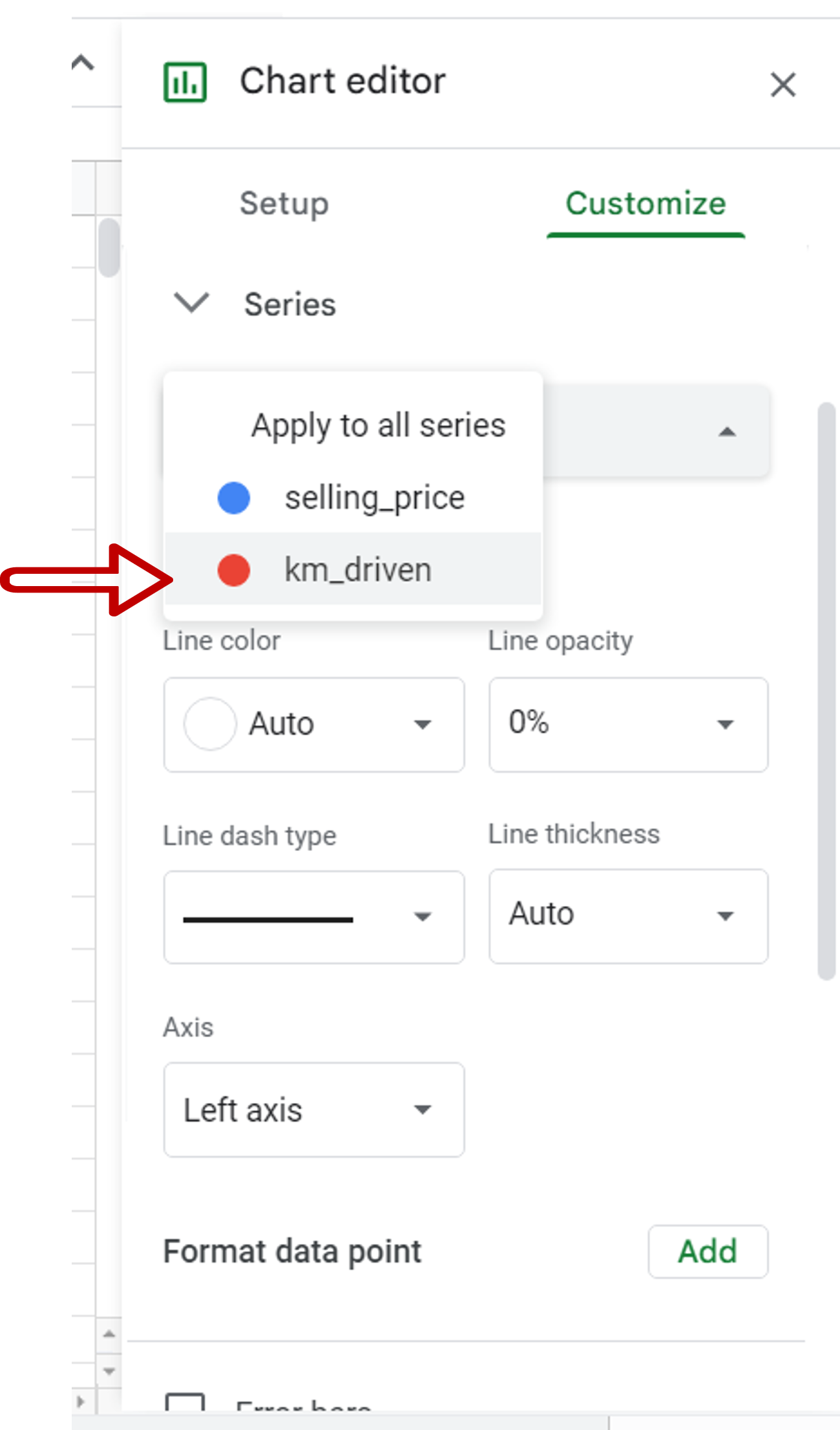
– Choose ‘km_driven’ as the series
Step 4 – Choose the axis
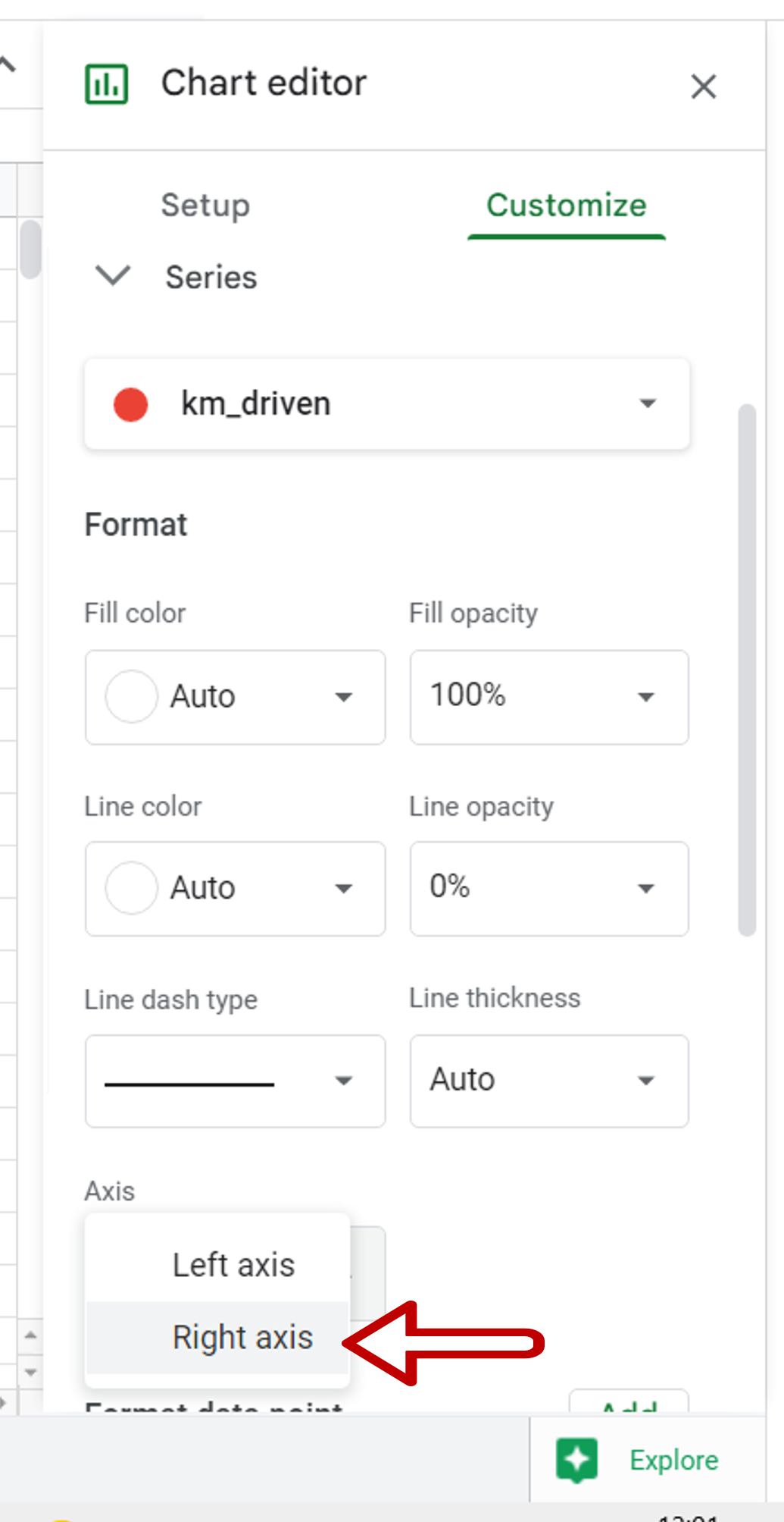
– Under the Axis dropdown choose Right axis
– The secondary axis is added
Step 5 – Open Chart & axis titles
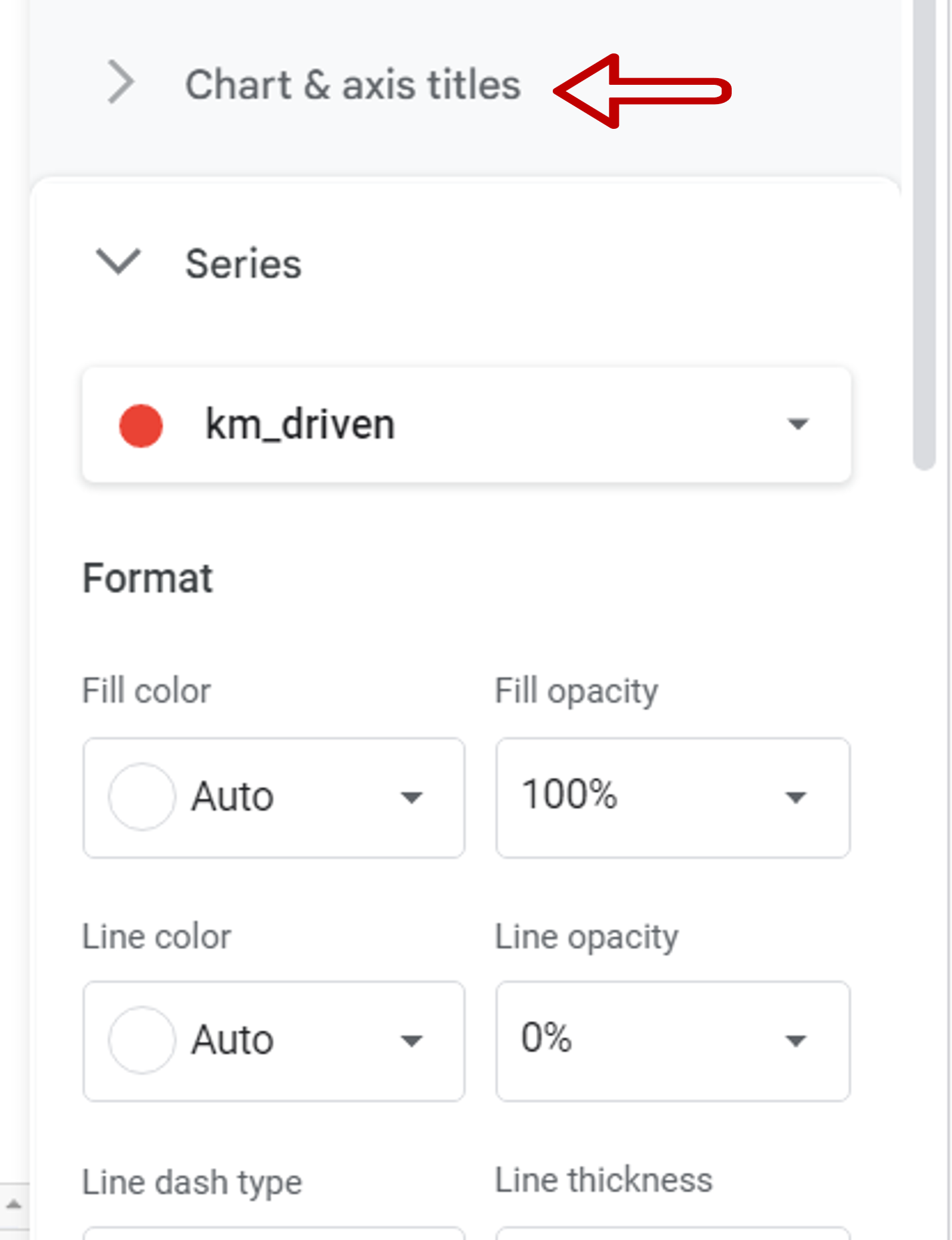
– Expand the Chart & axis titles section
Step 6 – Choose the axis
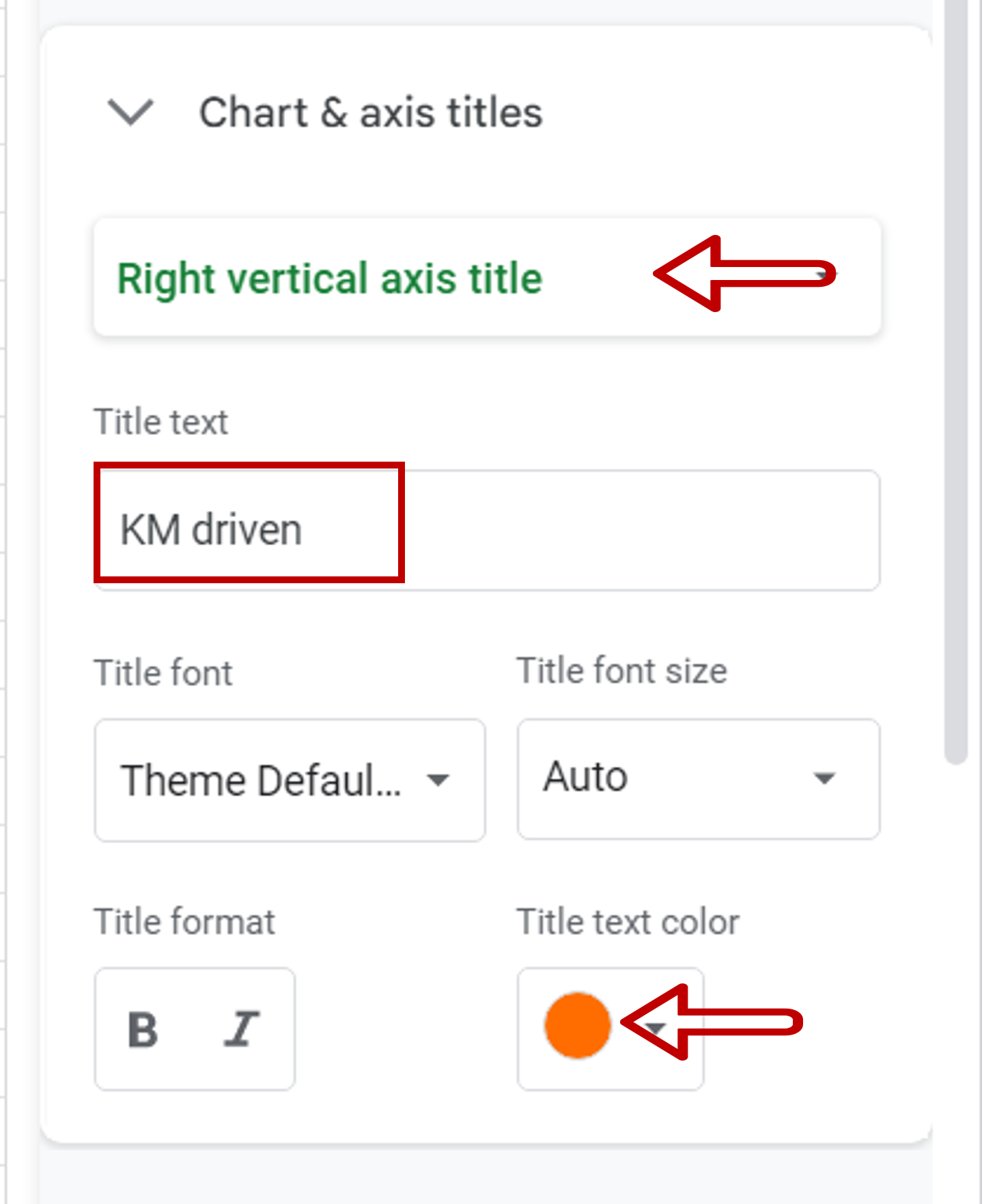
– Choose Right vertical axis title
– Enter the name as ‘KM driven’
– Choose the color
Step 7 – Check the result
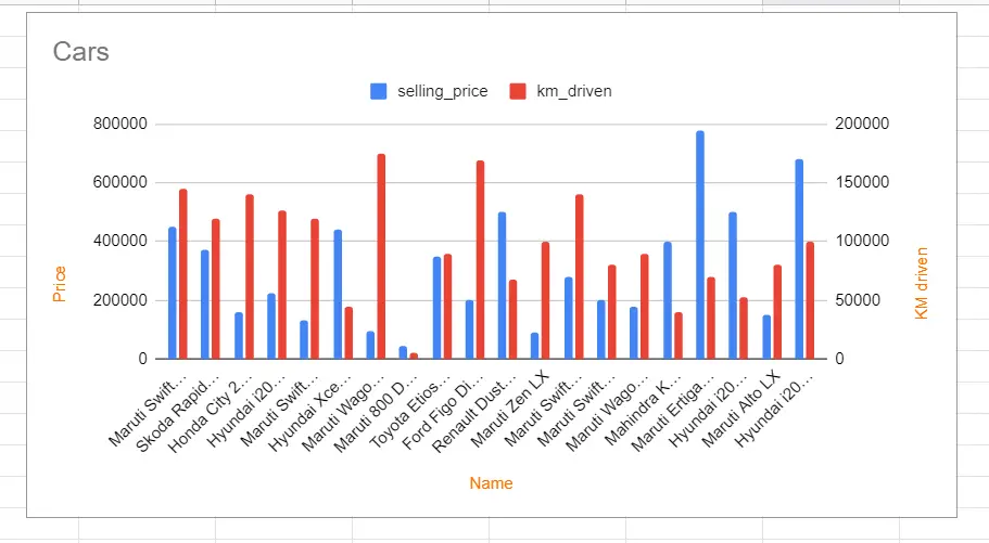
– Close the Chart editor
– A secondary axis is added to the chart for the kilometers driven